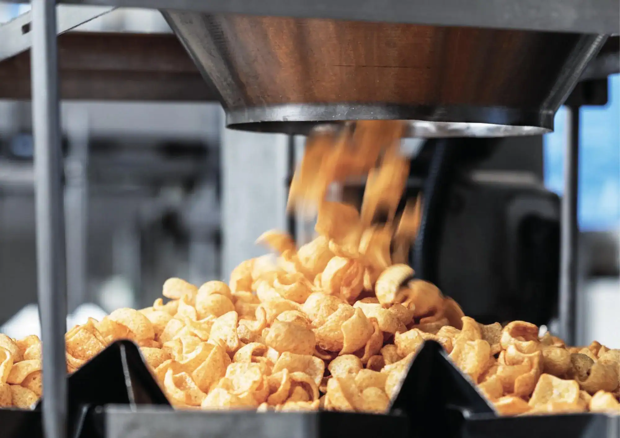
Case study · Branding
Since 1994, snacks for other people’s brands. In 2023, its own.
Tutichip: the rebranding of a private-label snack manufacturer, from the positioning study to the factory façade
- Client
- Tutichip
- Period
- Since 2023
- Services
- Positioning, brand platform and identity
- Studio
- Mariona Agency, Barcelona
01The starting point
It had the product. The brand was missing.
Since 1994, Tutichip has made snacks in Sant Esteve Sesrovires (Barcelona) for private-label brands and co-packing: tortilla chips, fried, baked and organic snacks, with the recipe, shape and packaging each client asks for. A business-to-business (B2B) company with an image that spoke like a consumer brand: no clear positioning and no story to set it apart in the eyes of those who decide which manufacturer to entrust with their product.
In 2023 it commissioned a rebrand from Mariona Agency, the strategic and creative agency from Barcelona, with one goal: to position itself as a solid, innovative and distinctive manufacturer that knows how to tell clients what it brings them, and to gain visibility in Europe.
- +30Years making snacks
- 18,500Tonnes of capacity a year
- 4Technologies: frying, extrusion, baking and popping
- 0Own brands: it makes snacks for others
02The study
Before you draw, listen.
The rebrand began inside the company, not at the design desk. Workshops with the Tutichip team, at its offices, to understand what manufacturers in the sector convey, what its clients look for and worry about, where Tutichip stood in the market and what image and message it needed to project. Using questions, exploratory grids, group exercises and comparisons with companies in the sector and beyond.
From April to July 2023. The study produced the brand platform and, built on it, the identity.
- 01
Workshops
With the team, at the company: its history, its values, its clients and where it wanted to go.
- 02
The sector
How snack manufacturers present themselves, along four axes: innovation, sustainability, approachability and reliability.
- 03
The client
The purchasing manager for private-label brands, in Spain and across Europe. They want a reliable supplier, with quality and attentive service, that won’t cause them supply problems.
- 04
The platform
Purpose, values, personality, positioning, value proposition and creative concept, in one document that brings order to all its communication.
What we found
Everyone talked about innovation. No one showed it.
The opportunity: to make innovation visible, with a graphic system of its own and photography of the factory, not stock images.
The approachable brands seemed unreliable. The reliable ones, cold.
Tutichip had to be both: approachable, to show its human, honest side, and reliable, to inspire trust.
In this business, it is the client who shines.
A polished, understated image with nothing strident about it: poise, not noise.
03The brand platform
know how plus know being
The factory’s know-how, matched by its way with every client. The whole brand is organised around that idea.
The platform says who Tutichip is: a production partner that listens to each client and stays alongside them from recipe to packaging. A creator and a sage, because it knows the sector inside out and innovates with new product lines; a caregiver, because it supports its clients and gives them confidence. Honest, committed and adaptable. And with a tone that is warm, sincere and professional.
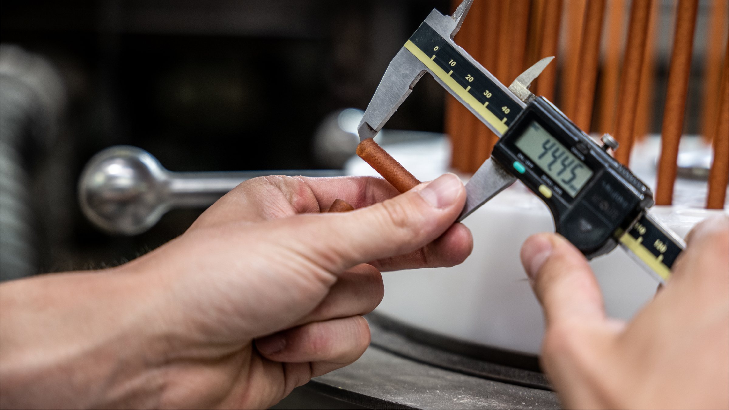
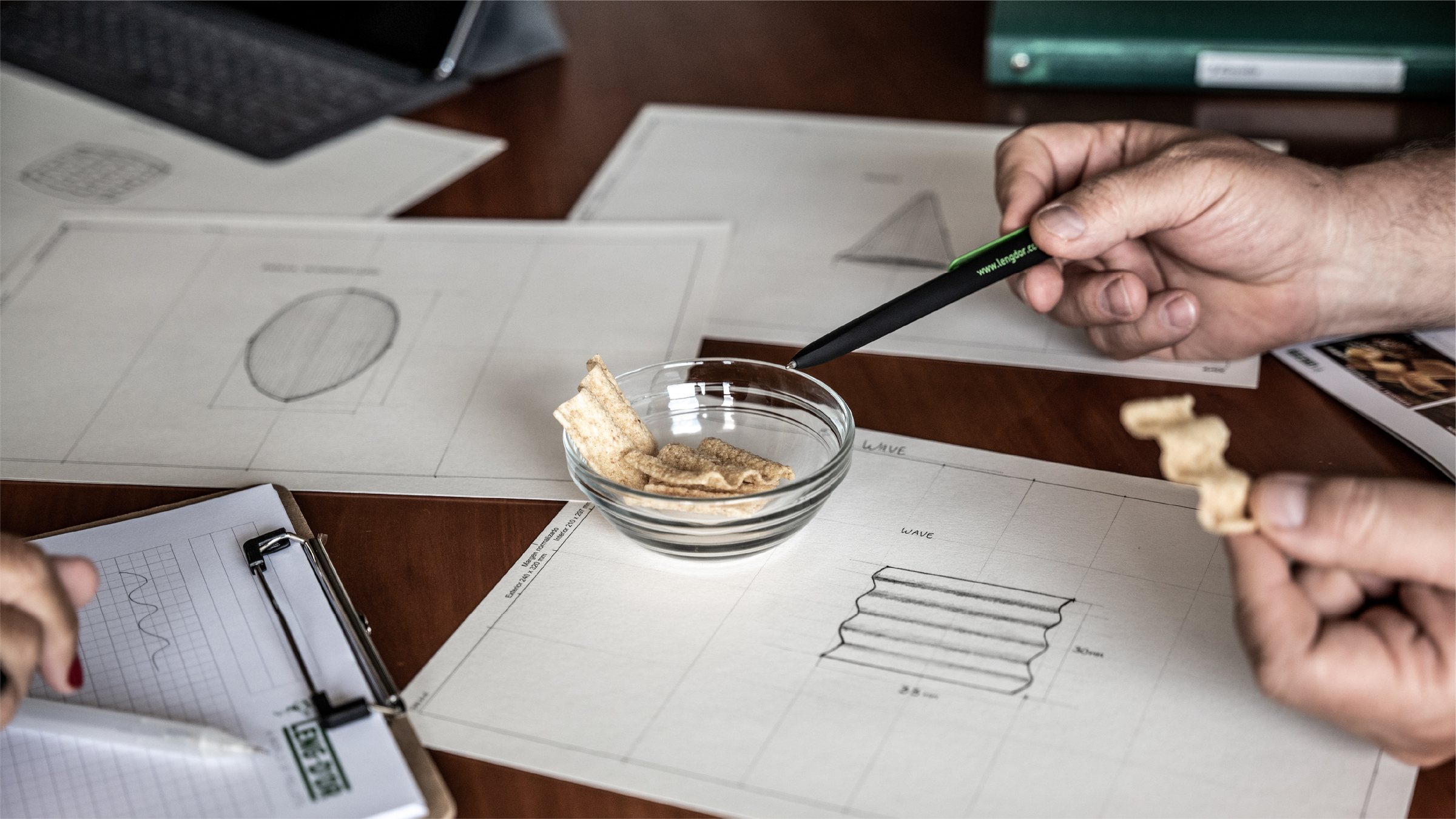
Know how. Every snack, measured to the millimetre.
Know being. Shape, texture and flavour are decided with each client.
04The shapes
An identity made from the product itself.
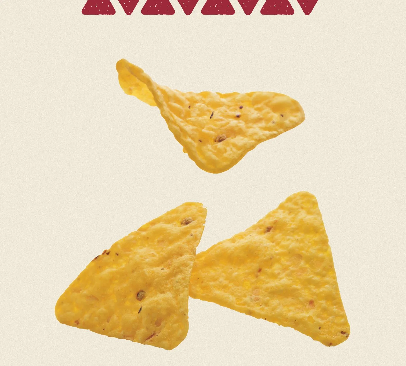
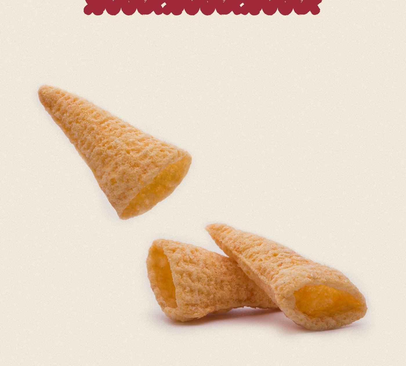
This is what innovation looks like: the graphic system turns the real shapes of the snacks into a brand asset. In the catalogue, each family carries its own shape in the header.
Family 01 / 04
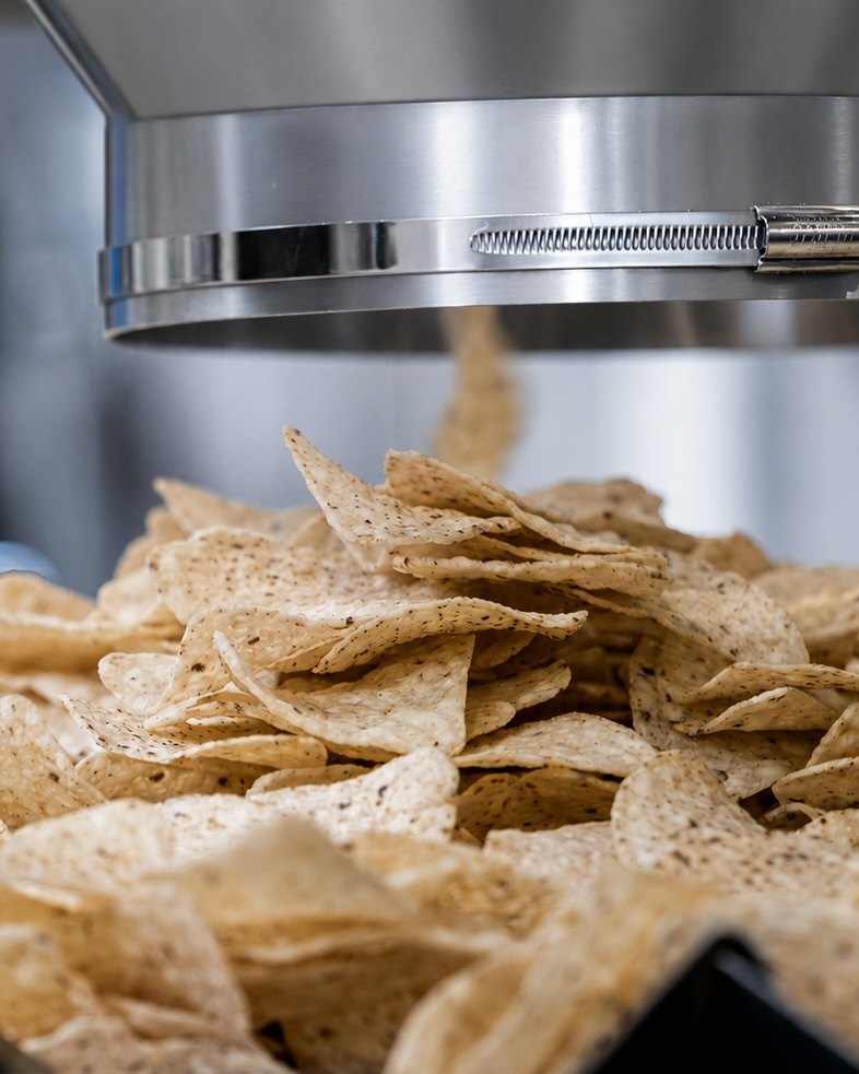
Tortilla chip
Corn cooked using the traditional nixtamalisation method, in many flavours and shapes.
Family 02 / 04
Fried snacks
Fried pellets in any format, shape and flavour.
Family 03 / 04
Organics
Organic snacks, a line Tutichip pioneered.
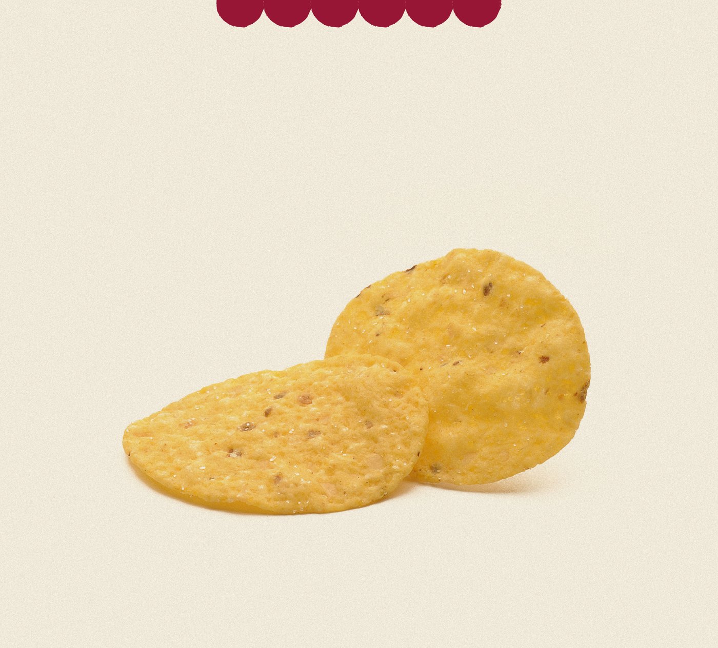
Family 04 / 04
Baked
Baked and crunchy, in a wide variety of shapes and flavours.
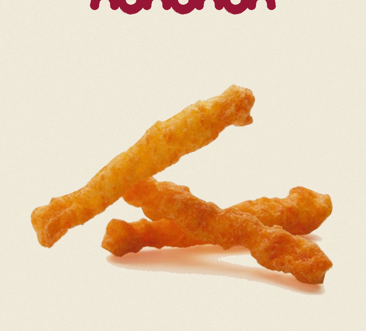
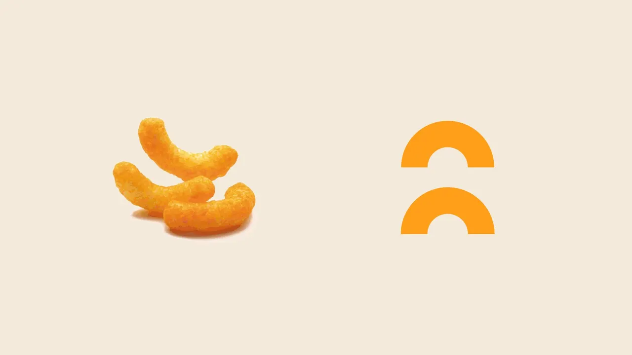
From snack to shape: the graphic system in motion. A circle, a triangle, an arc or a wave, depending on what comes off the line.
05Identity
Orange, maroon and a circle.
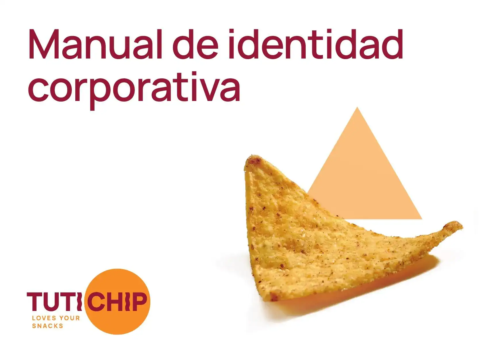
Rounded shapes and a modern, warm typeface, Manrope, to feel approachable while still inspiring confidence. A restrained palette of orange and maroon that supports the client and lets them shine. And CHIP, inside a circle. All of it in a corporate identity manual.
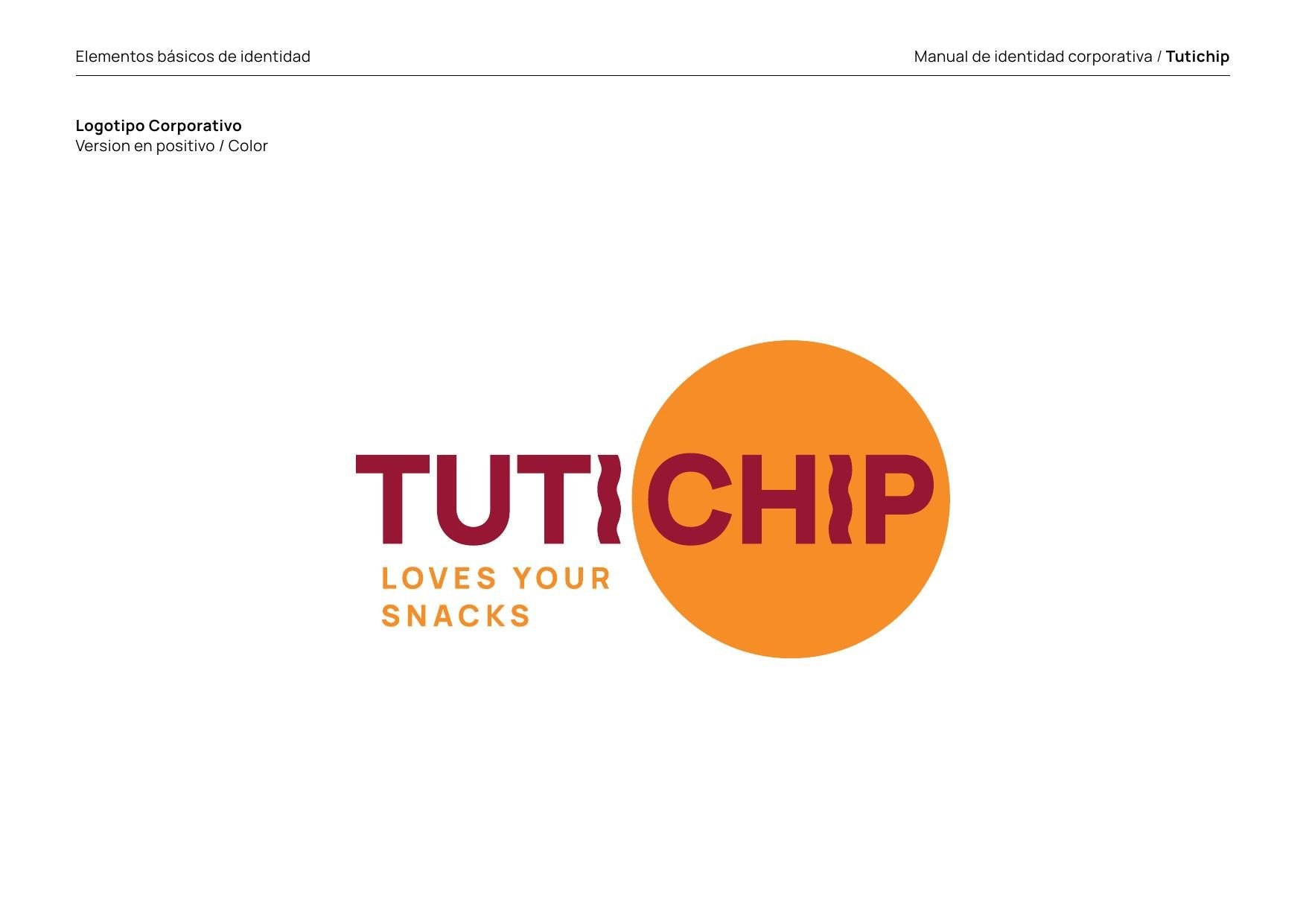
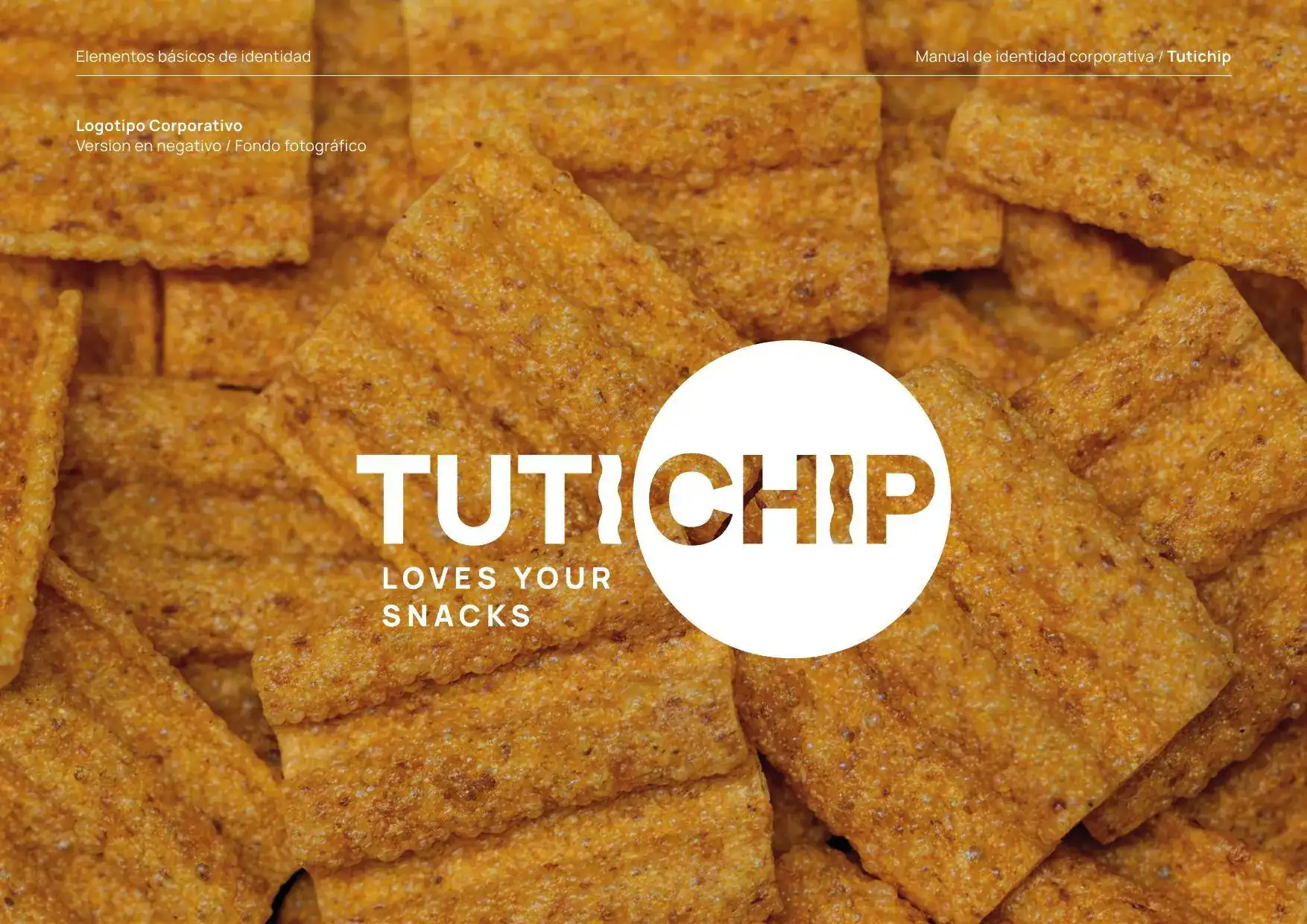
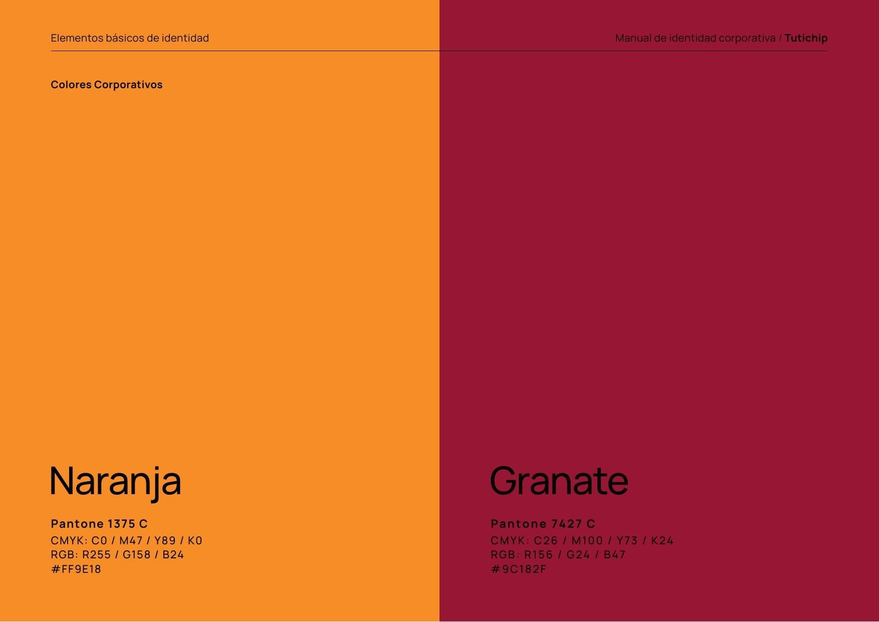
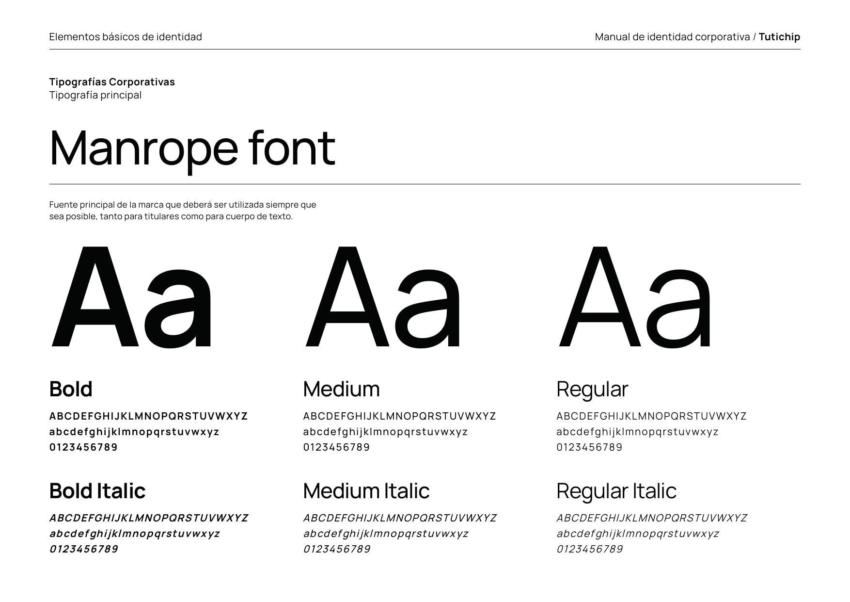
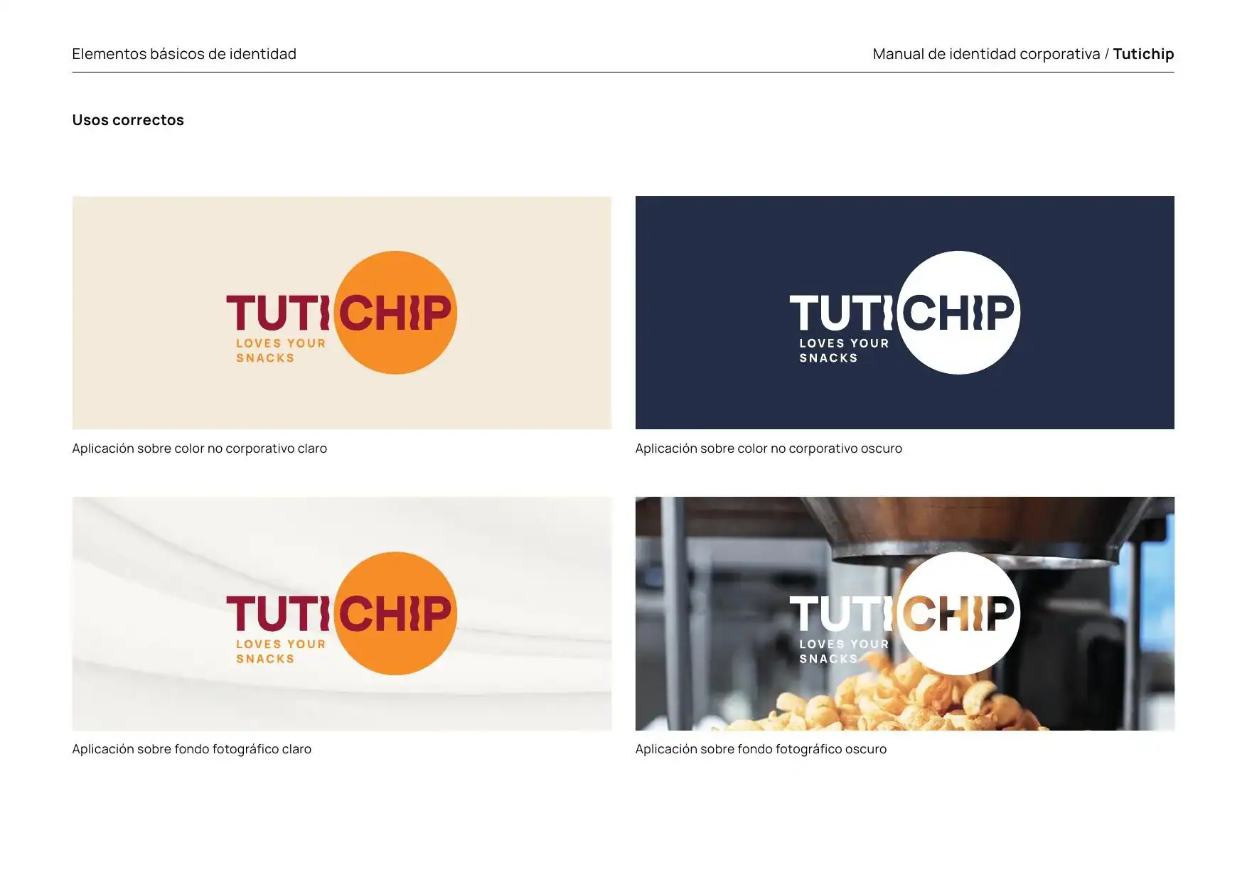
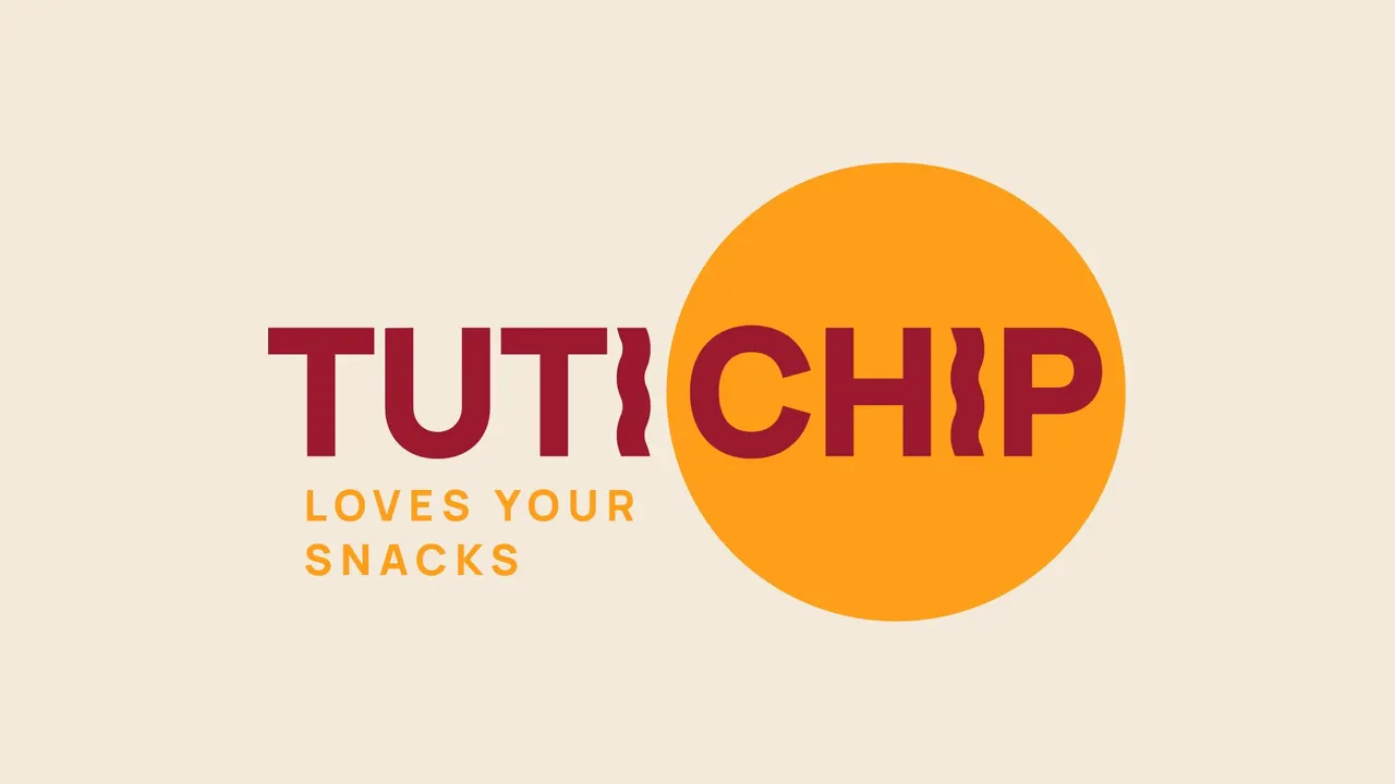
The logo, assembled: TUTI, the wave and the circle.
And the brand’s voice, in one line: “We love your snacks”.
06Catalogue
A catalogue for selling in Europe.
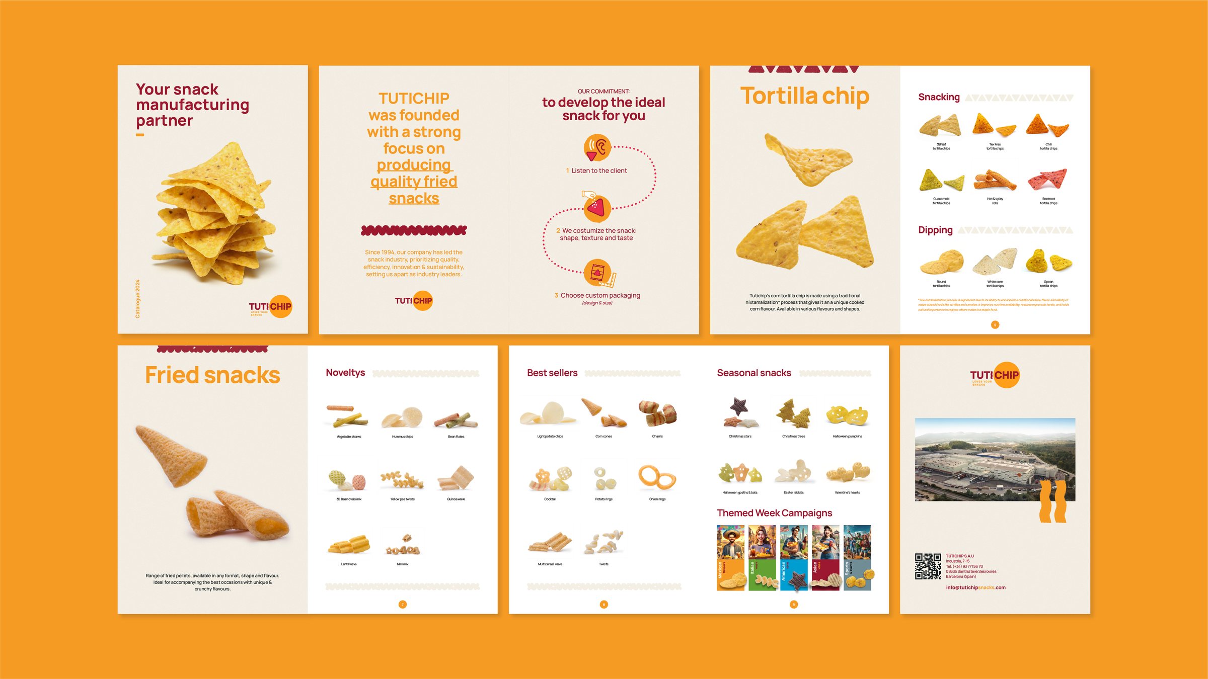
The 2024 catalogue, in English: who Tutichip is, how it works (listening to the client, customising the snack and choosing the packaging) and its product families, each with its own shape.
Then the 2025 catalogue and the 2026 updates.
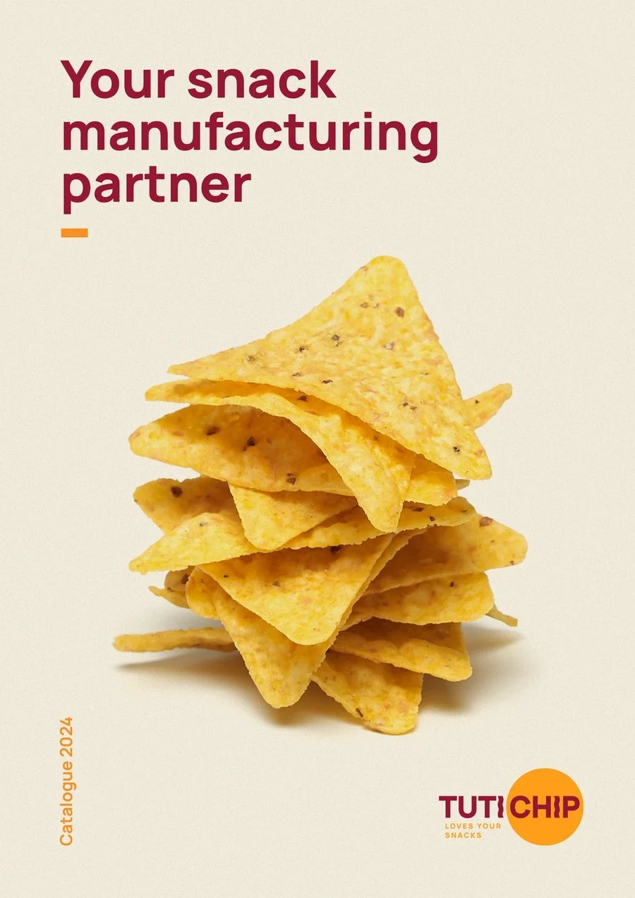
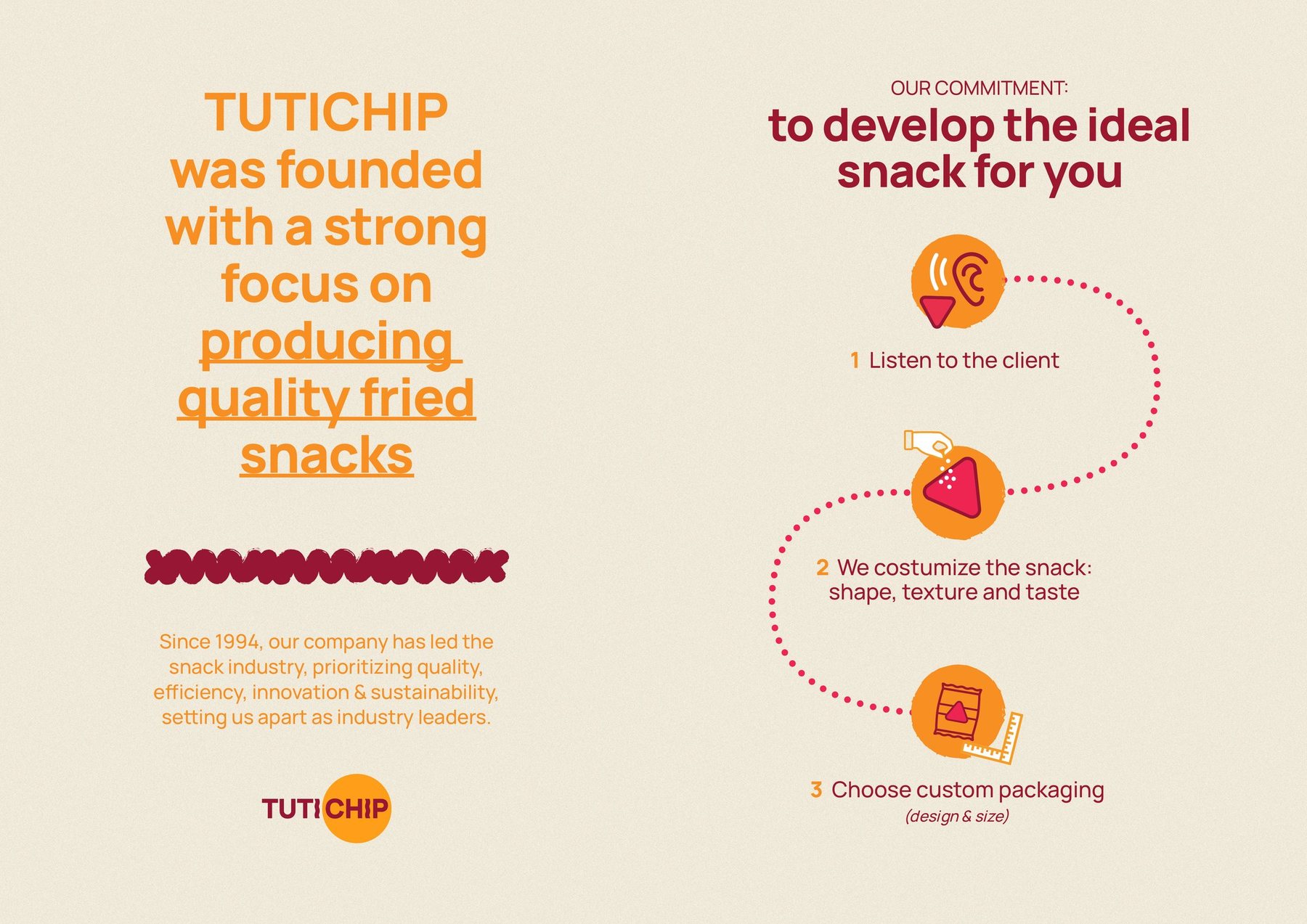
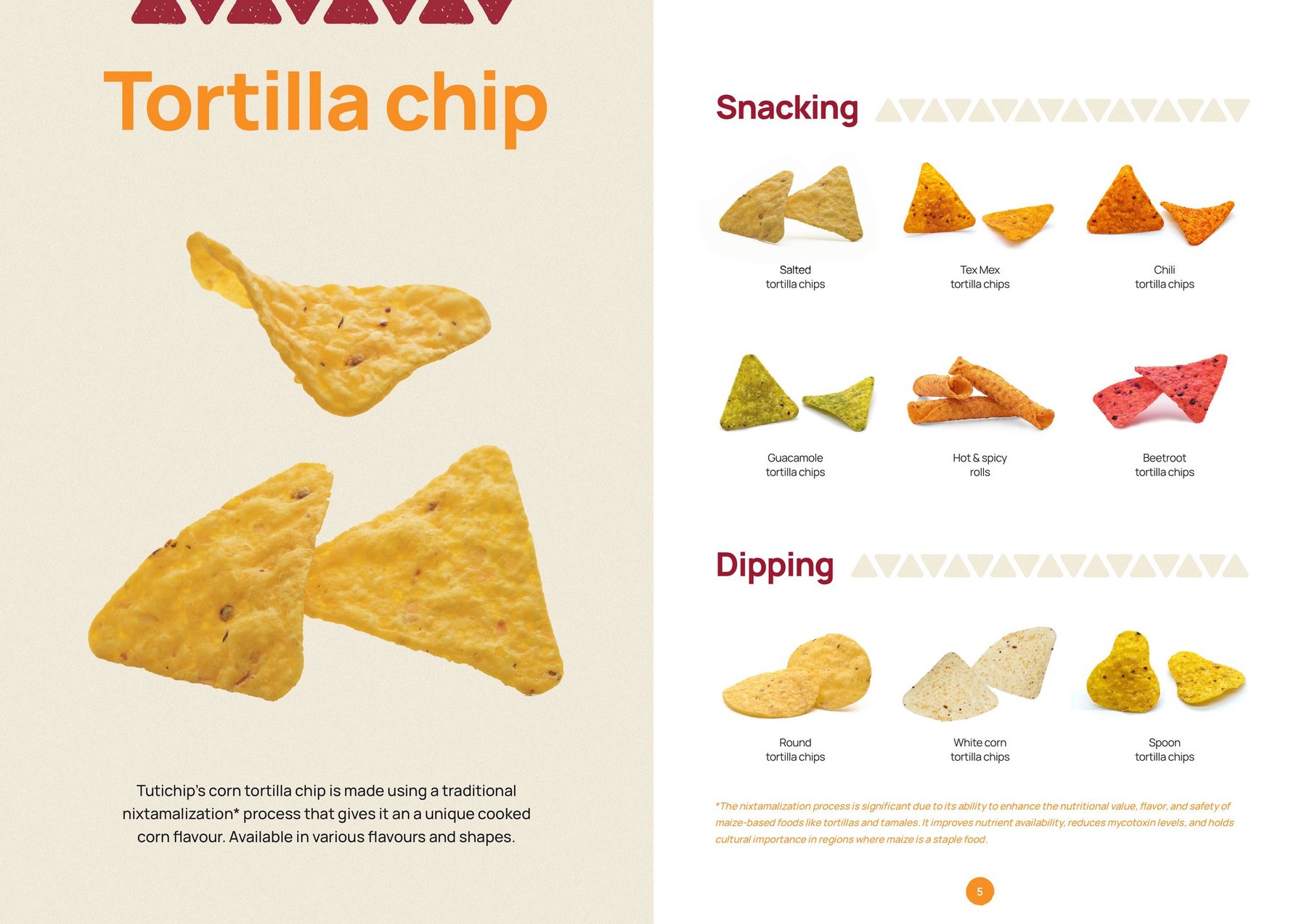
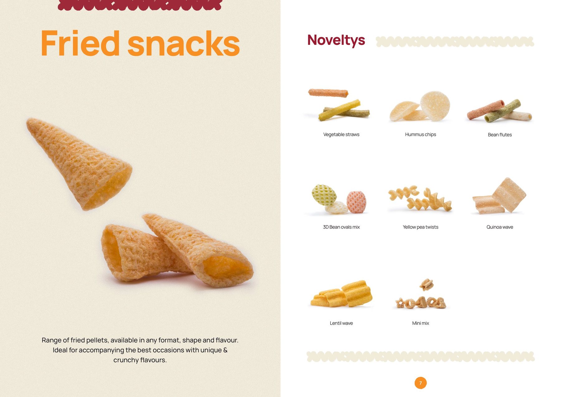
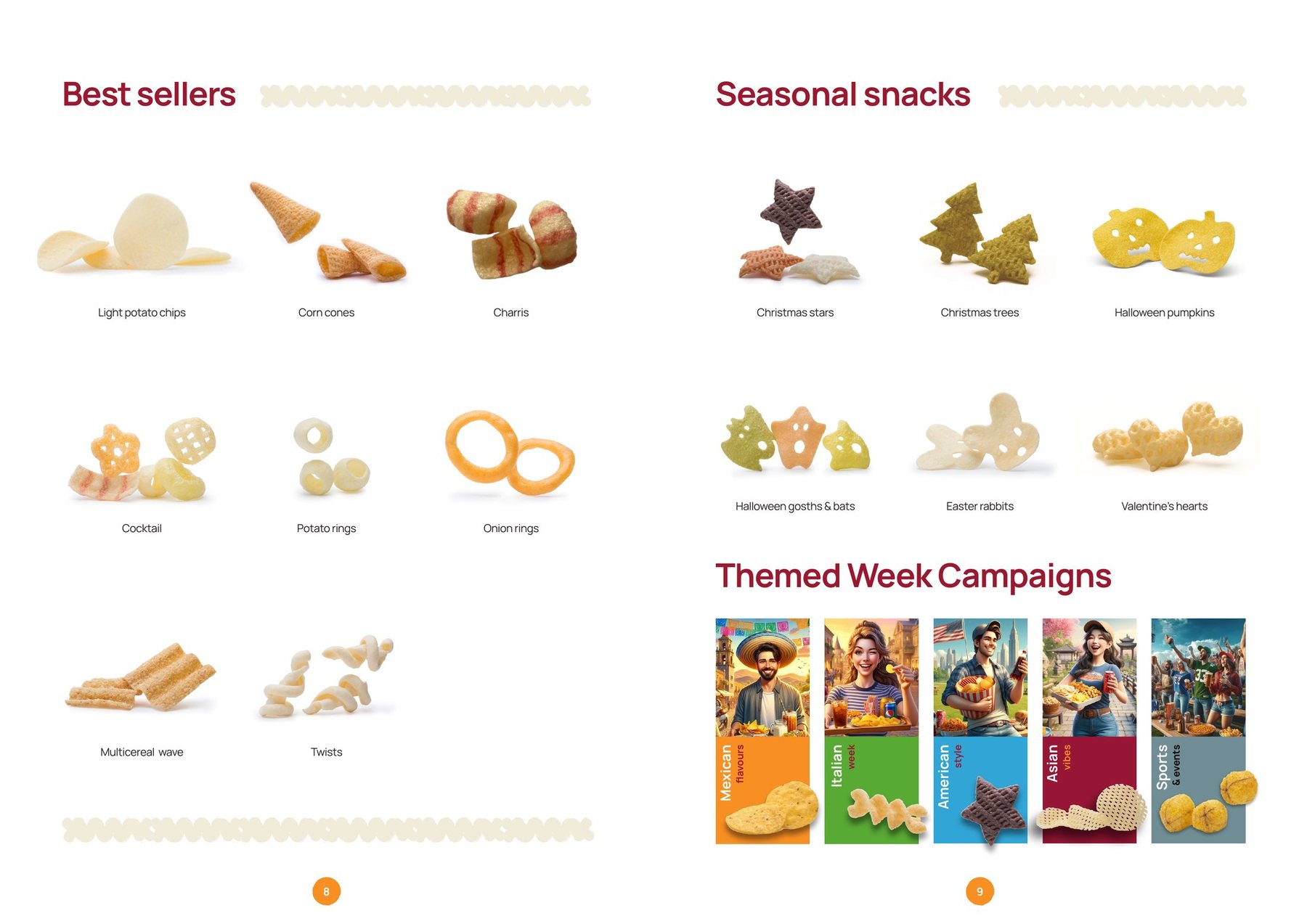
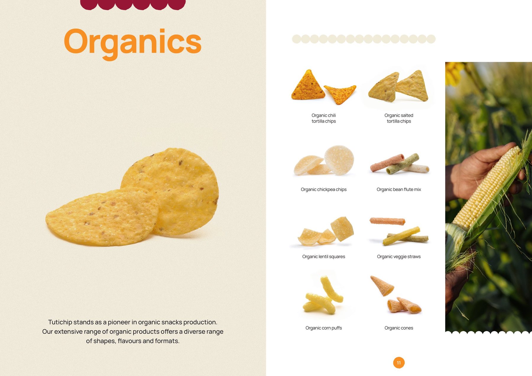
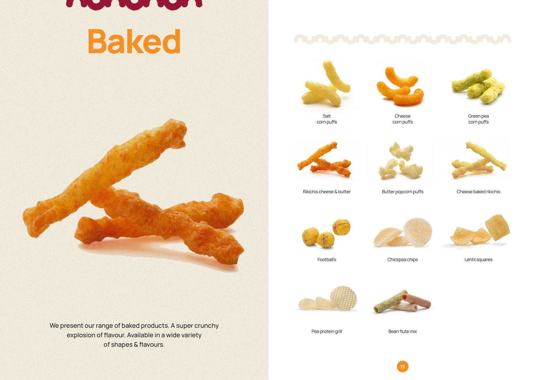
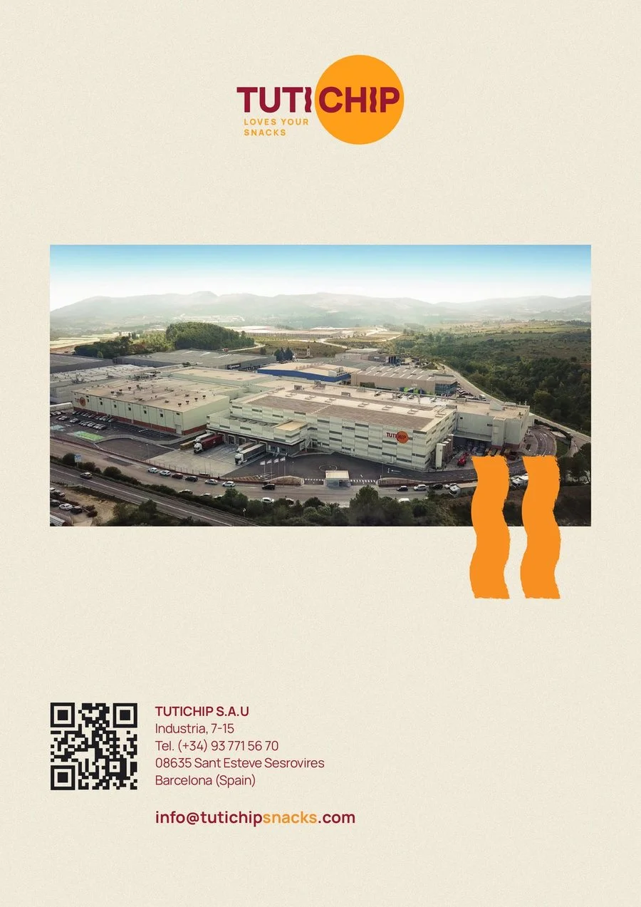
Catalogue 2024
07The brand, out in the world
From the factory to the street.
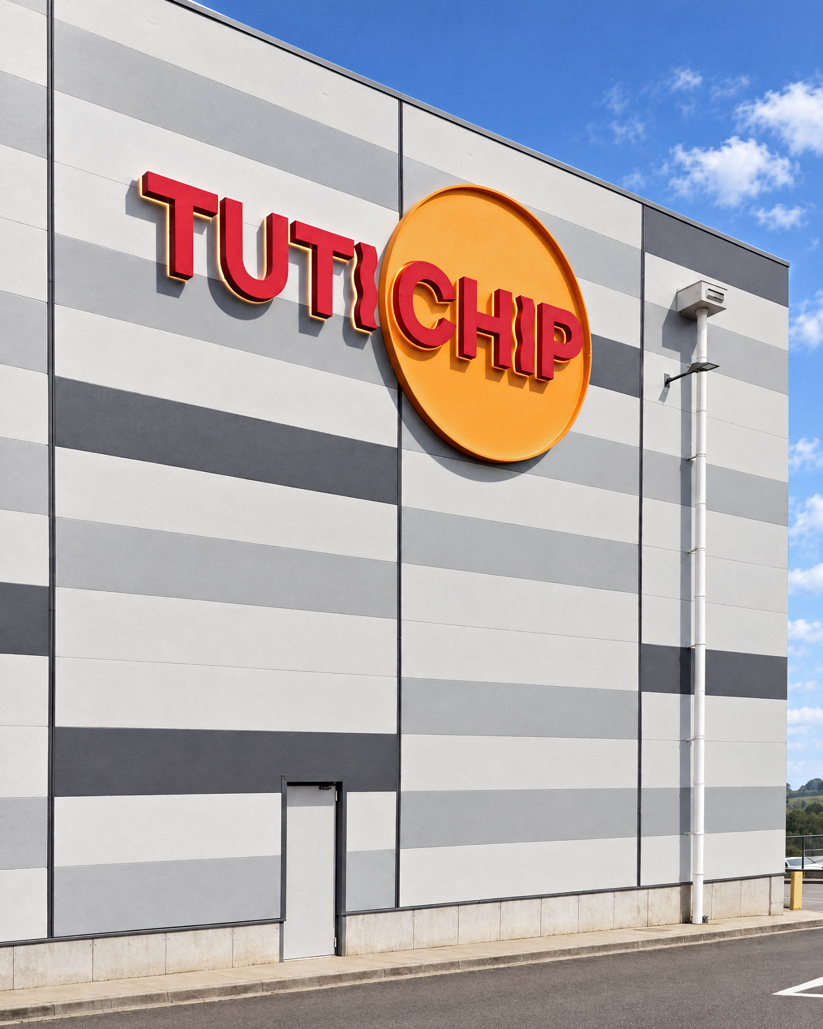
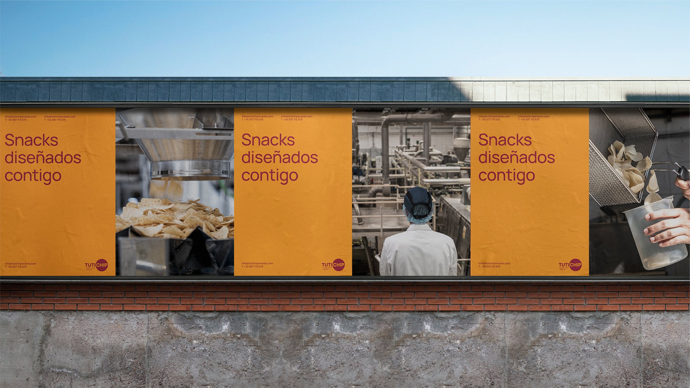
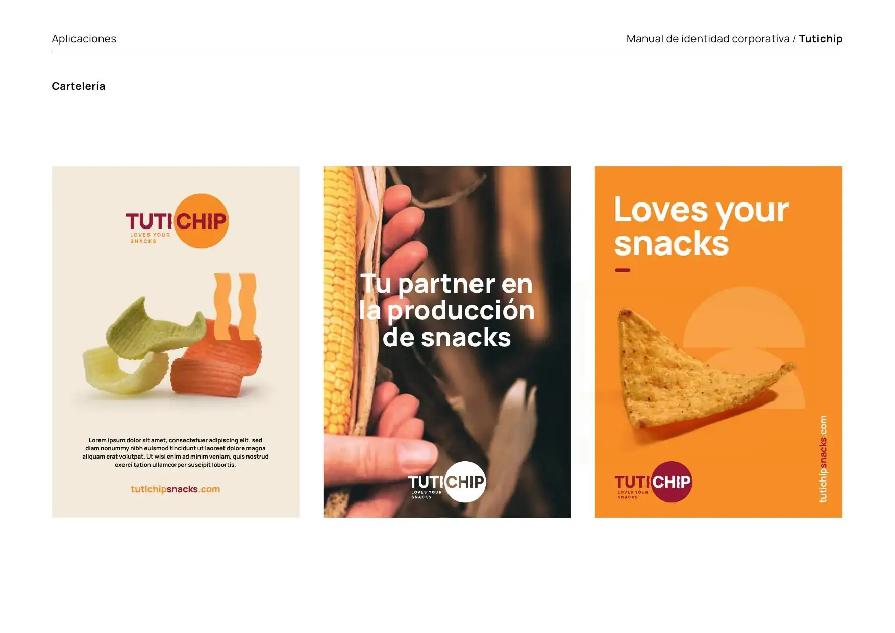
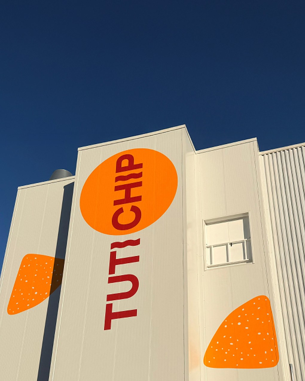
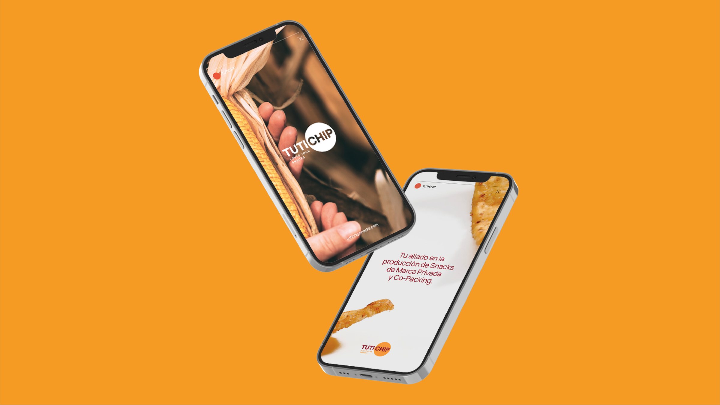
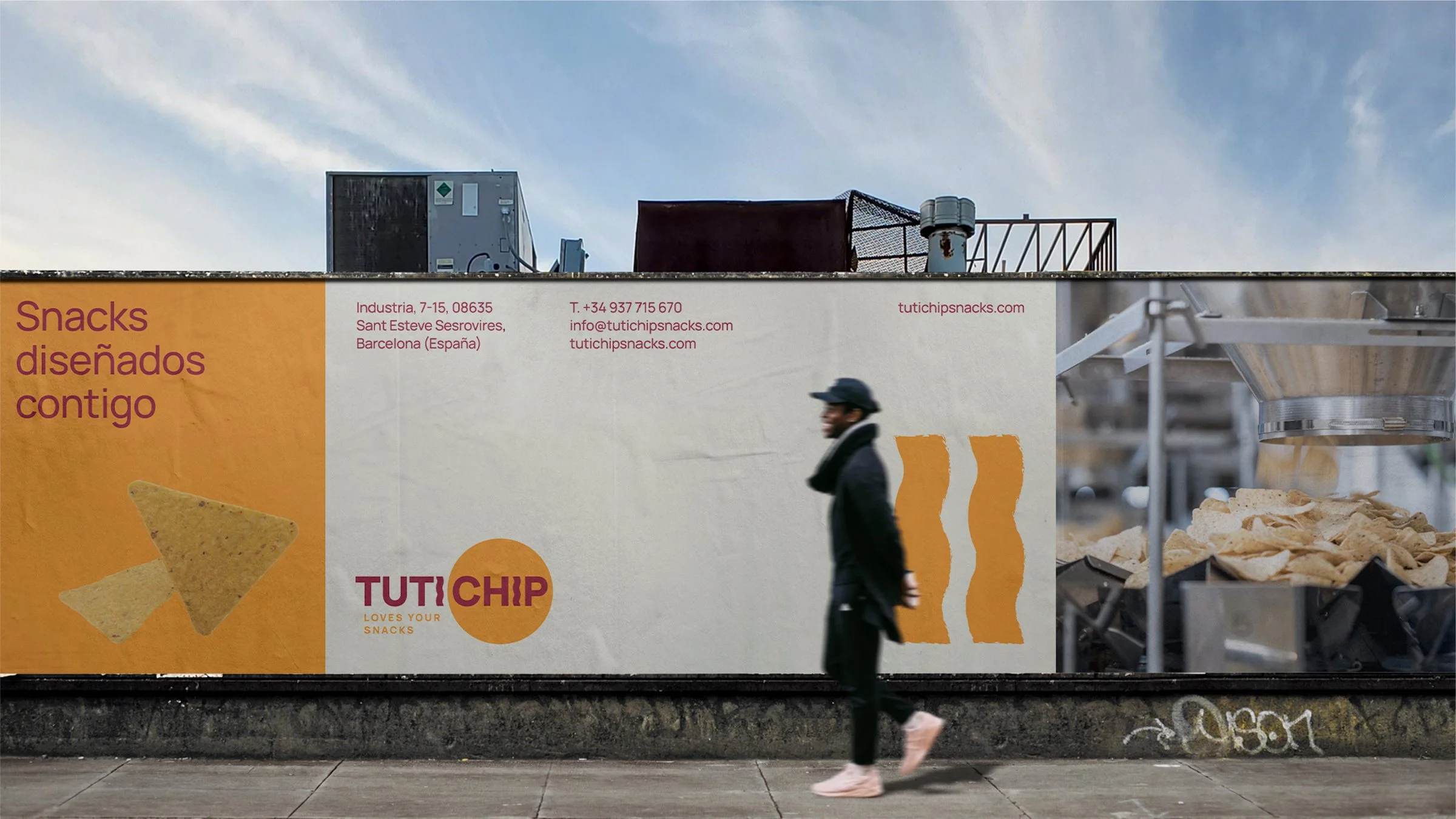
The brand carries through everything it touches: posters, social media, the catalogue, objects and, in 2025, the façade of the factory building in Sant Esteve Sesrovires, painted and fitted with its illuminated sign.

08Afterwards
Stands at three trade fairs, from 2024 to 2026, the latest at PLMA. The stand’s screen, in motion graphics. Ads in Alimarket and in the fair’s magazine. The catalogue, updated in 2025 and 2026. Tri-fold safety leaflets for visitors and hauliers, in Spanish and English. Infographics, stationery and the factory façade.
Tutichip already had the product. Now it has a brand to match.
The project
The challenge
Tutichip has made snacks for private-label brands and co-packing since 1994, but its image did not speak to its customer: the purchasing manager at a private-label brand. It lacked clear positioning and a brand worthy of its factory.
The approach
Positioning before design: workshops with the team, a study of the sector and the client, and a brand platform (know how + know being). On that foundation, the identity: logo, orange and maroon, Manrope and a graphic system made from the shapes of the snacks.
The result
A solid, approachable and innovative brand that tells clients what it brings them. And more than 25 projects since 2023: catalogues, trade fairs, ads, safety signage, stationery and the factory façade.
- Client
- Tutichip
- Sector
- Snack production · Food
- Location
- Sant Esteve Sesrovires, Barcelona
- Period
- Since 2023
- Services
- Positioning study and brand platform, visual identity, graphic system, identity manual, catalogues, trade fair stands, motion graphics, ads, signage and factory lettering
- Agency
- Mariona Agency, Barcelona
Frequently asked questions
What did Mariona Agency do for Tutichip?
In 2023, Mariona Agency, the strategic and creative agency from Barcelona, carried out Tutichip’s rebrand: a positioning study with workshops, the brand platform, the visual identity, the graphic system and the identity manual. Since then it has completed more than 25 projects for the brand: catalogues, trade fair stands, motion graphics, ads, safety signage, stationery and the factory façade.
How was the positioning study carried out?
Through workshops with the Tutichip team at its offices, a visual and verbal analysis of the manufacturers in the sector (innovation, sustainability, approachability and reliability) and a study of its client: the private-label purchasing manager in Spain and Europe. That work produced the brand’s purpose, values, personality, positioning and creative concept.
What does know how + know being mean?
It is the idea behind Tutichip’s brand platform: the factory’s know-how, matched by its way with every client. The whole brand is organised around it.
What is Tutichip’s graphic system based on?
On the real shapes of its snacks, turned into a brand asset. In the catalogue, each family (tortilla chips, fried, organic and baked) carries its own shape in the header.
