Naming Sand Farcit
Mariona Agency created the naming and branding for Sand Farcit, a creative sandwich shop in Sant Cugat del Vallès. The name joins the Catalan word farcit—filled—with Sand: the sandwich and, at the same time, a nod to the Sant in Sant Cugat. On that idea we built an identity of bold colours, as generous as the sandwiches that inspire it.
Naming and branding
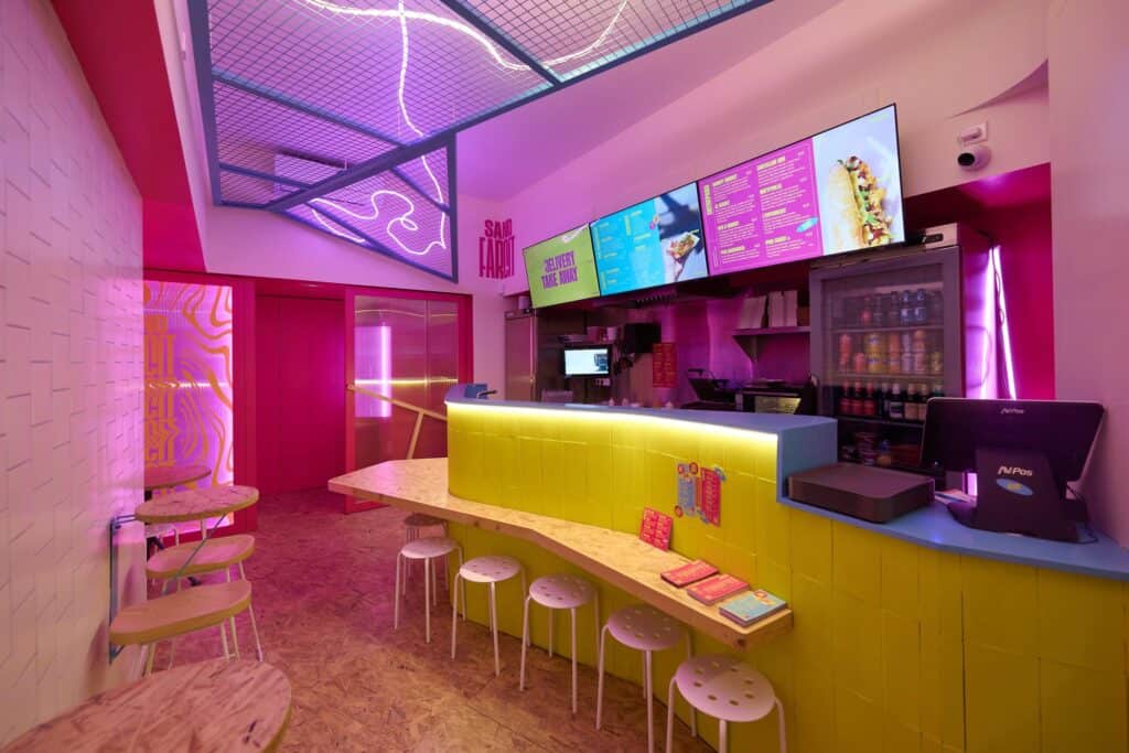
As much colour as filling.
Naming, logo, pattern system, mascot, menu, art direction for the shop and brand applications, in a palette of magenta, acid yellow and cyan.
Applications
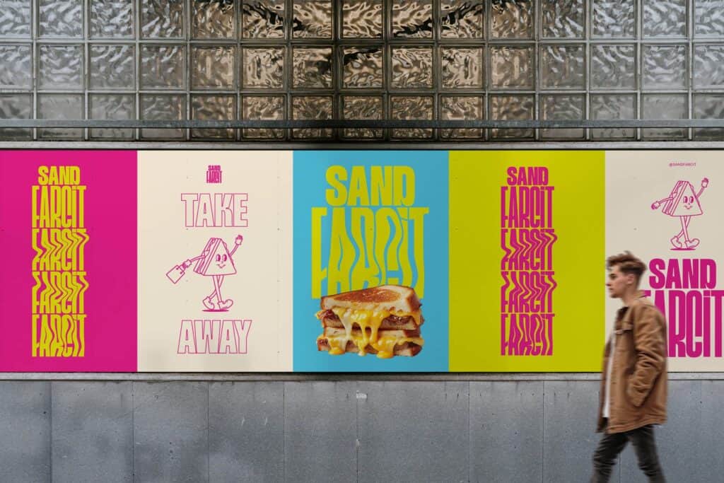
Colour, down to the last sticker.
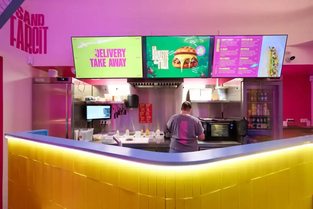
A name that speaks of its place, and colour with no half measures. That is how Sand Farcit takes on the chains: by being different.
The project
The challenge
A new sandwich shop in Sant Cugat del Vallès arrived with a clear proposition—creative, generous sandwiches, no half measures—but with no name or brand to present itself with. The brief was twofold: find a name that said at a glance what it is and where it comes from, and build around it an identity able to stand out in a crowded sector and compete with the big chains by being different.
The approach
The name came from playing with the local language. In Catalan, a well-loaded sandwich is an entrepà farcit: stuffed, full, complete. We joined it to Sand—the sandwich and, at the same time, a nod to the Sant in Sant Cugat—and so Sand Farcit was born: two words that pin down product and place, easy to say and to remember. The visual identity carries that idea of abundance into colour. Every Sand Farcit sandwich is built with an unusual quantity of ingredients, and the brand makes it visible: instead of a cautious palette, a system of bold colours—magenta, acid yellow, cyan—that pile up, mix and saturate just like the ingredients inside the bread. Even the logo melts and spills over, like the cheese in a freshly made sandwich. Colour is not decoration: it is a tally of what is inside. On that basis we built the logo, a graphic system of patterns, the mascot, the menu, the art direction for the shop and the brand applications.
The result
Sand Farcit opened with a brand you recognise from a distance and understand up close: a name that tells you its Catalan roots and its product in a single gesture, and an identity that turns abundance into a visual signal. Branding made not to go unnoticed—not on a street in Sant Cugat, nor up against the chains—and ready to grow with the business.
Frequently asked questions
Who created the naming and branding for Sand Farcit?
The naming and branding for Sand Farcit were developed by Mariona Agency, a strategic and creative branding agency based in Barcelona. The project covered the name, the visual identity, the graphic system, the mascot and the brand applications.
What is Sand Farcit?
Sand Farcit is a creative sandwich shop in Sant Cugat del Vallès, specialising in generous sandwiches overflowing with ingredients. Its name joins the Catalan farcit—filled—with Sand, the sandwich and a nod to the Sant in Sant Cugat.
Why does the Sand Farcit brand use such striking colours?
Sand Farcit’s bold colours—magenta, acid yellow and cyan—are a direct translation of its product. Every sandwich is built with a large quantity of ingredients, and the identity carries that abundance into colour: a saturated, generous palette, as loaded as the sandwiches it represents.
Where is Sand Farcit?
Sand Farcit is in Sant Cugat del Vallès, in the province of Barcelona. The name holds both the product and the place: Sand refers to the sandwich and to the Sant in Sant Cugat, and farcit is Catalan for filled.