
Branding for Clínica de la Mirada
Mariona Agency created the brand for Clínica de la Mirada, the oculoplastic surgery clinic run by Dr Gorka in Barcelona: the clinic’s logo, stationery, signage and framed artwork, its website, the photo shoot and the video. And, alongside it, the doctor’s personal brand, with his monogram, his cards and his website, drgorka.es.
The idea
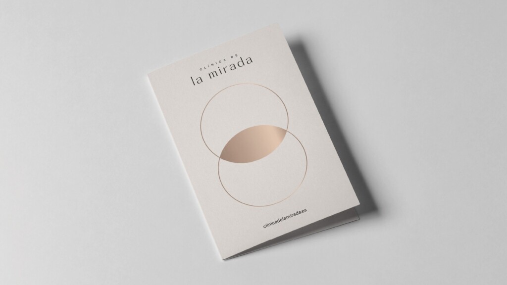
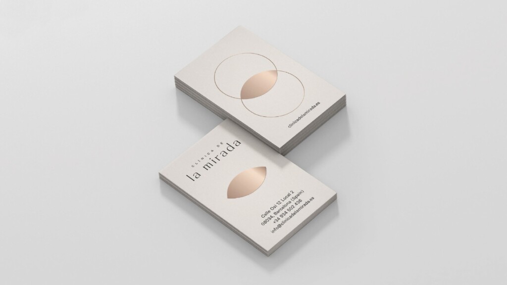
Two intersecting circles draw an eye.
The symbol is pure geometry: two fine circles and, where they intersect, the shape of an eye in a copper gradient. The logo, set in Hatton, is lower case and given room to breathe. Everything else grows from there: the paper, the façade, the reception desk, the artwork and the website.
Dr Gorka
A name that was already a brand.
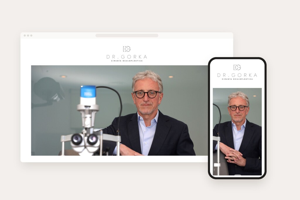
Before the clinic existed, Dr Gorka already had the hardest part: more than twenty years of oculoplastic surgery and the trust of his patients. Mariona Agency shaped that into a brand: a monogram that interlaces the D and the G, his name given the same room to breathe as the clinic’s, and “Cirugía oculoplástica” (Oculoplastic surgery) as a signature line, on his cards and on his website, drgorka.es. Two brands that appear together without competing.


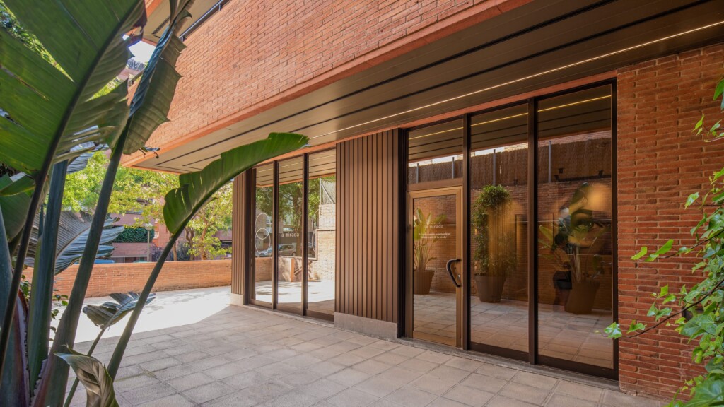
The clinic
The brand, in every corner.
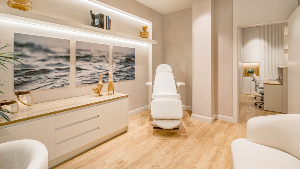
A clinic you recognise at first sight and a doctor who is a name in his own right.
The project
The challenge
After more than twenty years heading the oculoplastics unit at a major ophthalmology centre in Barcelona, Dr Gorka was setting up Clínica de la Mirada, where he is medical director. Two brands had to live side by side: his own, a name that already inspired trust among patients and colleagues, and that of a new place devoted to the eyelids and the area around the eyes, which had to convey precision and calm from the front door.
The approach
A simple idea: two intersecting circles draw an eye. The symbol fills that intersection with a copper gradient, and the logo, set in Hatton, is lower case and given room to breathe. That geometry organises everything else: the cards on 450 gsm cotton paper with the symbol foil-stamped, the prescription pads and envelopes, the window vinyls on the façade with lines about the gaze, the relief logo on the reception desk and the large-format artwork.
For the doctor, a brand of his own that does not compete with the clinic’s: a monogram that interlaces the D and the G, his name with the same letter spacing, and “Cirugía oculoplástica” (Oculoplastic surgery) as a signature line, on his cards and on his website, drgorka.es.
And the clinic, told in pictures: the photo shoot of the spaces and the doctor, with Carlos Garralaga, and a walk-through filmed in slow motion, in landscape and portrait, for the website on desktop and mobile.
The result
Two brands that appear together without blurring into one. The clinic, with a complete identity, from the façade to the prescription pad; the doctor, with a signature of his own that accompanies it on paper and on screen.
Frequently asked questions
Who designed the Clínica de la Mirada brand?
Mariona Agency, the strategic and creative agency from Barcelona. It created the clinic’s logo and identity, its stationery, signage and framed artwork, the clinicadelamirada.com website, the photo shoot and the video, as well as Dr Gorka’s personal brand and his website, drgorka.es.
What does the Clínica de la Mirada symbol represent?
Two intersecting circles. Where they overlap, they draw the shape of an eye, filled with a copper gradient that recurs on the cards, the leaflet and the website.
What is Dr Gorka’s personal brand?
The doctor’s own identity, alongside the clinic’s: a monogram that interlaces the D and the G, his name and “Cirugía oculoplástica” (Oculoplastic surgery) as a signature line. It appears on his cards and on his website, drgorka.es.
Which typefaces does Clínica de la Mirada use?
Hatton for the logo, headlines and highlighted text, and Basier Square for body text.
What is oculoplastic surgery?
The branch of ophthalmology devoted to plastic and reconstructive surgery of the eyelids, the tear ducts and the orbit, the area around the eye. It is Dr Gorka’s speciality and that of Clínica de la Mirada.