Case study · Real estate

Hola Pisos: the complete rebrand of Anticipa Real Estate’s home-sales brand, from the identity to the portal, the campaigns and the offices
- Client
- Anticipa Real Estate · Hola Pisos
- Period
- 2017–2019
- Services
- Rebranding, portal, campaigns and point of sale
- Studio
- Mariona Agency, Barcelona
01The brand
A name that already said hello.
Hola Pisos (“Hello Flats”) is the brand under which Anticipa Real Estate, the Blackstone group’s real estate company in Spain, sells flats, houses, commercial premises and parking spaces all over the country. A product associated with the world of finance, with a vast catalogue spread from Galicia to the Canary Islands, that needed warmth and an idea of its own.
Between 2017 and 2019, Mariona Agency, the strategic and creative agency from Barcelona, remade the entire brand and looked after it month by month: identity, colour, tone of voice, portal, campaigns, social media and offices.
- 29Months of work, without a break
- +100Projects, on top of the day-to-day
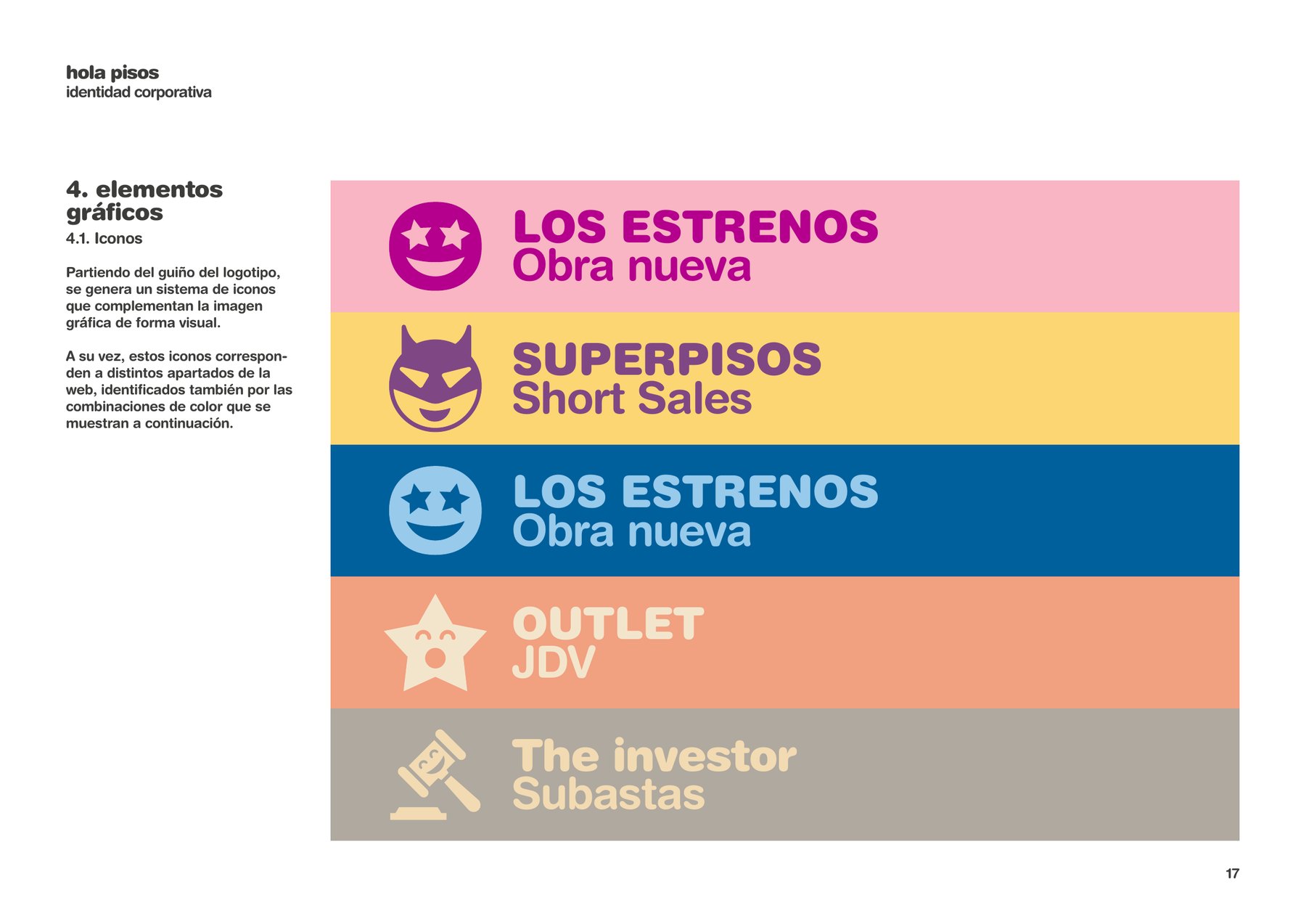
- 11Products with their own colour and icon
- +50Towns and cities with the brand at street level
02The idea
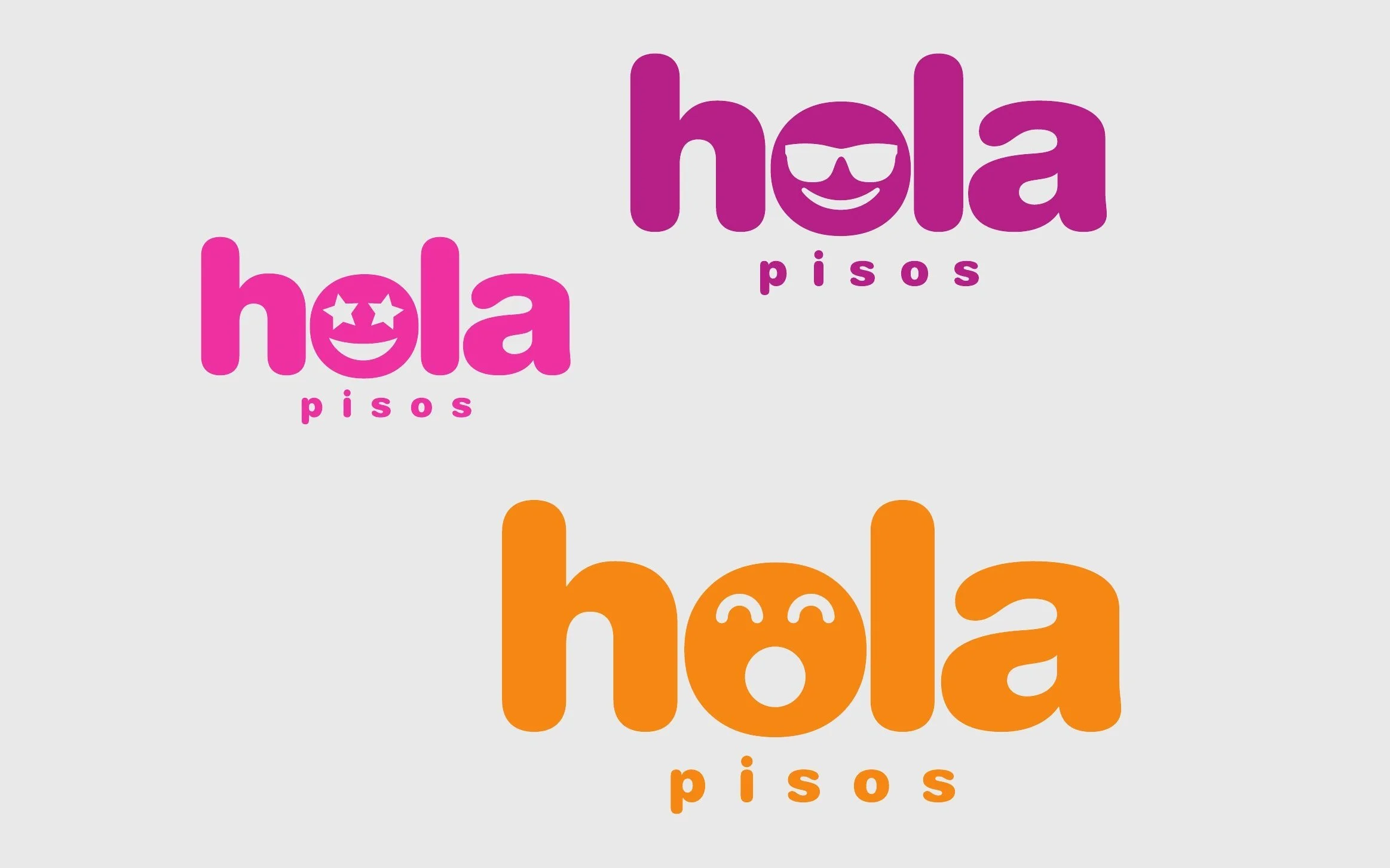
A face in the “o”.
- 01A name that is already a greeting.
- 02The “o” opens its eyes.
- 03And says hello.
In a sector of keys, floor plans and figures, a face. The “o” in hola smiles and greets you: rounded type, friendly shapes and a name that is, in itself, a gesture of warmth. A greeting instead of a transaction.
And a face can change its expression. That is the idea that holds everything else together: every product, every campaign and every message has its own.
03Colour
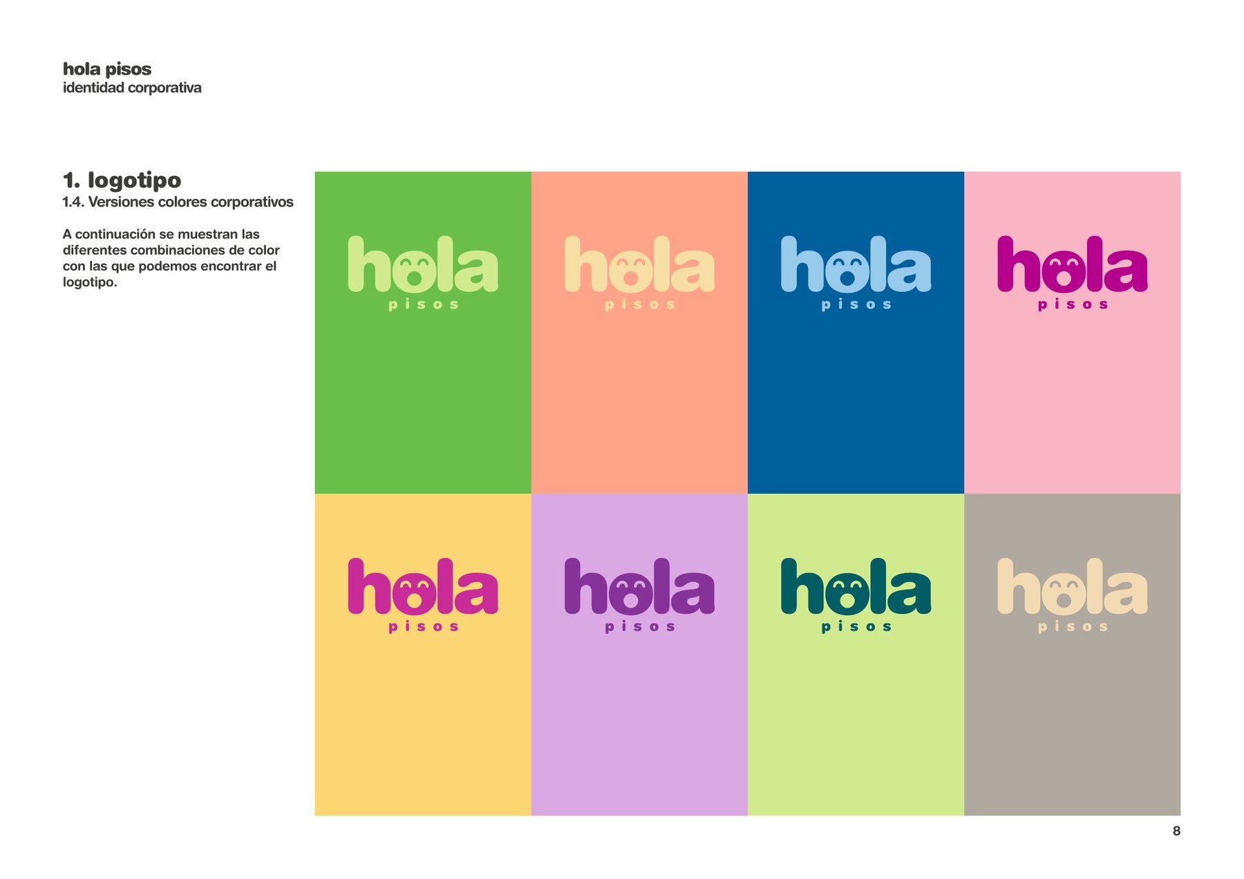
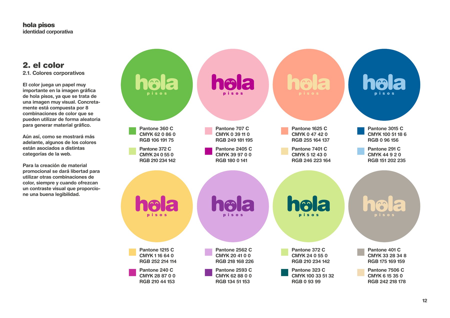
Eight colours, one language.
The manual sets out eight colour pairs that combine freely. Some also name a section: Los Estrenos blue, Outlet salmon, SuperPrecios yellow.
01 / 08Pantone 360 C · 372 C
02 / 08Pantone 707 C · 2405 C
03 / 08Pantone 1625 C · 7401 C
04 / 08Pantone 3015 C · 291 C
05 / 08Pantone 1215 C · 240 C
06 / 08Pantone 2562 C · 2593 C
07 / 08Pantone 372 C · 323 C
08 / 08Pantone 401 C · 7506 C
The brand in motion: the logo, the colours and the slogan.
04The voice
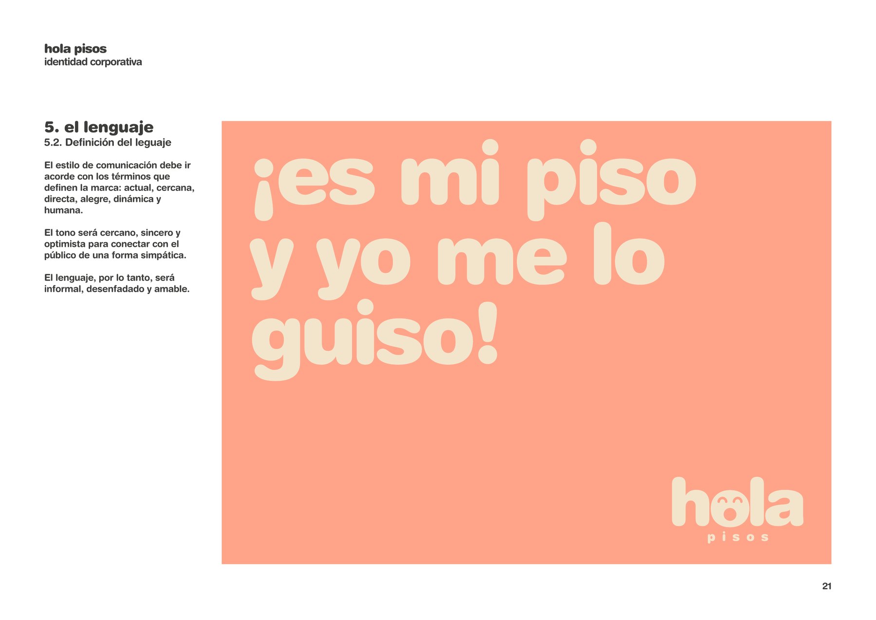
Age-old sayings, rewritten.
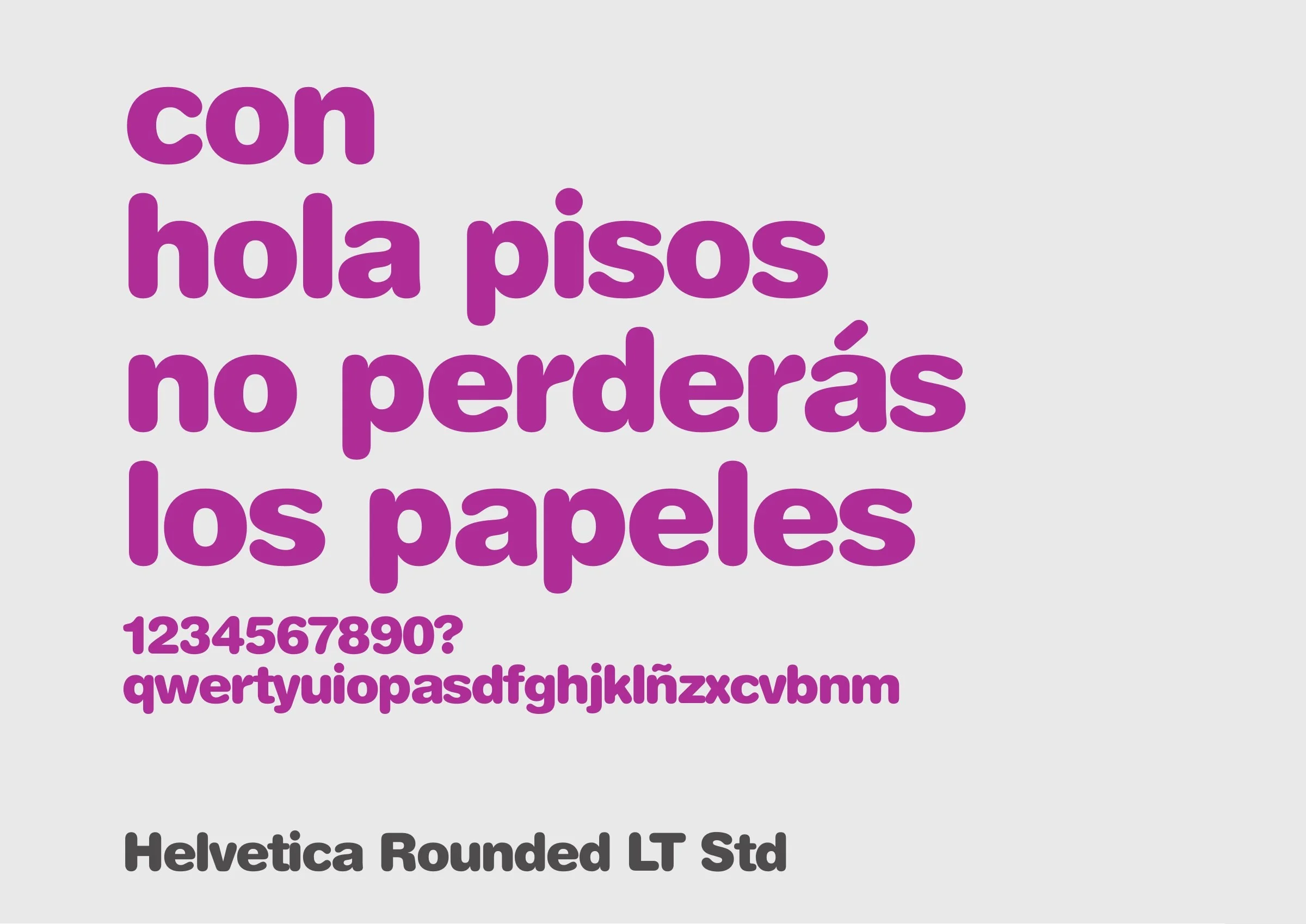
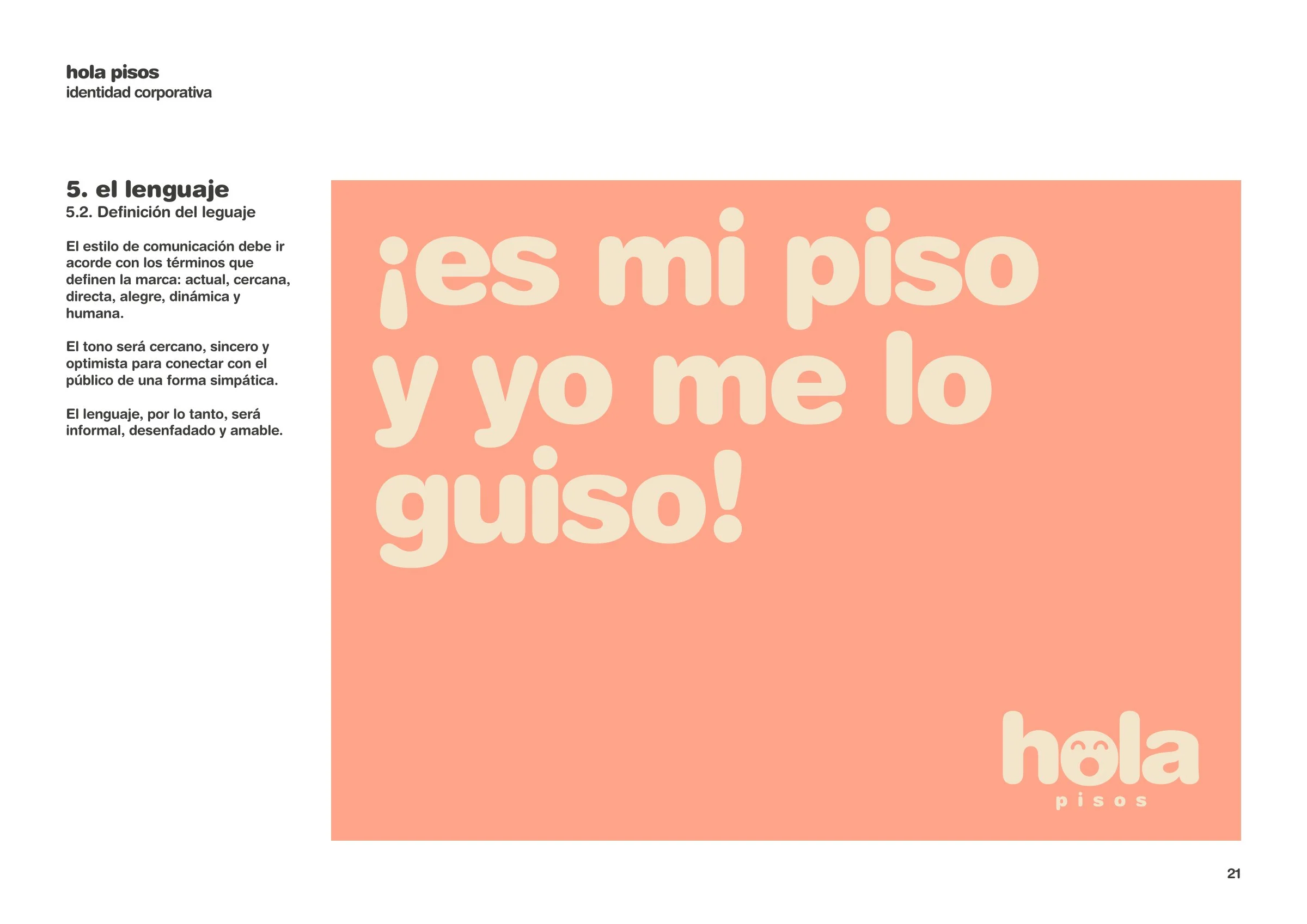
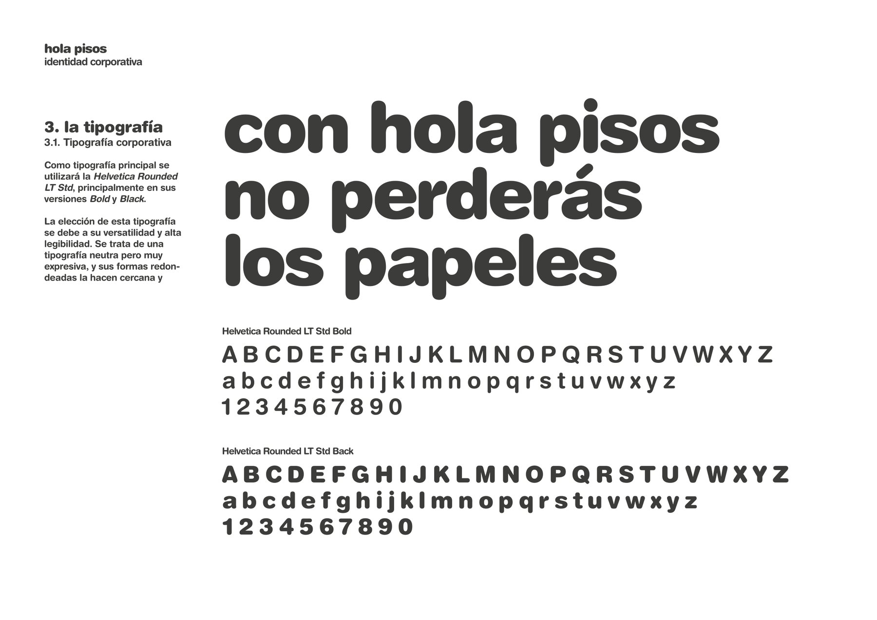
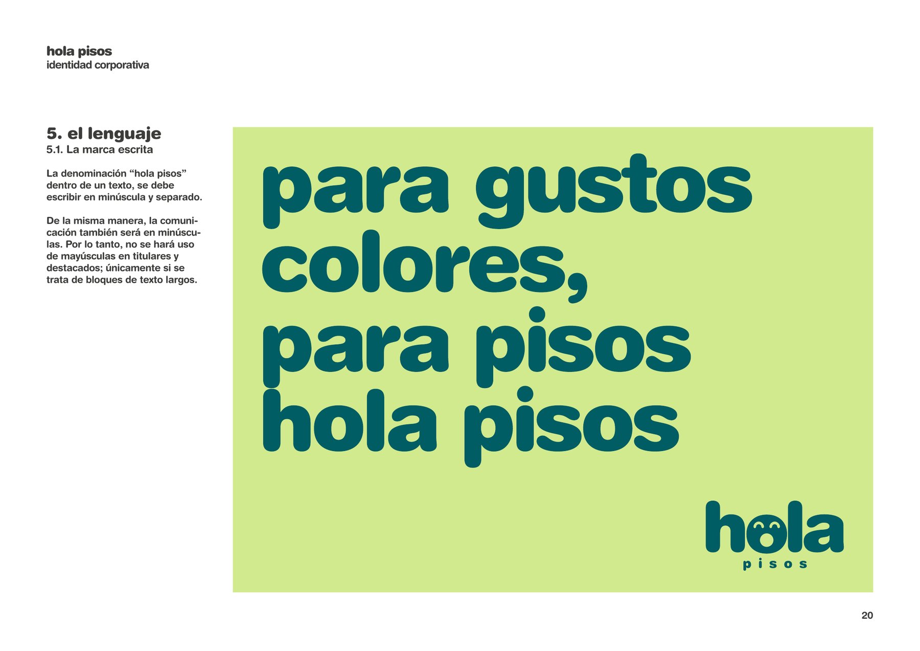
The brand talks the way people talk in the street: proverbs and set phrases, reworked to talk about flats. All in Helvetica Rounded, a typeface as round as the “o”.
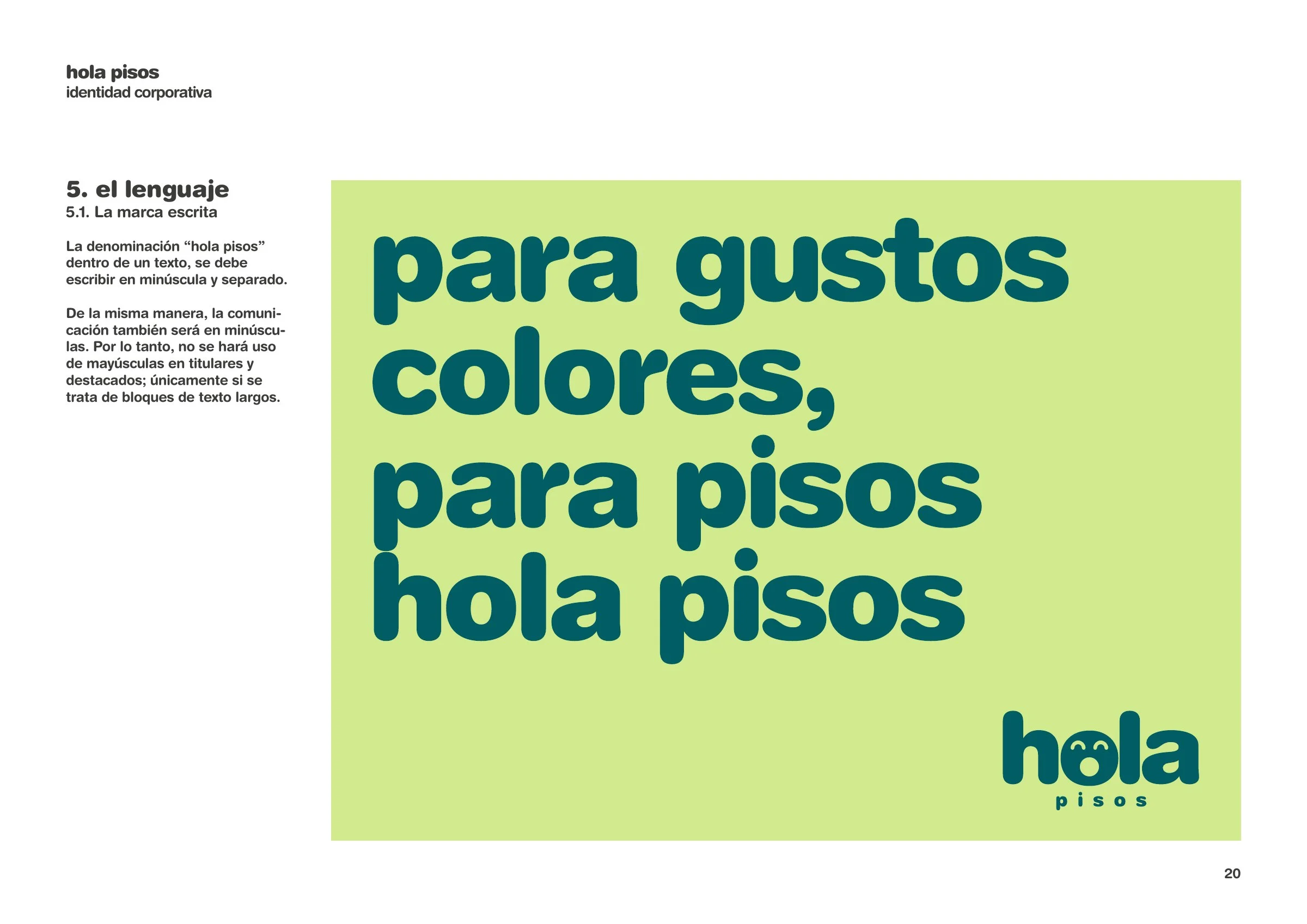
Para gustos, colores; para pisos, Hola Pisos.
- “Es mi piso y yo me lo guiso” (My flat, my way).
- “Con Hola Pisos no perderás los papeles” (With Hola Pisos you won’t lose your cool, or your papers).
- “Para gustos, colores; para pisos, Hola Pisos” (To each taste its colour; for flats, Hola Pisos).
05The products
Eleven products, eleven faces.
Each line of business has its own colour pair, its own name and its own face, and wears them the same way on the portal, on flyers and in the window. Customers know where they are before they read a word.
01 / 11
SuperPrecios
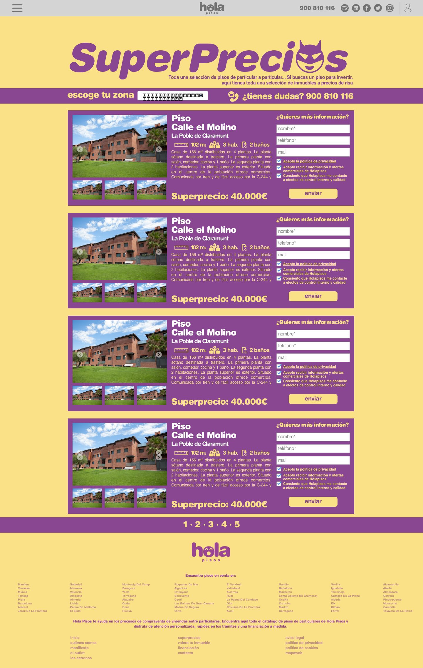
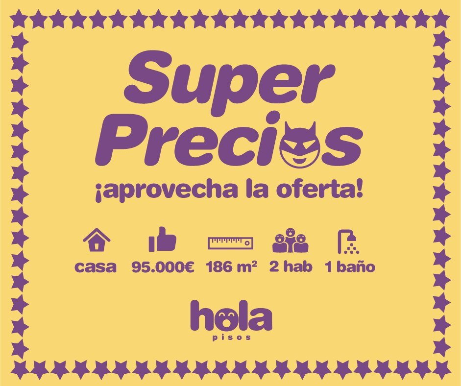
Properties with a special discount, in colours that grab attention so nobody overlooks the offer. Its face: a little devil.
02 / 11
Los Estrenos
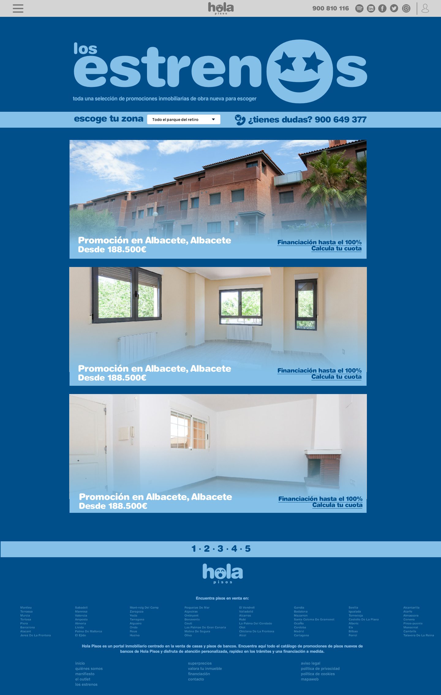
New builds, sometimes not yet finished. Blues that convey security and trust, and star eyes.
03 / 11
El Outlet
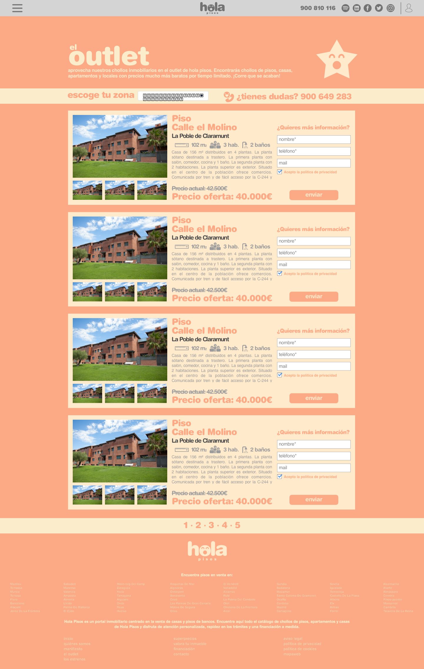
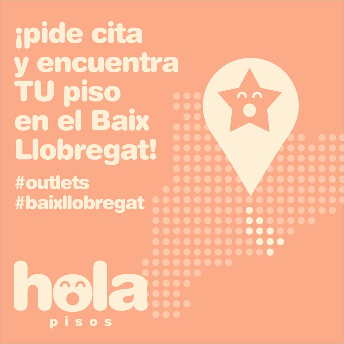
Special promotions that run for a limited time. Soft, cheerful, optimistic colours, and a smiling star.
04 / 11
Parking y trasteros
Parking spaces and storage rooms. Calm greens: the peace of mind of knowing you have room.
05 / 11
Los Start Up’s
Commercial premises, warehouses and offices, designed to catch the eye of entrepreneurs.

06 / 11
Centro Hipotecario
The free service for finding finance, in a colour that commands attention: this is where the company shows what sets it apart.
07 / 11
Valoramos tu casa
An approximate valuation of a home, in colours that calm and make for easy reading.
08 / 11
Solo para inversores
Plots and developments being sold off to large investors, in the tones of earth and building sites.
09 / 11
¡Pon tú el precio!
Bidding among those interested in a property, on a grey that lets the price do the talking.
10 / 11
Alquiler con opción a compra
Renting with an option to buy: an opportunity the market had barely explored, in colours that aim for security and trust.
11 / 11
Novedades
Properties going on sale for the first time: the alarm clock, so nobody is too late.
06The portal
A shop, not a list.
The portal was designed in the language of retail: each section with its own concept, colour and shop window, so that looking for a flat feels like browsing in a shop. Four versions in two years, on desktop and mobile.
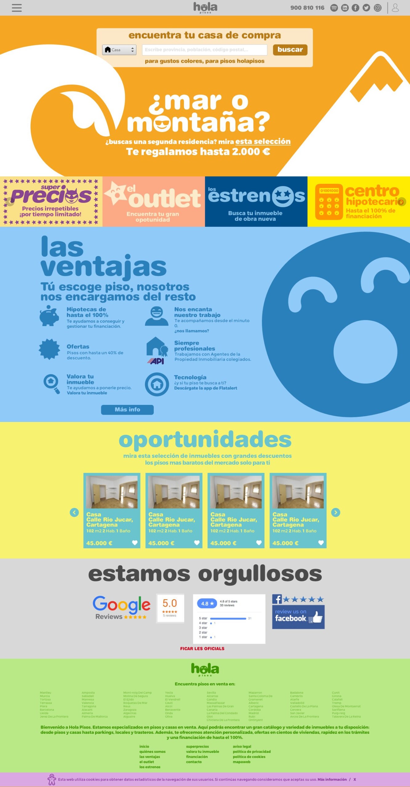
With the search bar up front, the benefits of buying with Hola Pisos and, on every listing, the mortgage calculator and a way to get in touch, close at hand.
01 / 04
The home page
A search bar, the benefits of buying with Hola Pisos and this week’s deals. Below, each section in its own colour.
02 / 04
Los Estrenos
New builds, development by development, with its blue and its star eyes.
03 / 04
El Outlet
Short-lived promotions, in salmon, like a shop window in the sales.
04 / 04
SuperPrecios
The offers, in yellow and purple, so they don’t go unnoticed.
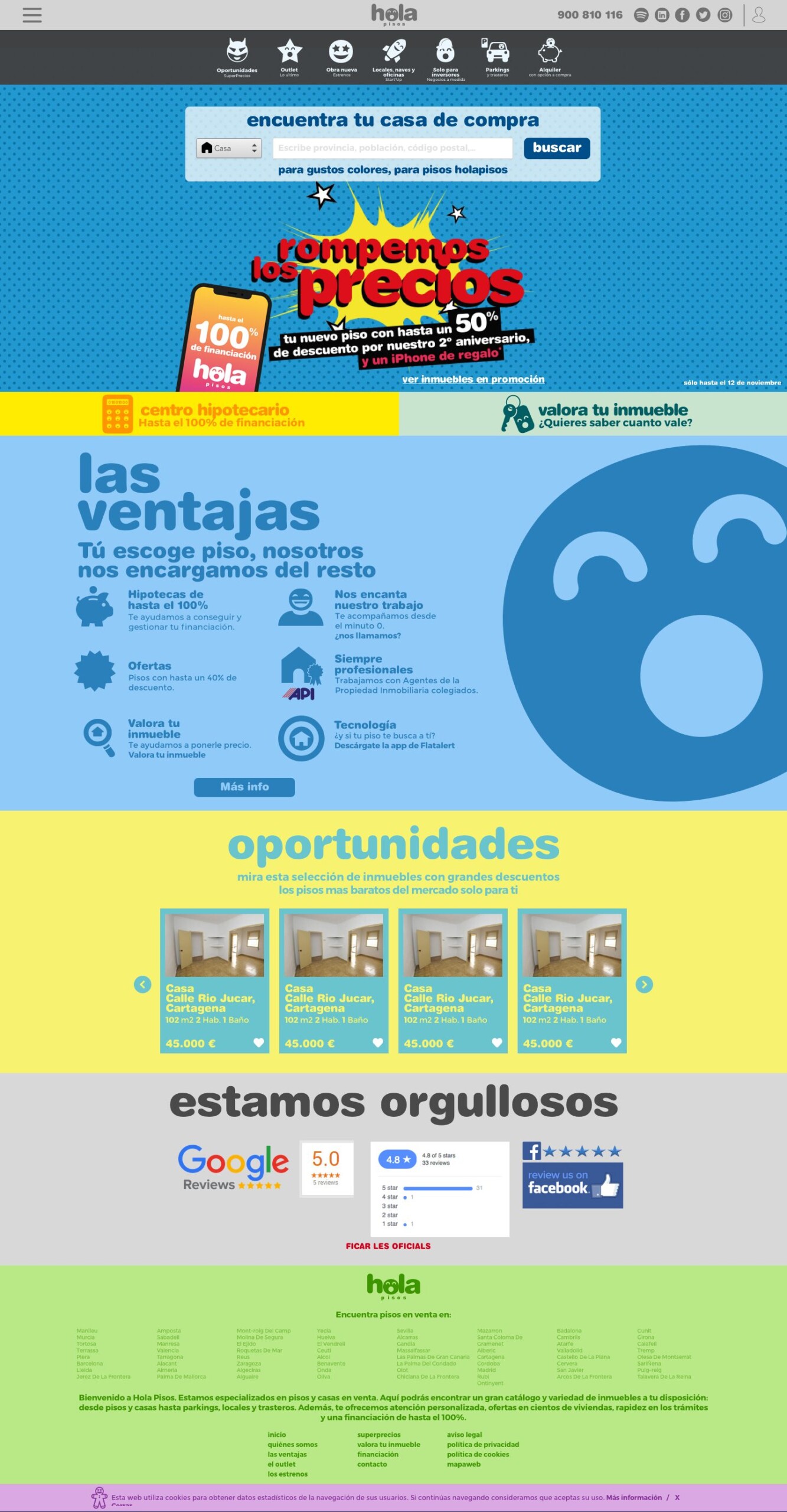
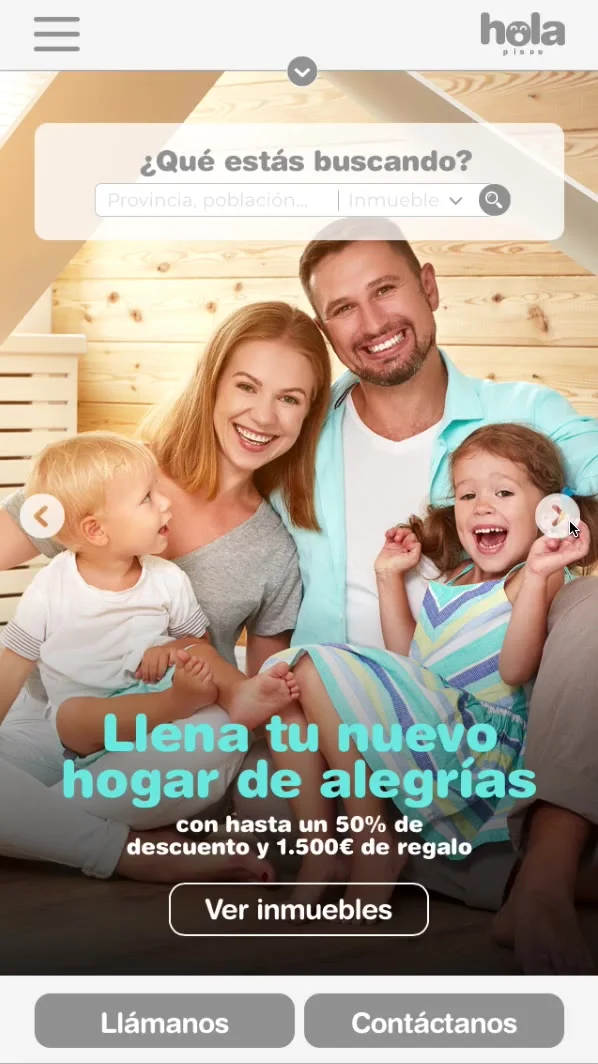
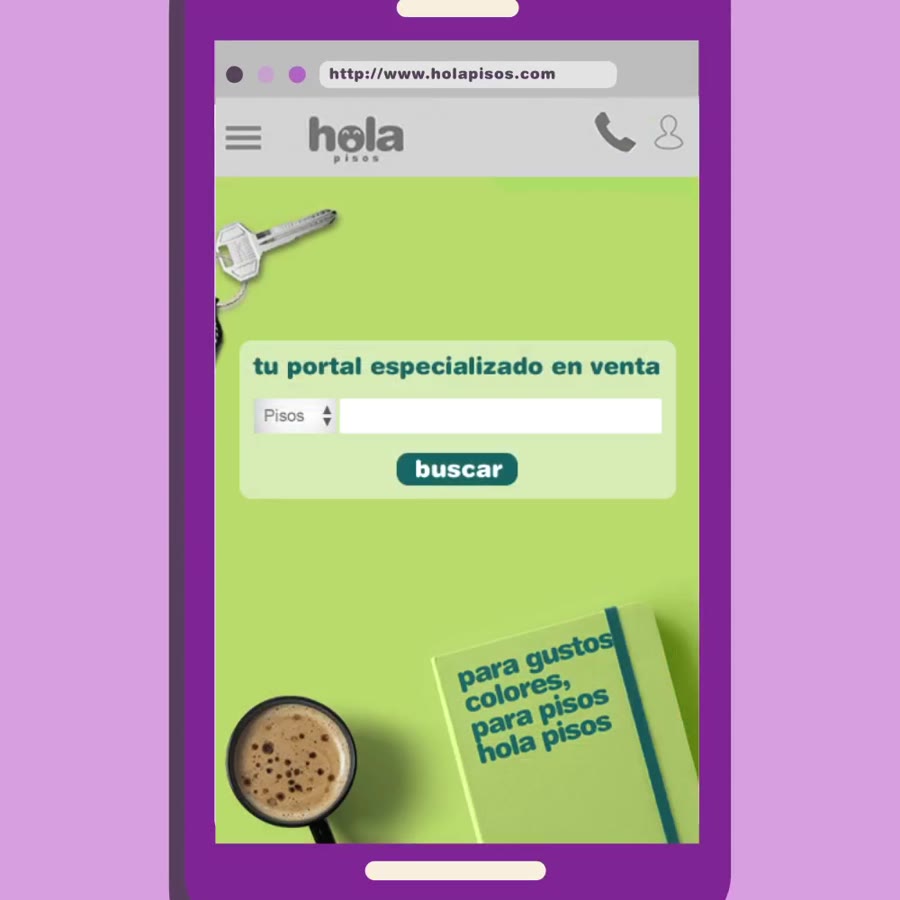
Version 3.2, with the second-anniversary campaign; the mobile site prototype; and the portal in Spanish and Catalan, on mobile and tablet.
07The campaigns
One season, one idea.
Every season, a campaign with a world of its own within the system: on the portal, on social media, in email and in the office. The logo and the tone, always; the rest changes.

01 / 06
“¡Que no te mareen!” (Don’t let them make your head spin)
Up to a year of mortgage payments free: a spiral that makes your head spin, for an offer that won’t. In Spanish, Catalan and English.

02 / 06
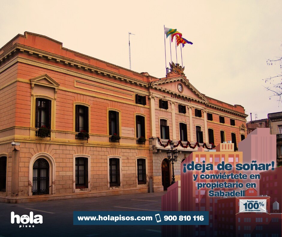
“¡Deja de soñar!” (Stop dreaming)
And become a homeowner at the best price. A spring of discounts, city by city.

03 / 06
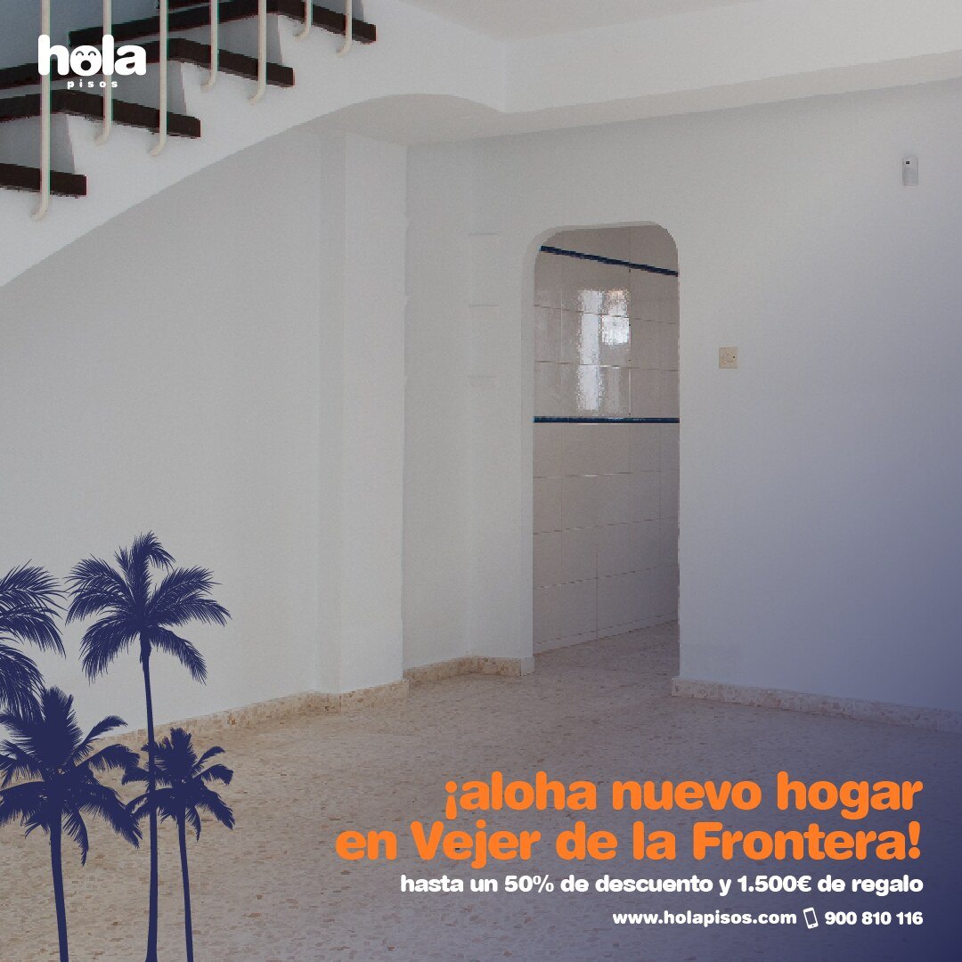
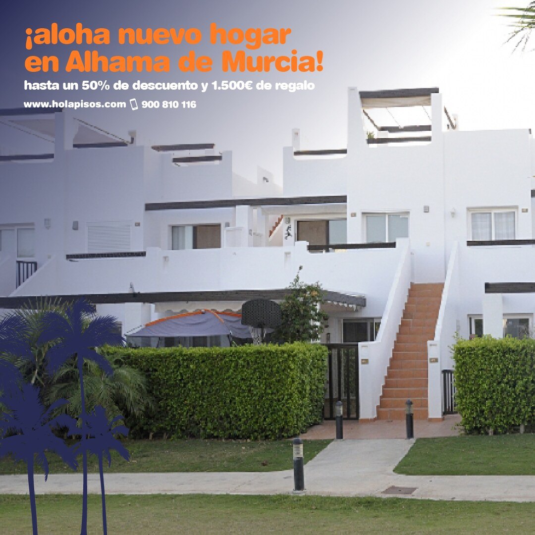
“¡Aloha nuevo hogar!” (Aloha, new home)
Summer, with palm trees: up to 50% off and a €1,500 gift.
04 / 06
“¡Estrena el año!” (New year, new home)
January, in black and gold: new homes for a new calendar.


05 / 06
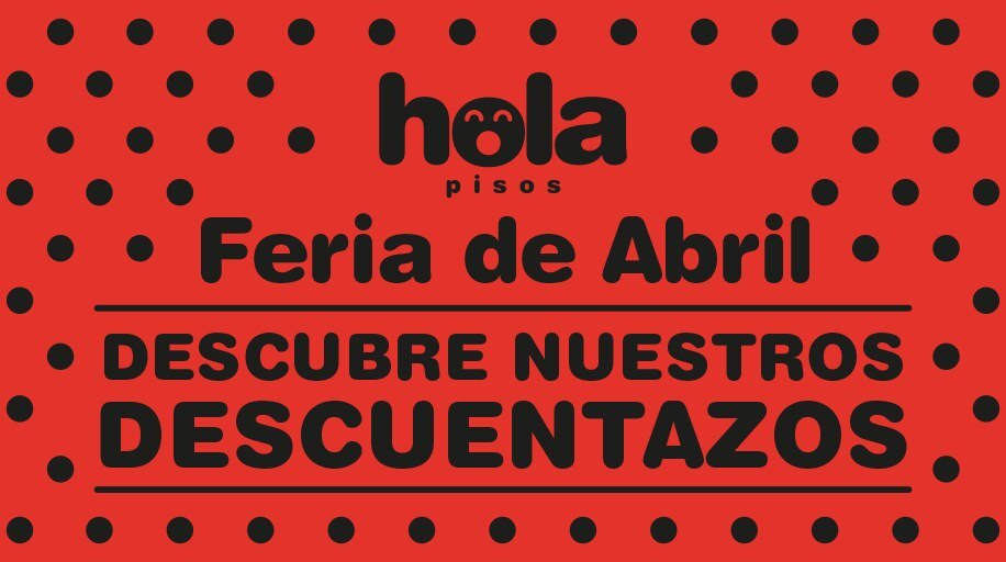
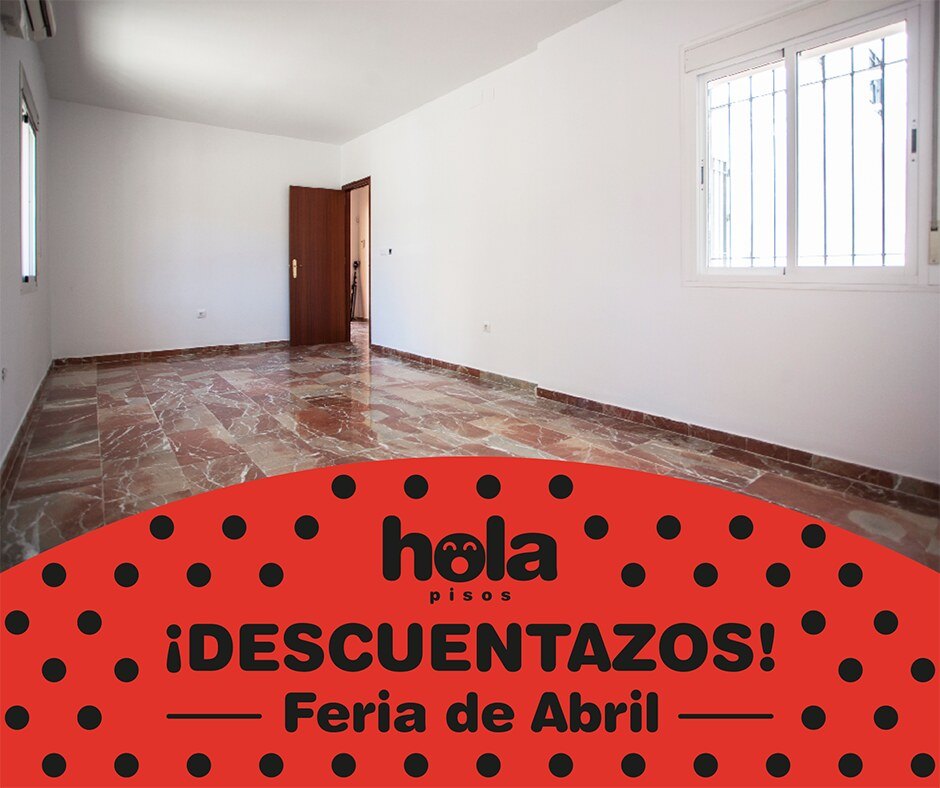
“¡Descuentazos!” (Massive discounts)
The Feria de Abril and its polka dots: discounts for the most flamenco week of the year.
06 / 06
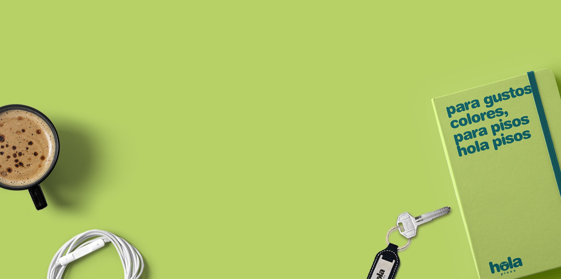
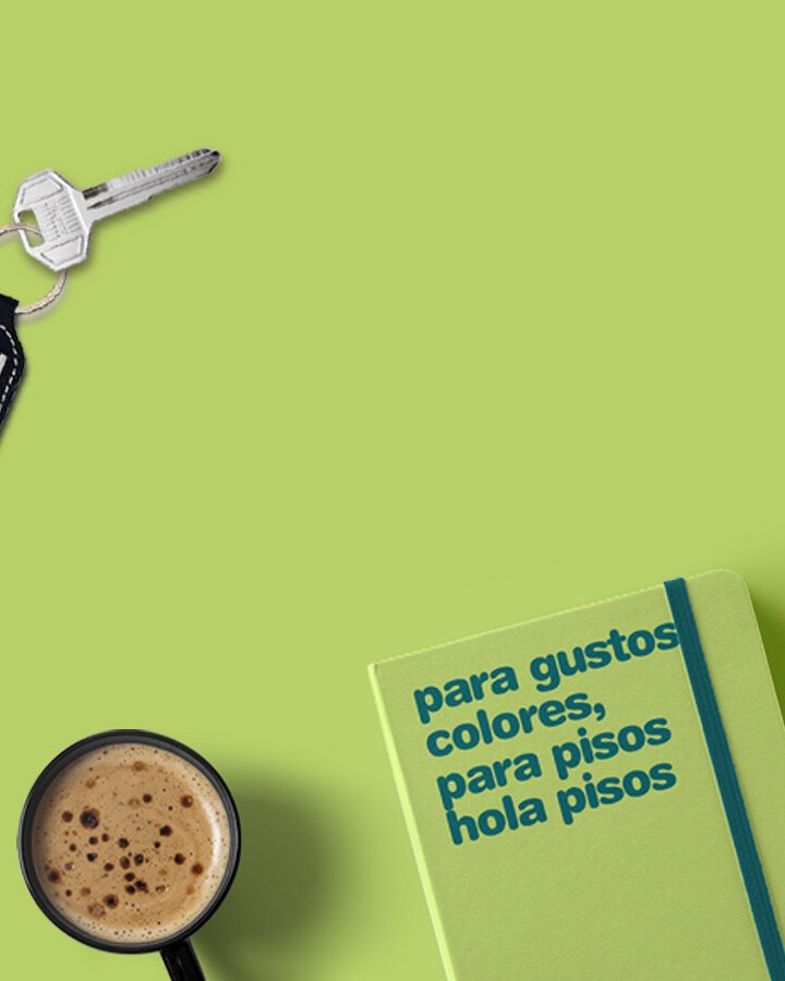
“Para gustos, colores” (To each taste its colour)
The brand campaign: a notebook, a set of keys and a coffee. In Spanish, Catalan and English.
08Social media
A face for every day.
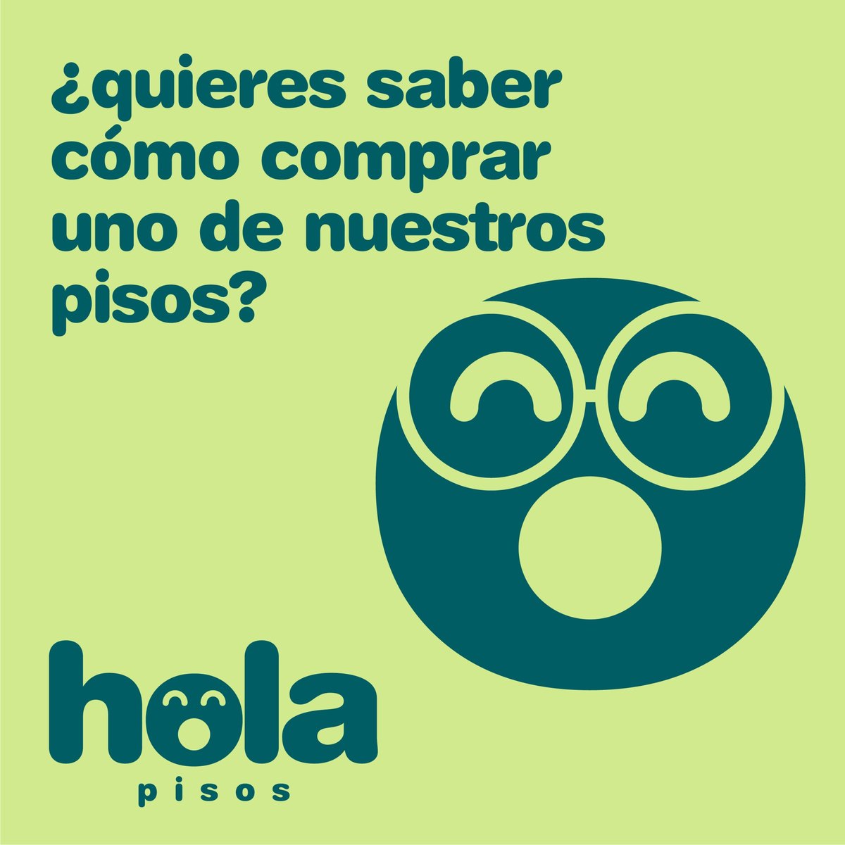
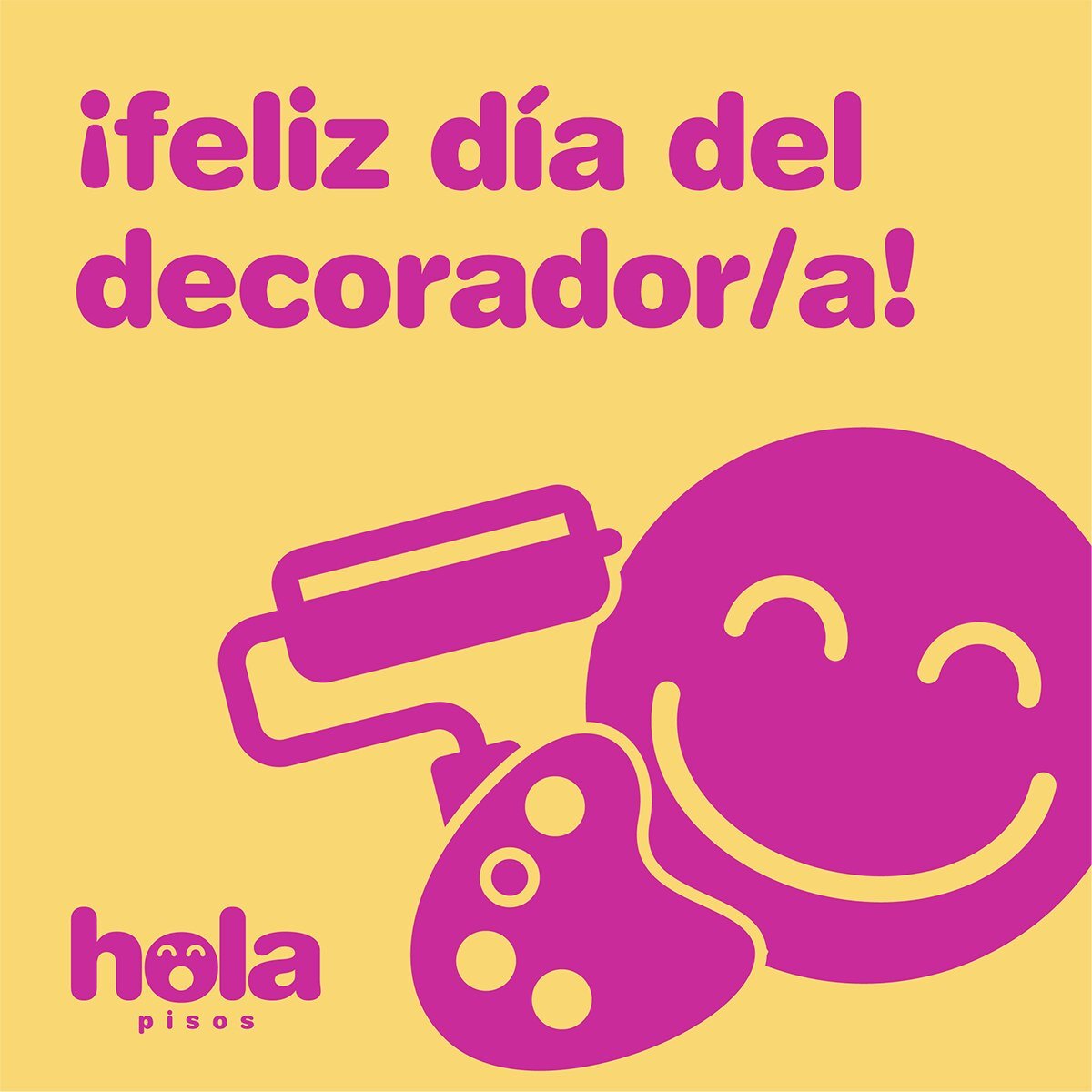
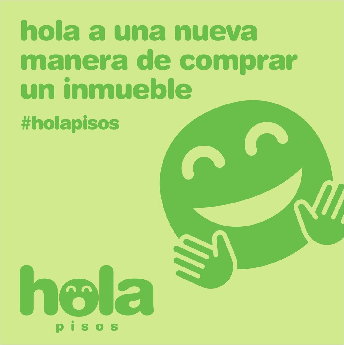
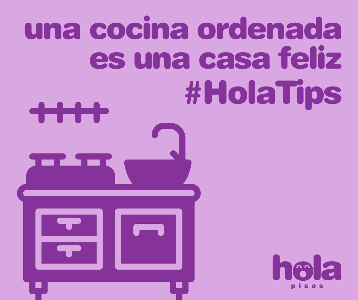
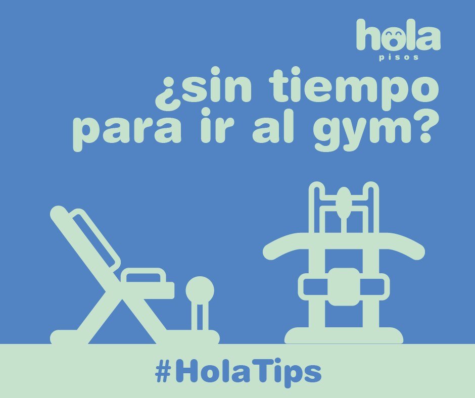
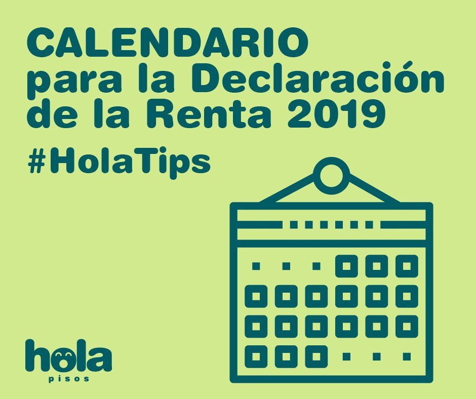
Facebook, Instagram, Twitter and LinkedIn, every week: offers, tips, special days and services. The face in the “o” changes its expression with every message: heart eyes, star eyes, spiral eyes.
With regular features, such as #HolaTips, and a promotion for each town.






09At street level
From the screen to the shop window.
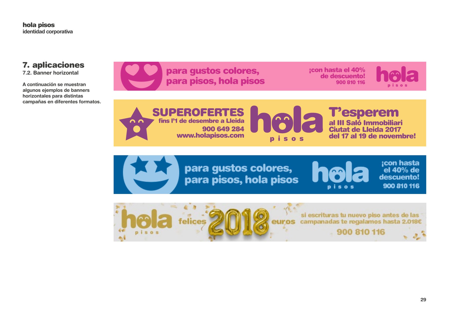
You can step into the brand, too. Its own offices and those of partner agents, dressed in the brand’s vinyls, plus site banners, plot hoardings, flags, roll-ups and signage for every development.
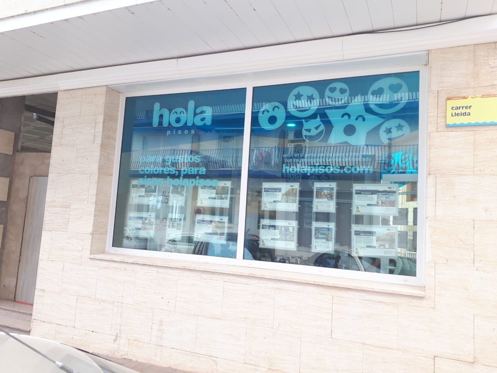
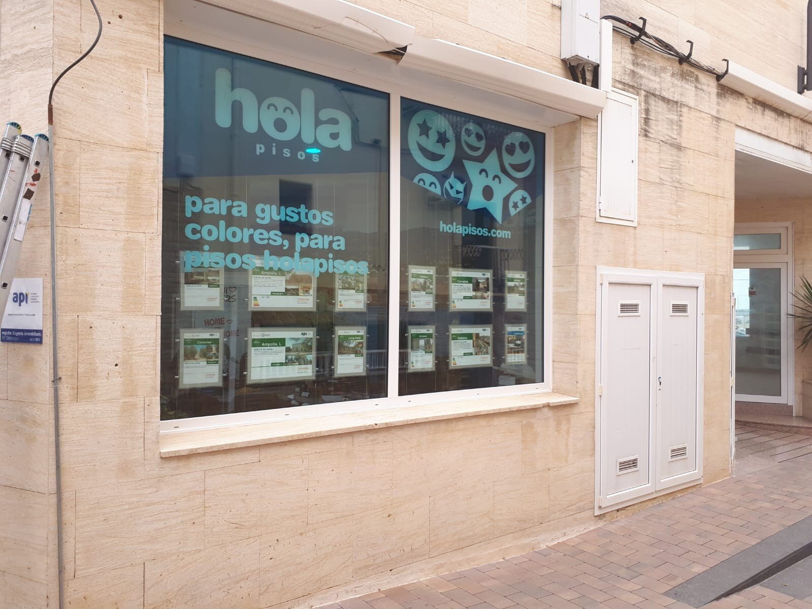
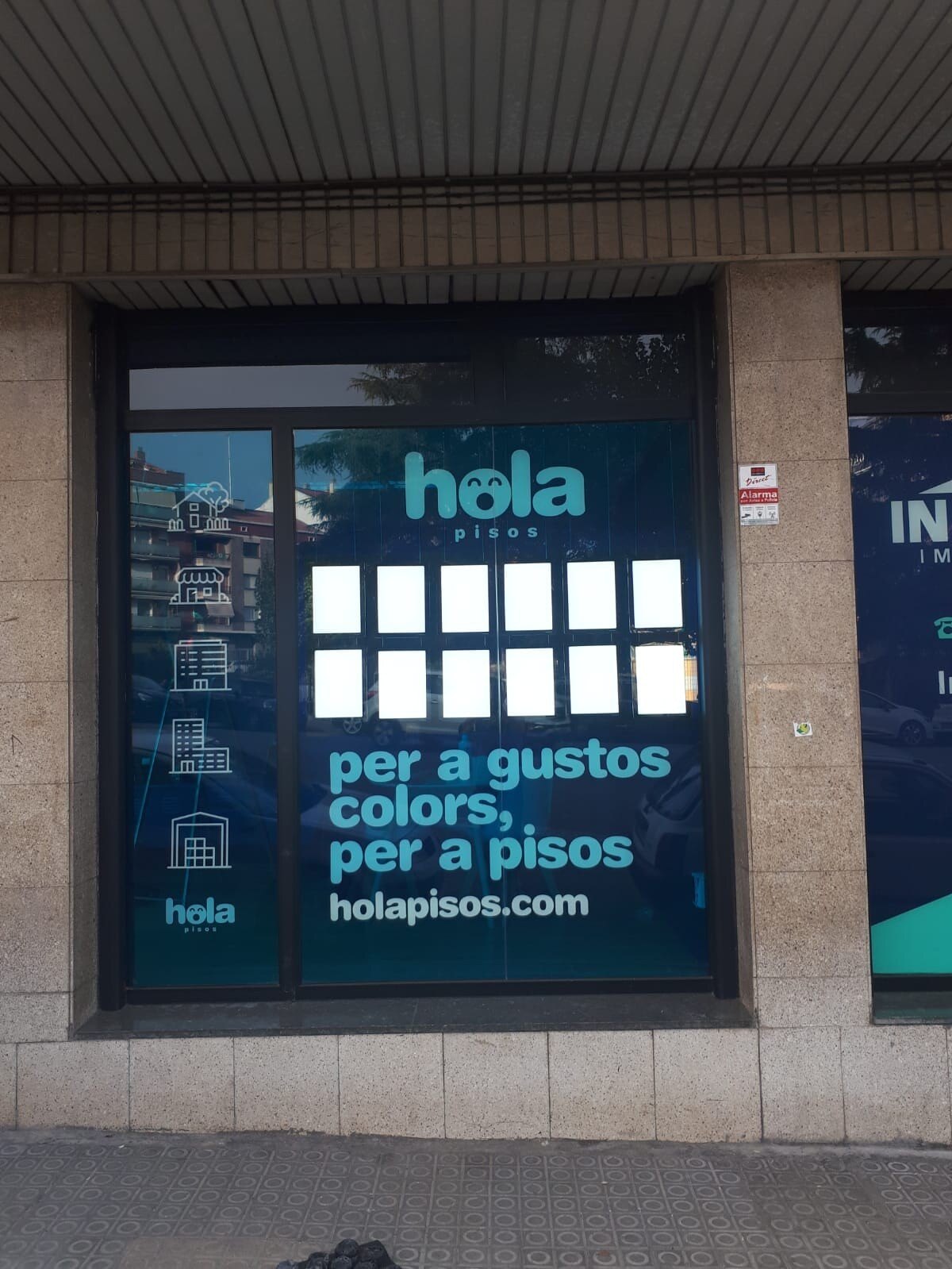
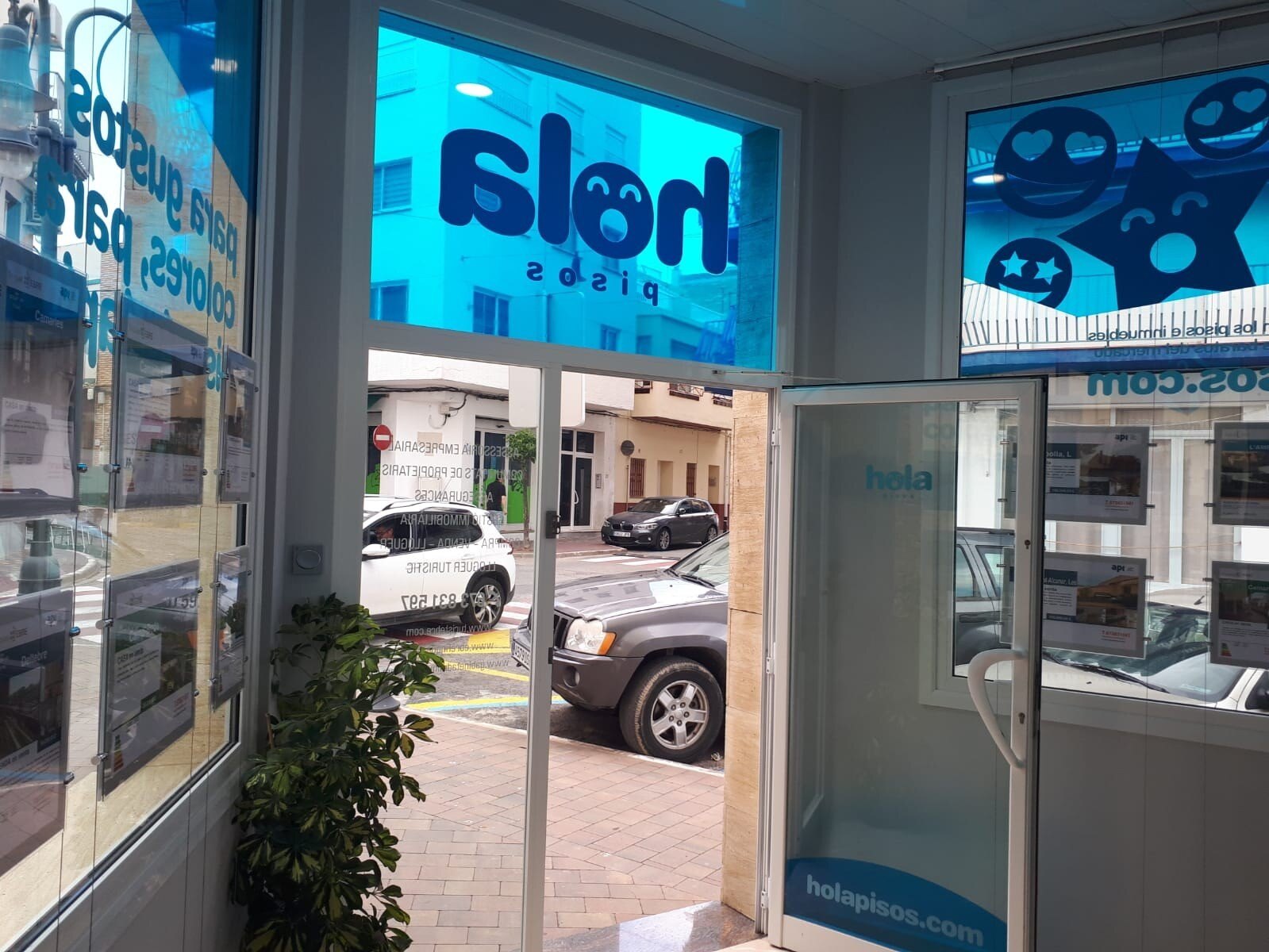
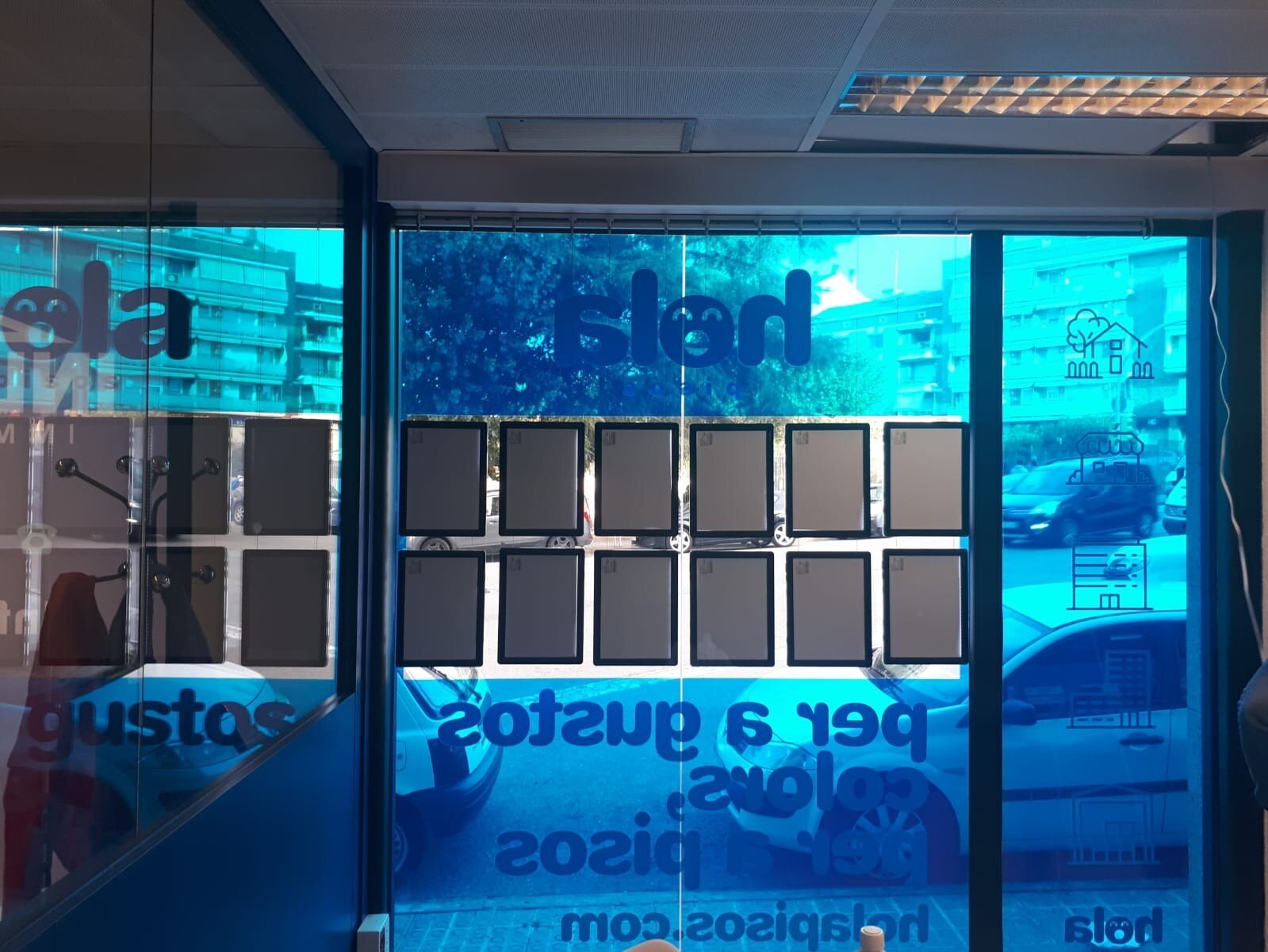
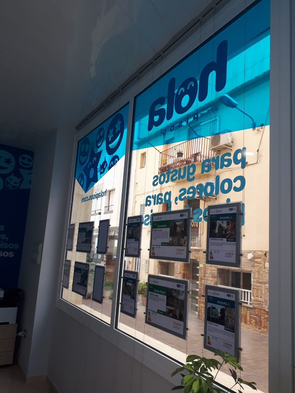
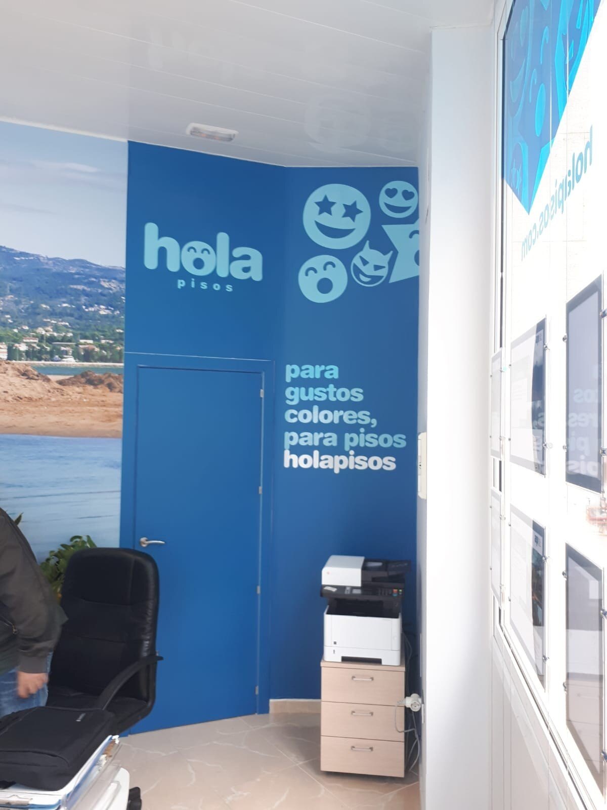
Flyers, banners, vinyls, posters and fairs
0towns and cities
From Cangas to Mogán and from Oviedo to Roquetas de Mar: every development with its own materials and its own map.
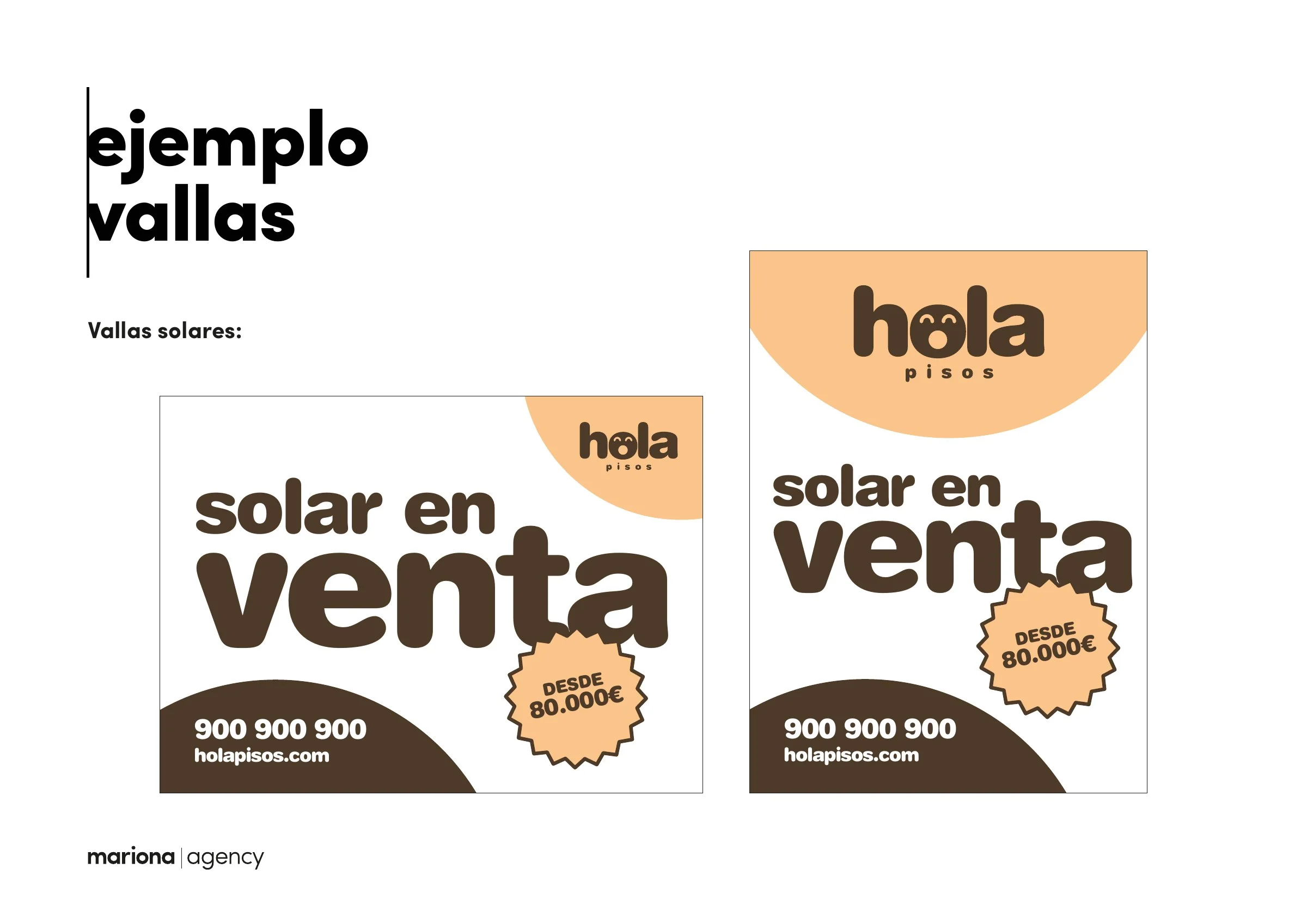
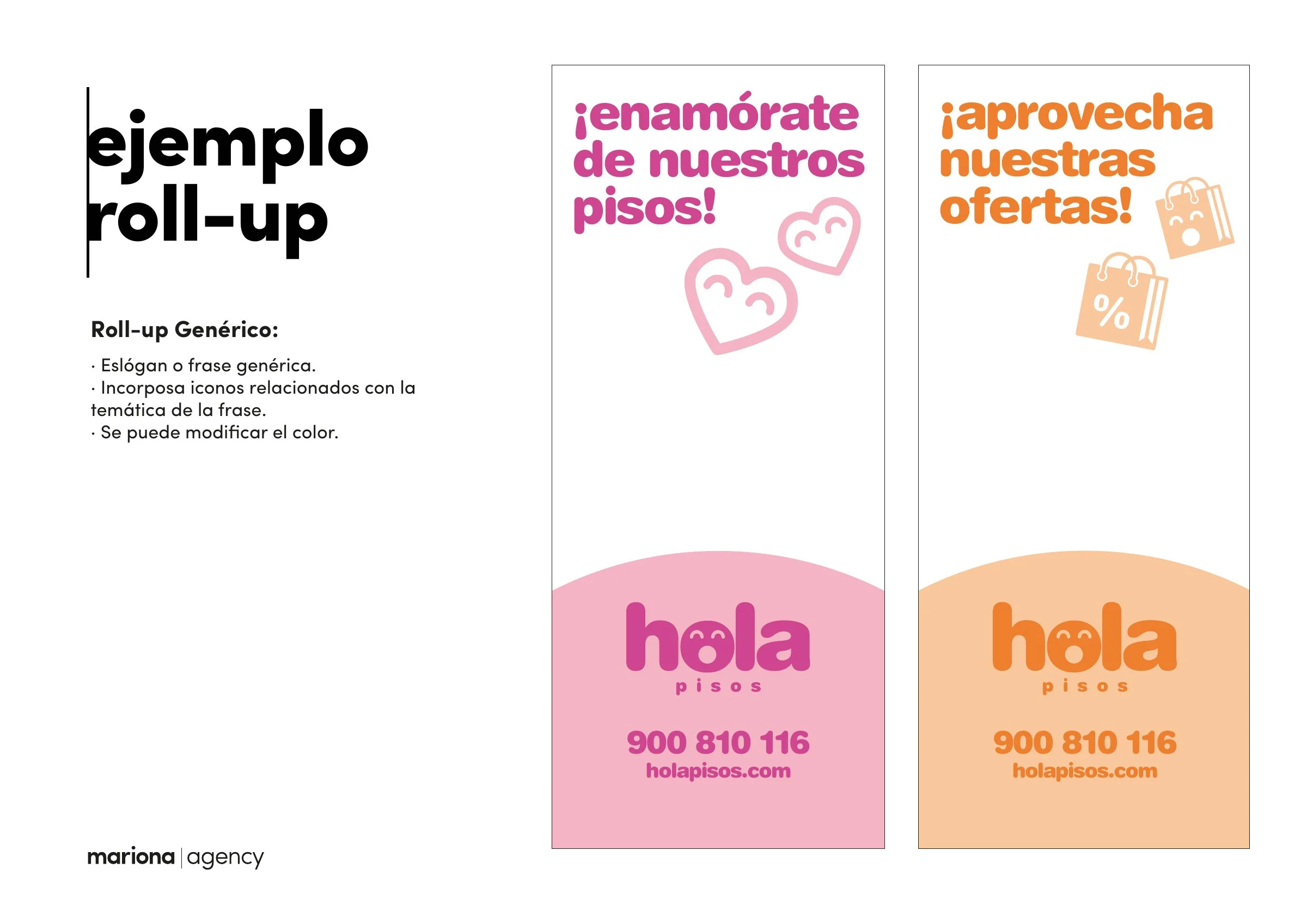
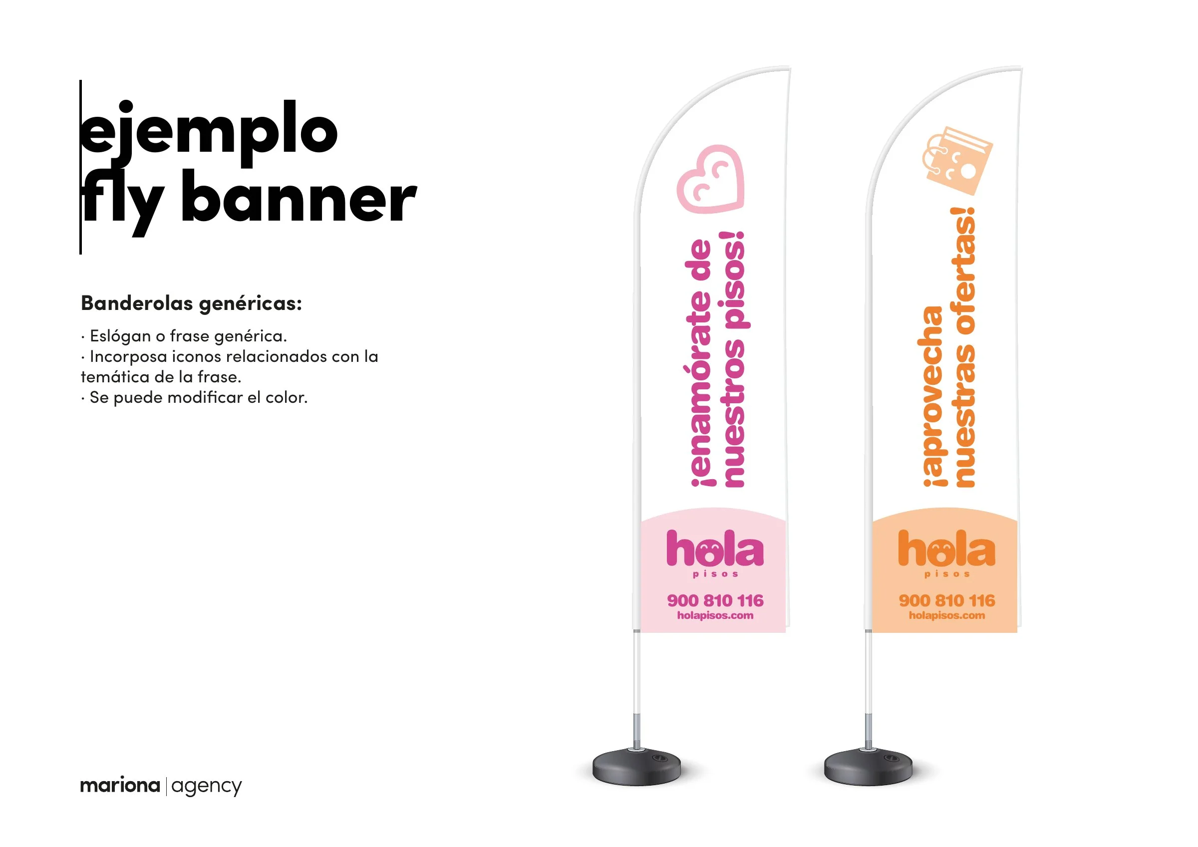
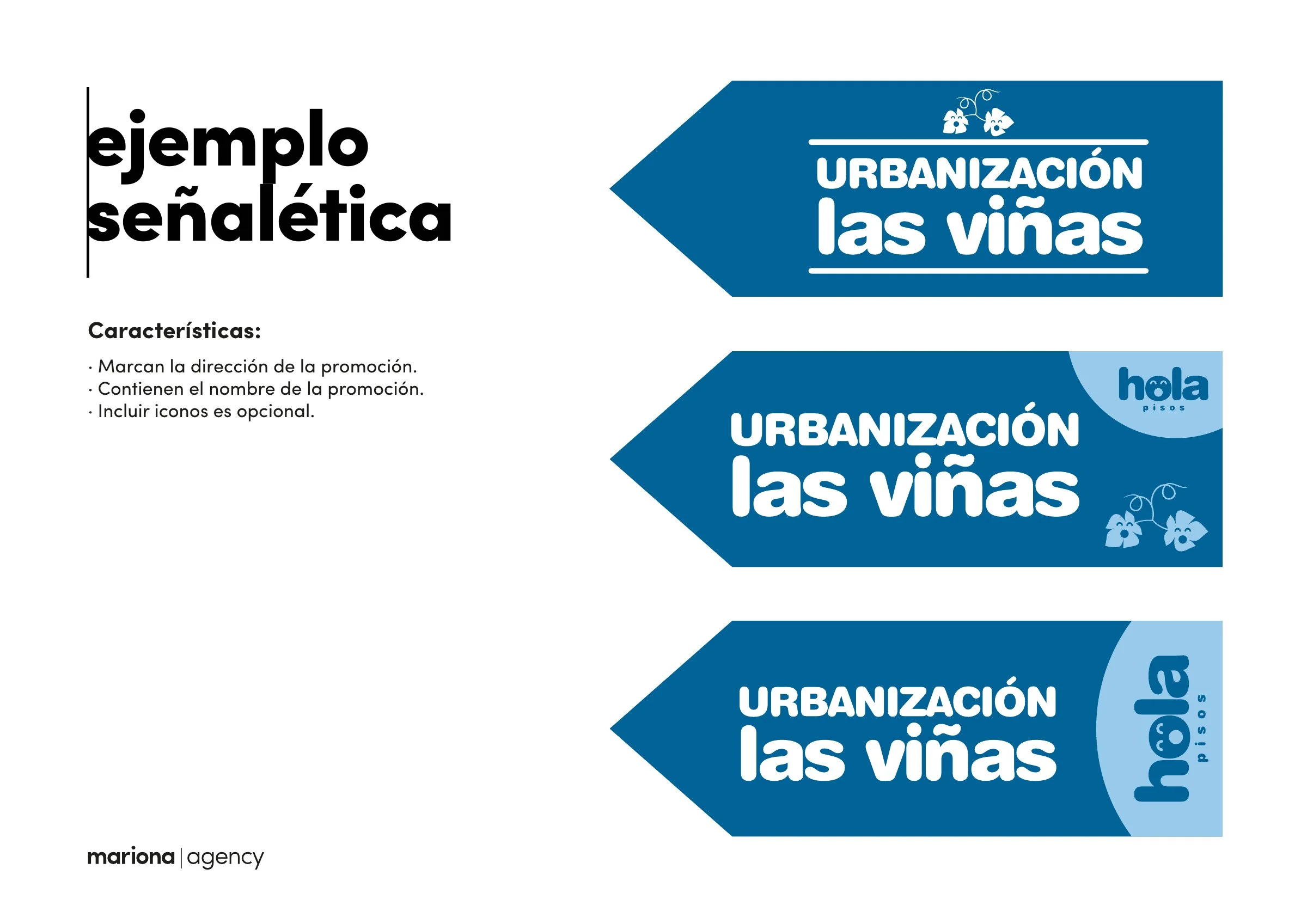
Plot hoardings, roll-ups, flags and signage, from the applications manual.
10Paper
One month, one colour.
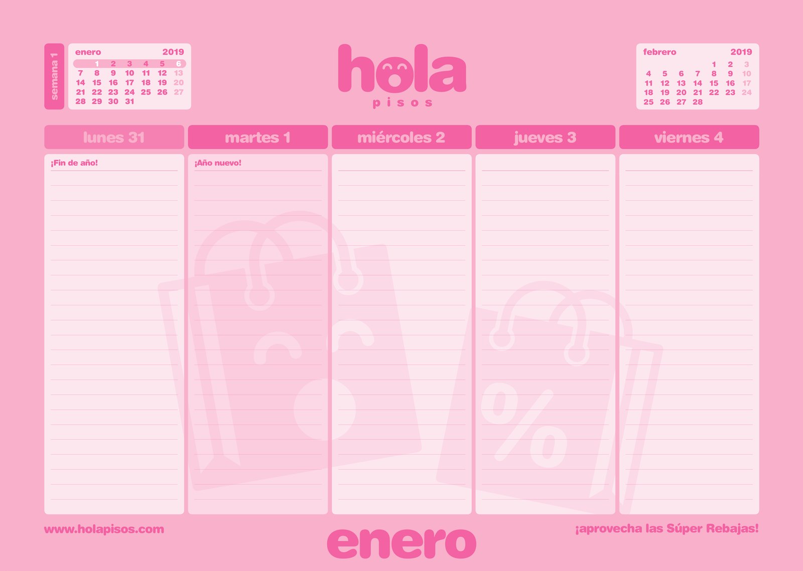
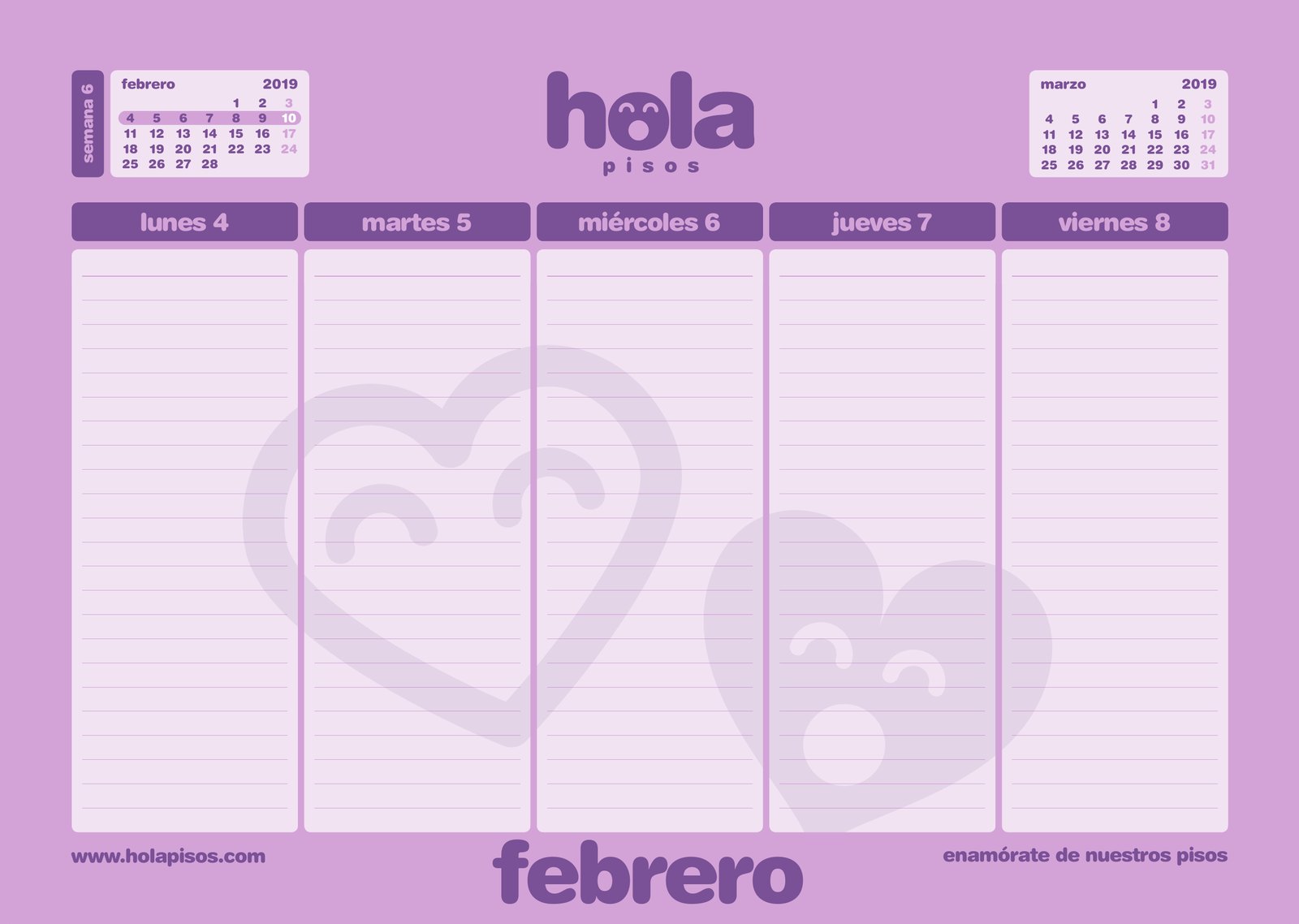
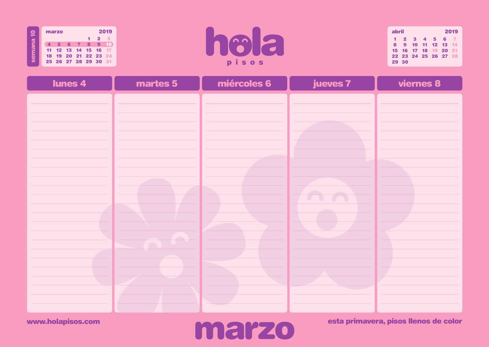
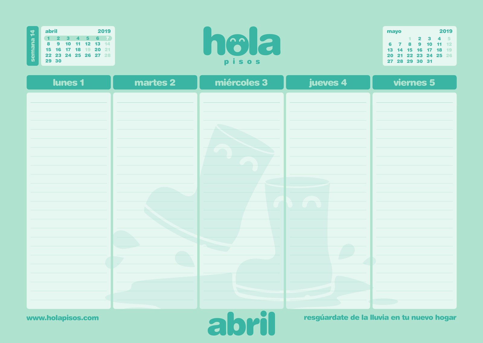
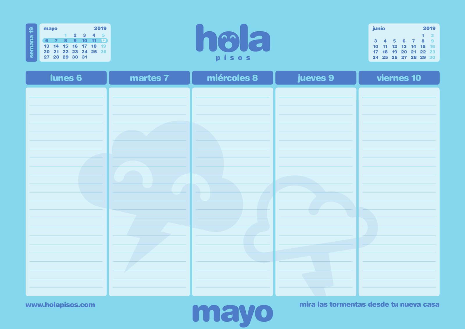
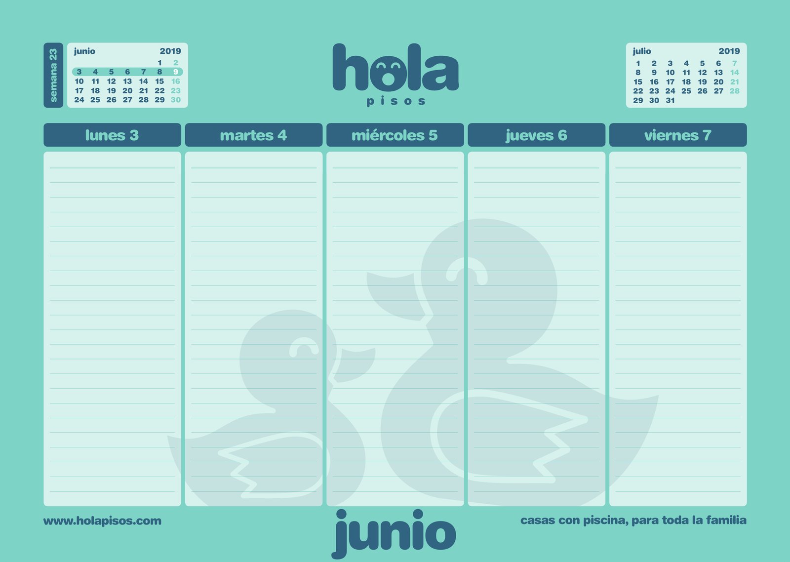
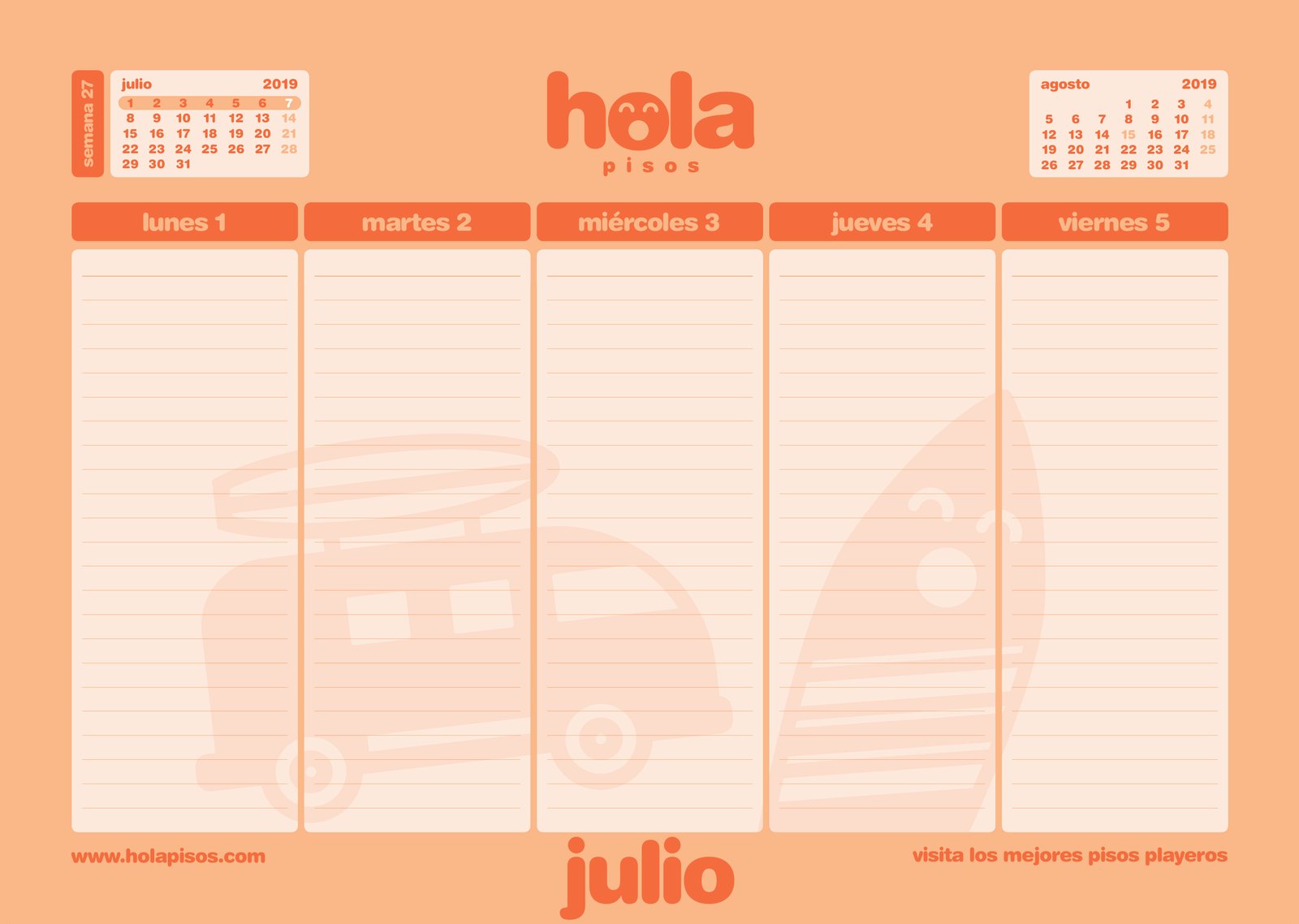
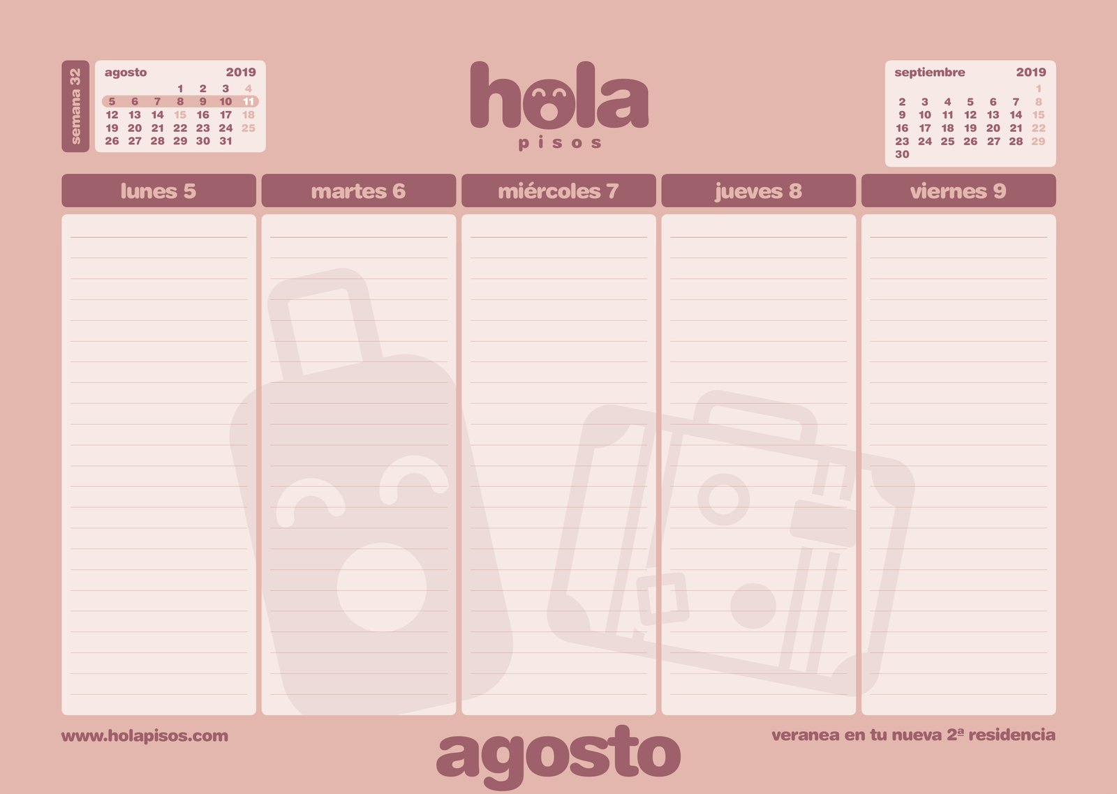
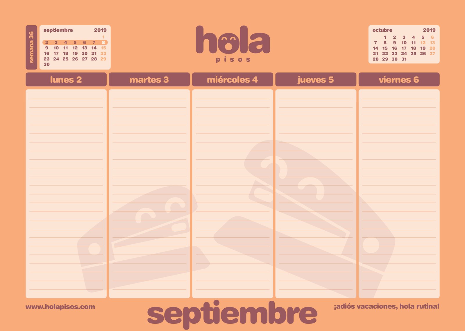
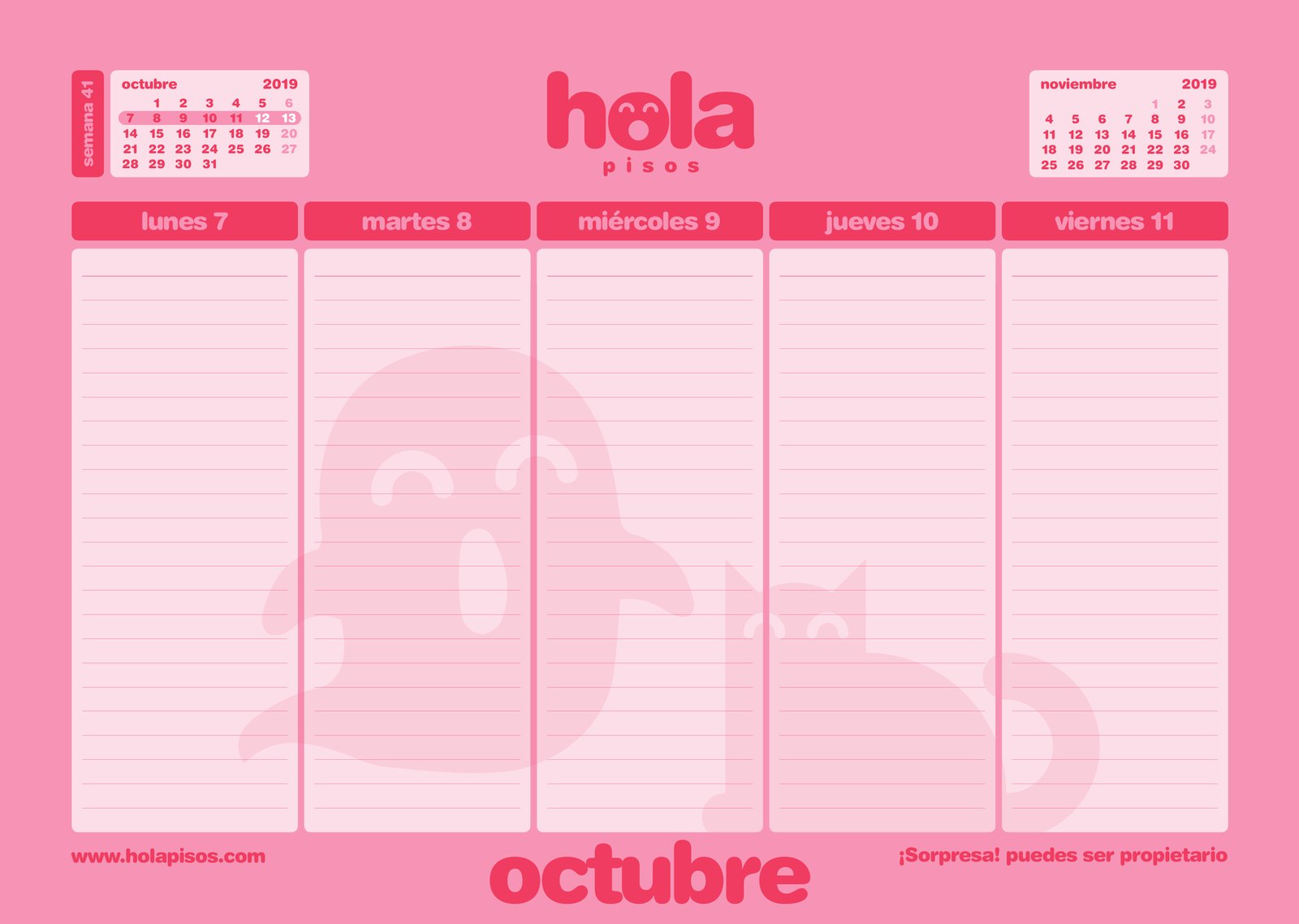
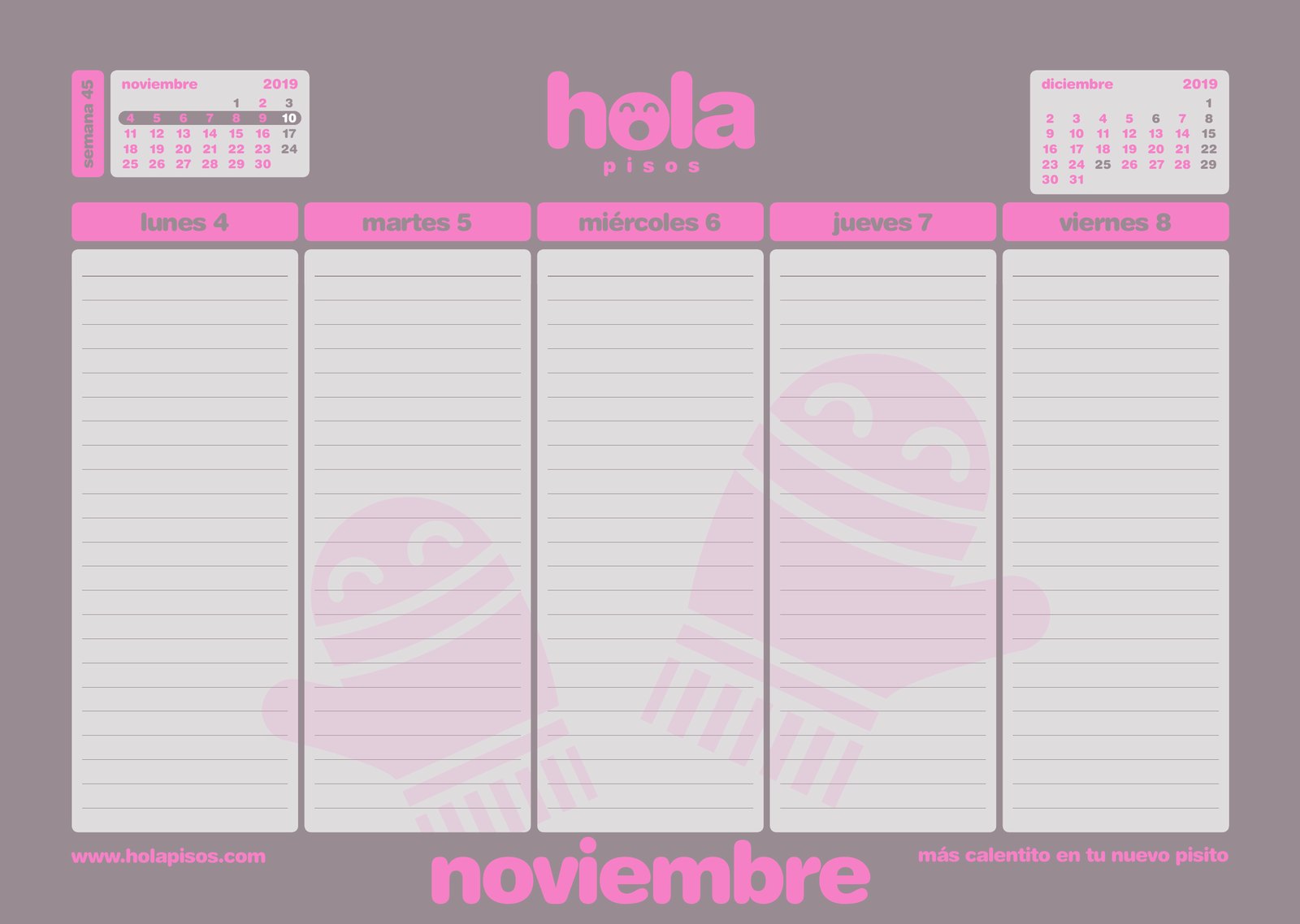
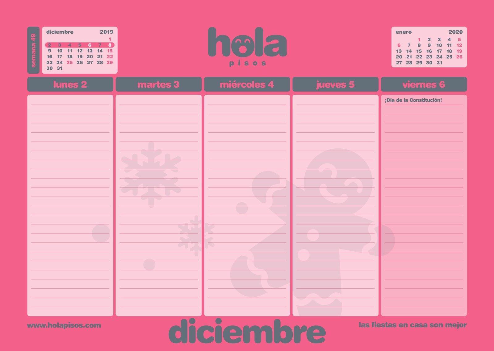
Every Christmas: a desk calendar, an easel calendar, a diary and notepads. In the calendar, each month has its own colour, its own drawing with a face and its own line: “enamórate de nuestros pisos” (fall in love with our flats), “mira las tormentas desde tu nueva casa” (watch the storms from your new home).
11The manual
So it says hello the same way in every city.
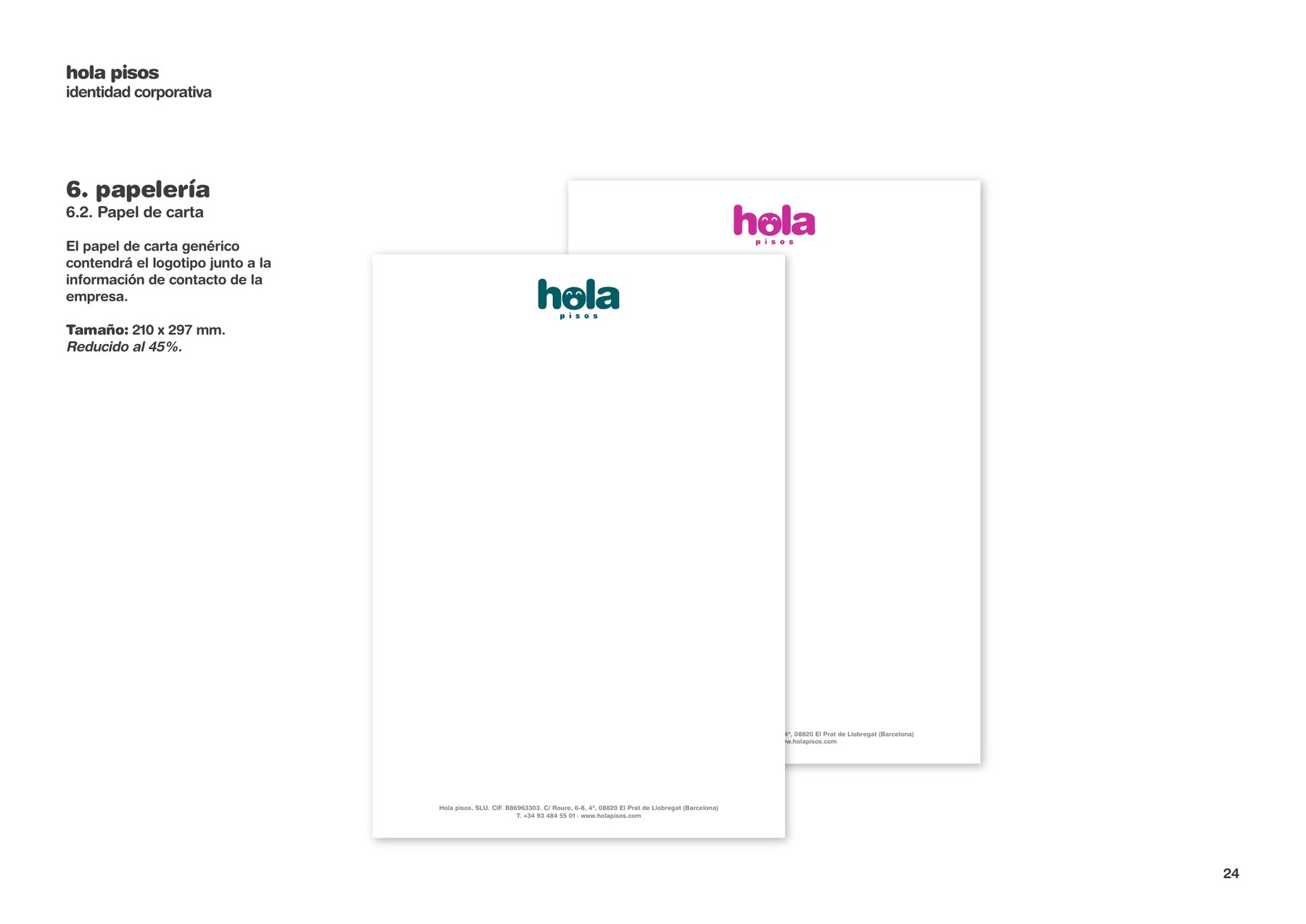
It all fits into manuals: the identity, the colours and icons for each product, the flyers and posters, and the banners, roll-ups, signage and office interiors. That way, a development in Tortosa and another in Mogán speak the same language.
A brand that says hello, from the screen to the pavement.
The project
The challenge
Anticipa Real Estate was selling a very large catalogue of homes under a brand that was friendly but generic. Hola Pisos needed an idea of its own: to convey trust and warmth in a product associated with finance, and to hold up across hundreds of applications without losing its face.
The approach
Turn the name into a gesture: the “o” in hola is a face that says hello and changes its expression with every product and every message. Around it, eight colours, Helvetica Rounded, eleven products each with its own colour and icon, a portal conceived as a shop and a tone of voice made of popular sayings.
The result
A complete brand that Mariona Agency looked after month by month for more than two years, together with the Anticipa team: four versions of the portal, seasonal campaigns, social media, offices, materials for more than fifty towns and cities, and the manuals that make the brand say hello the same way in every city.
- Client
- Anticipa Real Estate · Hola Pisos
- Sector
- Real estate
- Location
- Spain
- Period
- 2017–2019
- Services
- Brand strategy, rebranding, colour and icon system, verbal identity, web design and UX, campaigns, social media, point of sale, signage, office interiors and manuals
- Agency
- Mariona Agency, Barcelona
Frequently asked questions
Who did the branding for Hola Pisos?
Mariona Agency, the strategic and creative agency from Barcelona, was behind the complete rebrand of Hola Pisos, Anticipa Real Estate’s home-sales brand, between 2017 and 2019: identity, colour system, tone of voice, web portal, campaigns, social media, offices and manuals.
What is Hola Pisos?
The commercial brand under which Anticipa Real Estate, the Blackstone group’s real estate company in Spain, sells flats, houses, commercial premises, warehouses and parking spaces throughout Spain.
Why is the “o” in hola a face?
Because the name was already a greeting. The “o” became a face that says hello and, later, a system: every product and every message has its own expression, from the star eyes of Los Estrenos to the little devil of SuperPrecios.
How is the Hola Pisos colour system organised?
With eight colour combinations that are used freely and a colour pair for each product: eleven sections, each with its own colour, name and icon, from the portal to the flyers.
What did the work include, beyond the identity?
Four versions of the portal on desktop and mobile, seasonal campaigns, social media, flyers, banners, hoardings, roll-ups, signage, office interiors, calendars and the manuals for applying the brand in more than fifty towns and cities.