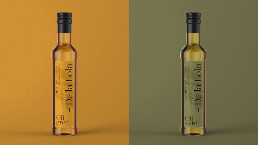
Branding and packaging for De la Lola
Branding and packaging for De la Lola, an extra virgin olive oil. A warm identity that runs from the olive grove to the bottle: logo, graphic system, colour and all the packaging.
Identity
A signature that becomes a seal.
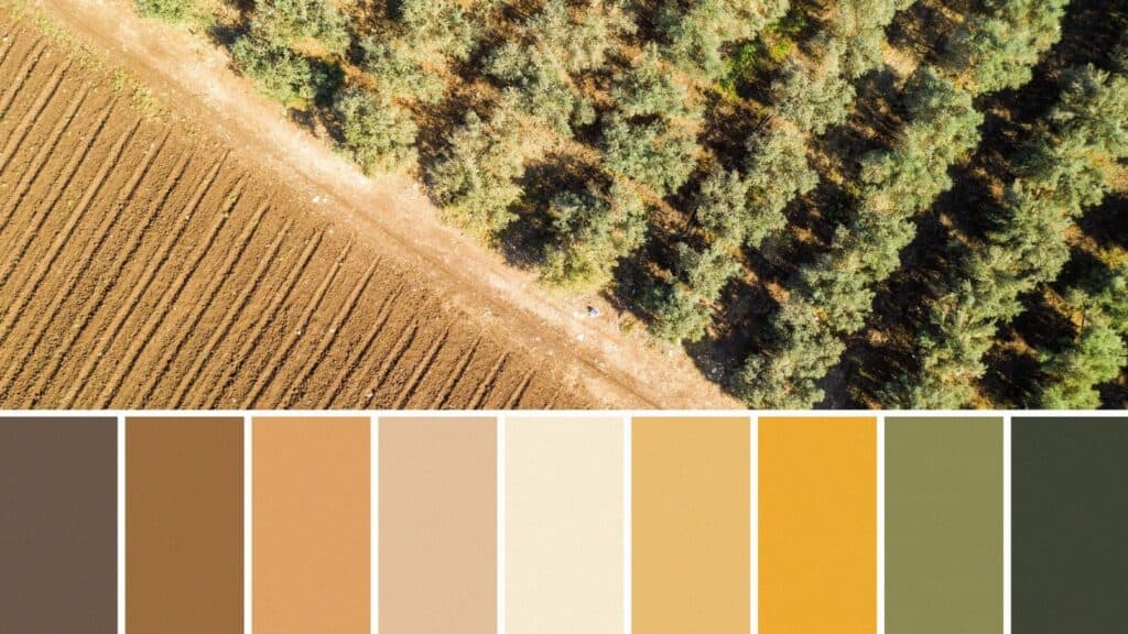
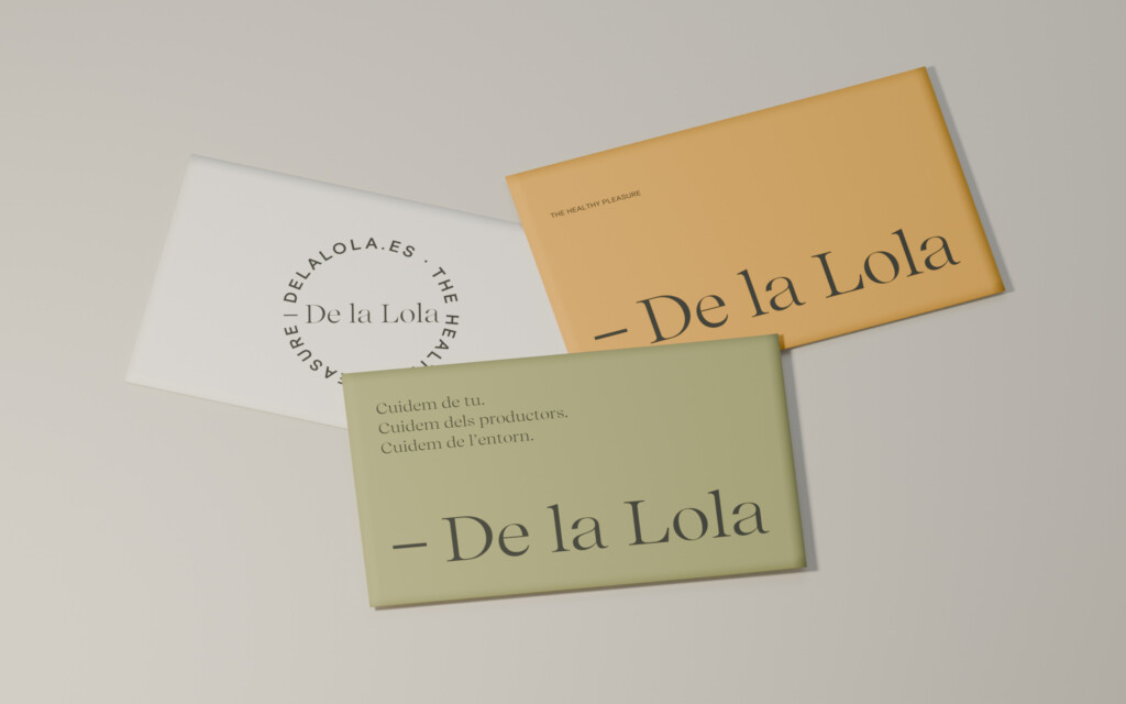
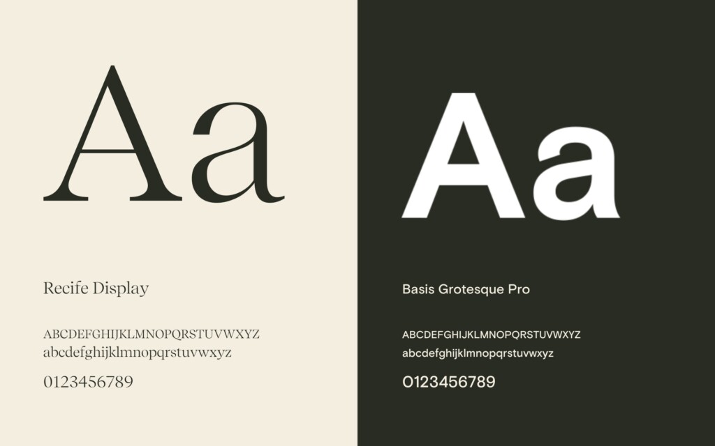
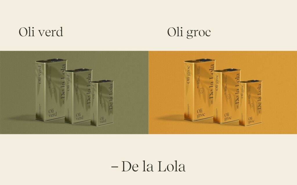
The horizontal signature and the circular seal share the same lines. Alongside them: Recife Display and Basis Grotesque Pro, a palette of ochres and olive green, and three messages that sum up the brand: “Cuidem de tu” (We look after you), “Cuidem dels productors” (We look after the producers) and “Cuidem de l’entorn” (We look after the environment).
Packaging
The warmth of the countryside, in every pack.
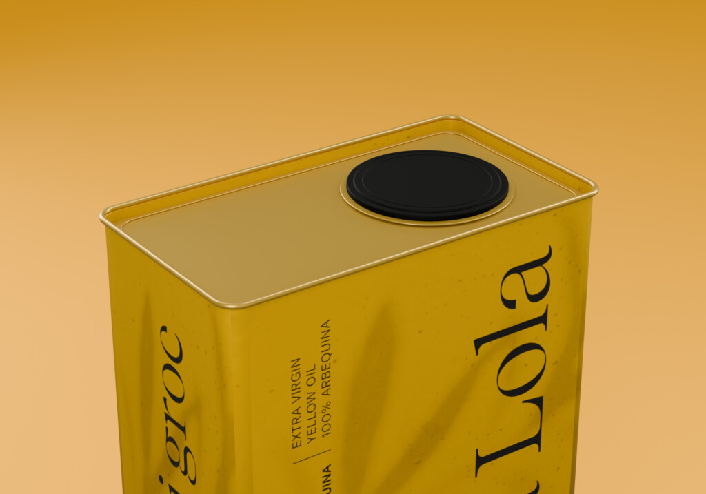
Logo, graphic system, a palette of ochres and olive green, typography and art direction, applied to the bottle, labels, gift boxes, bags and brand materials.
Applications
One voice, in every piece.
De la Lola comes to the table with the story of the olive grove.
The project
The challenge
De la Lola needed an identity that would convey the origin of an extra virgin olive oil and the care behind it, and consistent packaging that could carry the brand on the shelf.
The approach
Mariona Agency created the complete branding and the packaging: logo, graphic system, colour palette, typography and art direction, applied to the bottle, gift boxes, bags and brand materials.
The result
A warm, recognisable brand, from the olive grove to the bottle, with packaging that tells its story and sets it apart on the shelf.
Frequently asked questions
What did Mariona Agency do for De la Lola?
The complete branding and packaging for De la Lola: logo, graphic system, colour palette, typography and all the packaging (bottle, gift boxes, bags and brand materials).
Who designed the De la Lola brand?
Mariona Agency, a strategic and creative agency based in Barcelona, responsible for De la Lola’s visual identity and packaging.
What is De la Lola?
De la Lola is an extra virgin olive oil brand.