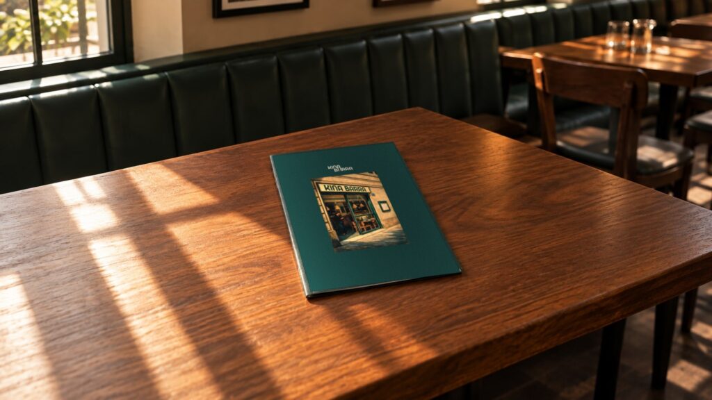
Identity, menus and website for Kina Barra
Mariona Agency, the strategic and creative agency from Barcelona, created the identity for Kina Barra, a Mediterranean restaurant in Barcelona, taking “Lingering is an art” as its starting point: logo, brand guidelines, menus, tableware, napkins and the restaurant’s website.
The idea
Lingering is an art.
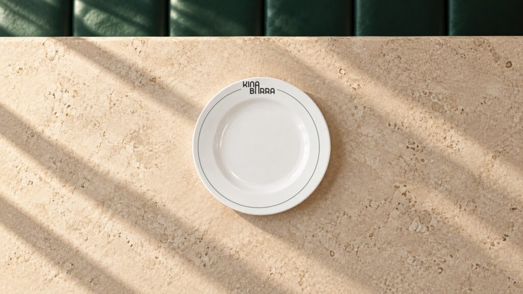
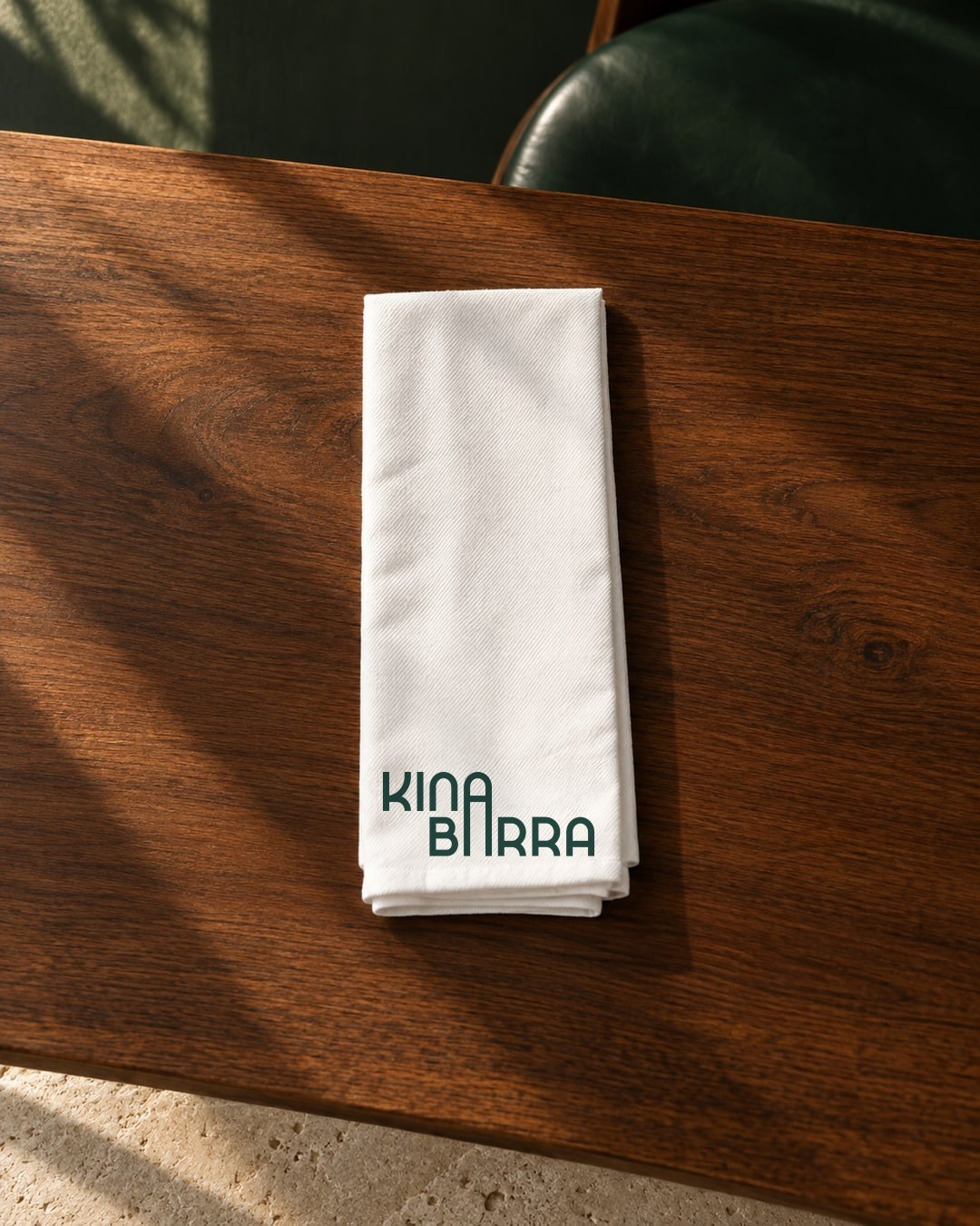
A brand designed for lingering at the table: warm light, conversation and time. The logo joins Kina and Barra with an elongated A, and the system takes its place at the table on menus, tableware and napkins, then carries through to the website.
Menus, guidelines and website
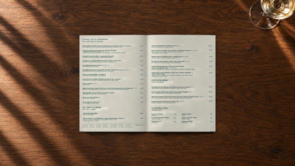
Everything is shared.
A brand to stay for, from the menu to the conversation after the meal.
The project
The challenge
Kina Barra was opening in Barcelona with a proposition built on produce, Mediterranean cooking and dishes to share. It needed a brand with a character of its own that would accompany the whole experience, from the front door to the long linger at the table.
The approach
Mariona Agency built the identity on one idea: “Lingering is an art”. The stillness of Edward Hopper’s paintings inspired an atmosphere of warm light, conversation and time. The logo stacks Kina and Barra and joins them with an elongated A; its geometric construction starts from the Bahuss typeface, and Futura organises the information on the menus.
The palette pairs a deep green and a limestone tone as the main colours, with ochre and charcoal as secondary colours. The menus, tableware and napkins bring that language to the table in a warm, familiar voice: “Kin tardeo” (afternoons at Kina), “Plats amb barra” (dishes with cheek), “A taula, tot es comparteix” (at the table, everything is shared).
The result
A brand that sits down at the table with the diner. The guidelines set out the use of the logo, colour and typography, and the restaurant’s menu has already been updated with the same system.
The website brings that system to the screen: a single page in Catalan, Spanish and English, with the green marble, the limestone tone and the logo at large scale, photographs of the restaurant and its dishes, and the menu and bookings just a tap away.
Frequently asked questions
Who designed the Kina Barra identity?
The Kina Barra visual identity was created by Mariona Agency, the strategic and creative agency from Barcelona: logo, brand guidelines, the restaurant’s menus and applications such as the tableware and napkins.
Which typefaces does the Kina Barra brand use?
Bahuss, a geometric typeface, for the logo and headlines, and Futura for the information on the menus.
What are the Kina Barra colours?
Two main colours, a deep green and a limestone tone, and two secondary colours, ochre and charcoal.
What inspires the brand?
The idea that “lingering is an art” and the stillness of Edward Hopper’s paintings: warm light, conversation and time to stay.
Who made the Kina Barra website?
The Kina Barra website, kinabarra.com, was designed and developed by Mariona Agency in 2026, based on the restaurant’s identity: a single page in Catalan, Spanish and English with the menu, bookings, address and opening hours.