nume
Mariona Agency, the strategic and creative agency from Barcelona, turned UME Unión Musical into nume: strategic diagnosis, naming, narrative, visual identity, brand guidelines and retail branding for the entire network of shops, plus the launch campaign for the new brand.
The idea
Evolve, don’t start from scratch.
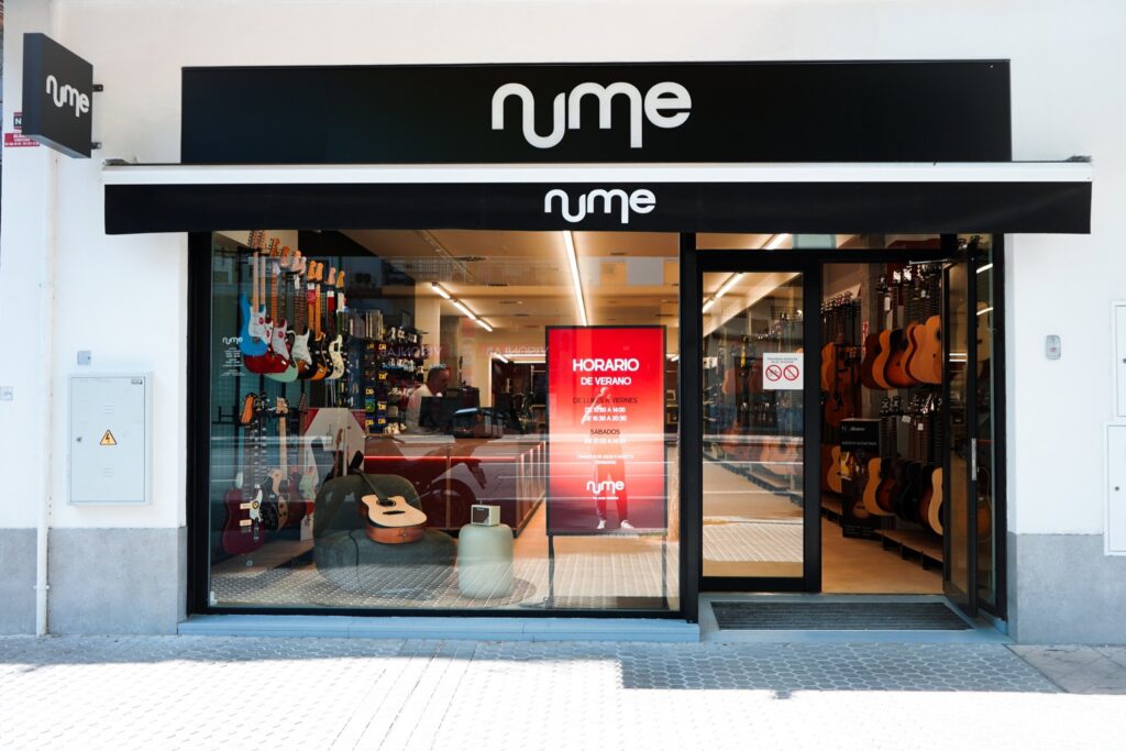
“Music is not an object; it is movement and energy.” With that idea, nume stops presenting itself as an instrument shop and becomes a place where music happens: where it is discovered, tried out and shared. The logo says it in a single line that rises and falls like a wave; the gradient brings in the energy of live music, and the n and the u, joined together, become the element that brings order to signs, posters, screens and stationery.

Applications and campaign
The same wavelength, at every touchpoint.
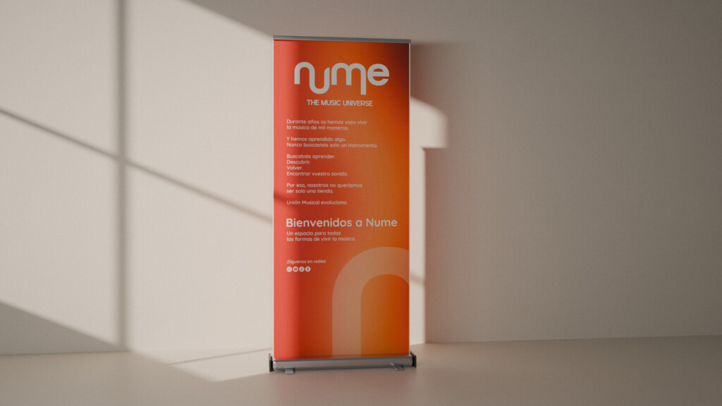
A new way of introducing itself. The same passion for music.
The project
The challenge
UME Unión Musical had been serving musicians in its shops for decades, but its brand did not live up to that history: initials easily confused with those of the Unidad Militar de Emergencias, Spain’s military emergency unit; the word “Española” (Spanish) in the name, which held back expansion across southern Europe; and an image that did not reach younger audiences or women.
The brief was not a facelift but a paradigm shift: moving from an instrument shop, where you buy an object, to a music space, where you live an experience.
The approach
Understand before designing: a brand audit, a competitor analysis and future scenarios. The conclusion was to evolve, not to start from scratch. That is where nume came from: a name that keeps the sound of UME and decades of recognition, works in Spanish, French, Italian and Portuguese, and leaves the military association behind.
The narrative was built on three pillars—vitality, passion and accessibility—and the identity took music as movement: a logo written in a single wave, a gradient that captures the energy of live music and a graphic element born of the n and the u, designed to crop, hold images or dress a background.
The result
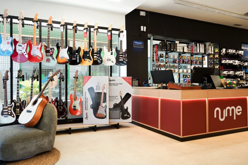
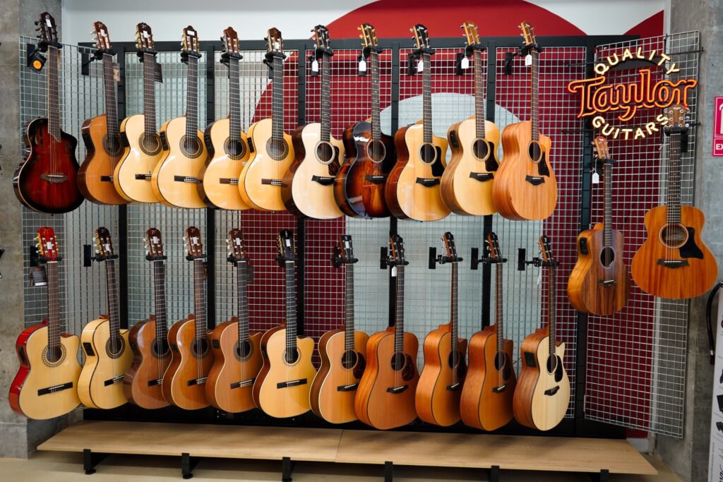
A complete system for the network of shops: identity and retail branding guidelines, with rules for signage, materials, zones and display designed to guide the brand’s interior designer; signs and final artwork for all eleven shops; stationery, badges, lanyards and bags; an audiovisual pack for the in-store screens and thumbnails for the video channel.
The new brand hit the streets with a launch campaign—a manifesto video, a roll-up banner and shop-window graphics—and with the design for adapting numemusic.es to the new system.
Frequently asked questions
Who created the rebrand from UME to nume?
Mariona Agency, a strategic and creative agency based in Barcelona: strategic diagnosis, naming, narrative, visual identity, brand guidelines and retail branding, plus the launch campaign for the new brand.
What is nume?
nume is the new brand of UME Unión Musical, Hol Music’s chain of musical instrument and professional audio shops, with eleven shops in Spain and online sales at numemusic.es.
Why the name nume?
Because it keeps the sound of UME and the recognition earned over decades, works in Spanish, French, Italian and Portuguese, and breaks the association with the Unidad Militar de Emergencias, Spain’s military emergency unit, which shared its initials with the brand.
What does the project include?
Strategic diagnosis, naming, narrative and tone of voice, visual identity, brand and retail branding guidelines, shop signs, stationery and badges, an audiovisual pack for the screens, the design for adapting the website and a launch campaign with a manifesto video.
Did Mariona Agency design the shops?
No. Mariona Agency defined the brand system for the point of sale—signage, materials, zones and display codes—and designed the signs for each shop; the interior design is by a studio appointed by the client.